The first step in Warhol’s silkscreen printing process was choosing an image. Warhol found images for his painting from a variety of sources, but this is one he drew himself such as A la Recherché du Shoe Perdu (1955).
Warhol then selected and cropped an area of the source image he wanted to make up the final silk-screened painting. Next, Warhol sent his cropped image to a photographic studio to have it transferred into a high contrast black and white image on transparent film. This transparency is called a film positive, which is used to burn the image onto the silkscreen.
Warhol then sent the film positive to a commercial printer to be transferred onto a silkscreen. To do this, the screen mesh is coated with a light sensitive emulsion. Once the emulsion is dry, the film positive is placed onto the silkscreen and exposed to a bright light. This fixes the image onto the screen, creating a photographic stencil where an area is “open” for ink to be pushed through. Once complete, the silkscreen was sent to Warhol’s studio.
Before Warhol began painting, he decided on a multiple or single composition for his final painting. Once the composition has finalised, Warhol laid out guidelines for the final image onto the canvas. To do this, he created a basic line drawing of the silkscreen image by tracing the film positive. Warhol then transferred this image onto the canvas by using carbon paper.
The next step in Warhol’s silkscreen process was choosing colours to paint the canvas. Sometimes Warhol used the traced lines as a guide and other times he ignored all or some of the lines and painted the canvas with large strokes of colour. This is evident by observing Warhol’s portrait of Elizabeth Taylor, Liz (1964), an iconic figure in cinema. One can see the lips and eye shadow clearly as it was painted earlier.
After the layer of paint has dried, Warhol lined up the image on the silkscreen with the painted image on the canvas. This process is called registration. Next, Warhol put some ink onto the silk screen and dragged the squeegee across the silkscreen, pushing ink through the open areas in the mesh of the screen.
Coca Cola and Campbell’s both decided they wanted to sue Warhol, but then thought that this is an excellent advertising initiative.
Warhol had the merit to understand, before others, that the Coca Cola bottle was the fundamental emblem of American (and international) mass culture that could be assumed to be a symbol of one entire age. Here he describes the importance of the Coca-Cola bottle in society (1975):
You can be watching TV and see Coca-Cola and you know that the President drinks Coke, Liz Taylor drinks Coke, and just think, you, can drink Coke too. A Coke is a Coke and no amount of money can get you a better Coke than the one the bum on the corner is drinking…Liz Taylor knows it, the President knows it, the bum knows it, and you know it.
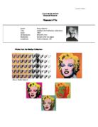
The first appearance of Warhol’s “Coke” bottle was in 1962, so I wanted to look at his Three Coke Bottles (1962) work. This piece of artwork is more interesting because one can see the gradual evolution of Warhol’s technique, which refined through time. Hence, by looking at a raw piece of work one can see Warhol’s perception of the subject. Comparing his work from the 60s and the 80s can immediately identify this. In addition, I wanted to concentrate on a piece of work, which used “big, simple designs”.
There are three translucent green bottles and there is a large Coca-Cola logo, in red, underneath. The centre bottle is slightly more offset than the others and is a lighter green. Warhol probably did not want to create a meaning or reason for this; it is more probable, therefore, that the second bottle happened accidentally because of the silkscreen process. Yet, through this, Warhol creates a focal point through the offset of the print and its visibly lighter colour.
The red logo underneath, I feel, is redundant due to the fact the bottle itself shows that it is a Coca-Cola product. Many people would probably say that the logo is the focal point, but if it were removed, people would still recognise the bottles. The point is that the audience knows it is a Coca-Cola bottle. The bottles seem to overpower the logo, yet the symbiotic relationship between works harmoniously together. The red contrasting with the watery green makes a pleasant combination. This is to do with the colours and the brightness and contrast seem to balance out creating a banal, but attractive piece of work.
I have drawn a sketch of the Coca-Cola Contour Bottle and looked at its shapes which are very simple and big which when brought together have the image of the internationally renowned bottle. The lines; the curve of the bottle; the abstract shapes, which litter the innards of the bottle; and the omnipresent Coca-Cola logo all combine into the image we all know and recognise.
This sketch was also the outline of how I created my artwork. Using the blotted line technique, but with a pen with no ink, embossed the image into the watercolour paper. The watercolour paint was then put onto the paper in the places I chose. Then, when the paint was dry, the gold leaf was applied. Each bottle is idiosyncratic, even though the same image, technique, materials and time were used to create the image. This paradox was exactly what Warhol achieved; this is why his work is so alluringly enthralling.
It is the simplicity and directness of the bottle Warhol emphasises; the way we underestimate its influence and power. Banality aside, this bottle symbolises America. That is why it is so significant, and that is why Warhol is so significant. He observed the materialism of the 60s and communicated this through his art – the meaning, lost through the accelerated bombardment of images over decades, still is important. Warhol says that he is, “…afraid that if you look at something long enough, it loses all of its meaning”.
Warhol uses more than one bottle; I feel this is important as why does Warhol repeat images? In the 1981 interview for Radio 3, Warhol said that he always thought, “that I don’t do the first one good” and instead of spending more time on just one picture he spends “more time making more than one picture”. The “number is very important” and he would like to “churn out” thousands of images. This refers to his past quote about him wanting to be a machine without emotion. Therefore, the most effective procedure to create his artwork was the silkscreen process. This makes the artist totally disconnected with its audience and the actual artwork.
He was opposed to the concept of a work of art as a piece of craftsmanship; in Warhol's own words, "I want everybody to think alike. I think everybody should be a machine". The silk-screen images expressed the mood of repetition, banality and insipidness, which underlies a consumerist perception of the world. Unfortunately, this is exact opposite of how I created my image. Each one was painstakingly made, and created to be ironically beautiful which goes against Warhol’s ideology. Yet, I find this interesting: how the same effect can be created either way.
He “churned” out his works (products) like a manufacturer, going as far as naming his studio 'The Factory'. Thus, Warhol's work was intent on dehumanising his subjects whether they are images purloined from mass-culture or depictions of atrocities such as car crashes. Warhol raised monotony to new heights, as he said at the time, "I like boring things".
Warhol always said that “If you want to know all about Andy Warhol, just look at the surface of my paintings and films and me, and there I am. There's nothing behind it.” I find that quite sad and actually quite depressing but I feel there is more to Warhol than he says; he calls himself “very superficial”, but artworks such as Tuna Fish Disaster (1963) and Electric Chair (1971) show a much darker, eerie mindset. The use of fresh, fluorescent colours such as hot pinks and acid blues tinting pictures of electric chairs or car crashes (many times repeated) really puts Warhol as one of the most important artists of the 20th century.