The background of the painting, is set on the newspaper ‘classifieds’. The composition shows two bodies that are distorted using rounded lines and the body parts are either exaggerated in some way, for example making the arms skinnier. The painting shows intamacy and a bit of sexualness between the two characters in the painting. The image shown in the painting, isn’t realistic because the bodies are distorted and the colours that are used are bright and bold, and not seen as normal skin colours. The colours, lines and shapes seem to take over in this painting, as they are quite bold. The colours that are used are a mixed combination of colours from bright to pale and dark colours. The colours are varied in tone but what makes the colours stand out is the thick black outline around each shape which gives it more impact on the painting. The painting may perhaps be from observation or imagination, for the reason that two people could of positioned themselves in that position to give the artist a outline of the painting and then the artist may well of added lines and curved the lines to distort the original outlines and to give it more emphasis.
At the uppermost part of the painting, are the mouths of the two body forms in bright white. As most people, find it hard to visualise what the painting is, the mouths at the top, is a good place to start. That is the only part that is in full white colour. Whispey lines are used to form the hair with a grey background with blue hints to make it more subtle.
The painting itself, is very intersting to visualise, as it does give a shock to the audience, which draws you more to it. The artist’s intention for this piece of work was from a selection of work, but was intended to ‘shock through the intense perhaps obscene use of the human form’, and he has achieved this very successfully. This type of sexuality, the human obsession with lust, excess, and obscenity appears more and more often in the modern world. The artist intended to attempt to visually represent this want and desire with the fundamental message. The artist is to have said that
‘the ‘clippings’ (the layers of the painting) contain the emotional value of this event’.
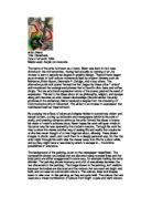
Artist: Roy Lichtenstein
Title: Kiss V
Date of artwork: 1964
Media used: Oil and magna on canvas
Roy Lichtenstein was known as ‘the master of the stereotype’, and the most sophisticated of the major Pop artists in terms of his analysis of visual practice and his ironic use of past styles.
He was born in New York City in October 1923. His parents were middle-class and he described himself as having had a quiet and uneventful childhood. Art was something not taught as part of his cirriculum at his high school, in his junior years, he started to draw and paint as a hobby. His first subjects were jazz musicians and his work was affected by Picasso’s Blue and Rose Period paintings.
The painting is based of pop art movement. The painting ‘Kiss V’, depicts a portrait of a man and a women, where they are hugging and the women is emotionally upset sheding tears. The bright primary colours of the work, is usually instantly recognisable to be one of Lichtenstein’s work. The artwork is very comic-like based and can appeal to all types of viewers. The womans face is overlapping the mans face, and the hand of the woman seems to be in the foreground gripping on to the mans shoulder. The image of the two portraits is quite a close up.
Lichtenstein produced about six paintings showing these characters, and all six of them shows a story between the two characters. Each picture shows a different story varying from love, anger to sorrow.
It was in 1961 that Lichtenstein produced about six paintings showing characters from comic-strip frames, with only minor changes of colour and form from the original source of material. It was at this time, that he decided to use the Ben-Day dots, lettering and speech bubbles as his signature in his work. His work made an impact on Andy Warhol who started to create similar work. At the present day, his use of style is used by the greeting card industry.
The colours used in all six of these comic strips are bold, bright primary colours, even though the subject matter of the painting is about emotions, the artist still uses bright colours. Usually other artist’s use colour as a way of showing emotion thorugh their paintings. However, Lichtenstein does the opposite and uses bright colours and creates the emotion through his characters facial expressions and speech bubbles to express how they are feeling.