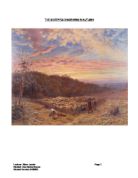
The first fixation we are instantly drawn to is the sky as it looks heavenly and ghastly it has a great impact on the picture, contrasting colours are used to show the clouds and the sun rising in autumn, is captured through the season’s predominant colours: brown, red, orange, and yellow. Tonal variation is used you can almost see the red of the sky foreshadowing on to the ground and the tress casting a shadow. If you look along a straight road, the parallel sides of the road appear to meet at a point in the distance, this is shown just above the trees on the right hand side, because that is where it narrows down. This point is known as the vanishing point and has been used to add realism to art since the 1400's.
The juxpositioning of the objects and scenery is fascinating; as if the sheepfold and the people were placed further we would have not concentrated on them. Linnell - the artist has really considered spacing and has achieved a contrasting division of several different elements such as the sky, the forest/woodland theme, the mooreland, sheepfold with the farmers and the autumny season.
The tree on the left hand side gives us an autumn feel, and from the sky we can see that it is early dawn morning and some farmers have come about to do their daily tasks collect wood and look after the sheep, there is even a sheepdog. The picture does give a sense of reality, however the setting for a sheepfold is peculiar and the sky gives us the impression of an almost mysterious place.
It is also intriguing to point out the contrast of the individual tree placed on the far left hand side, This particular tree leaps out in contrast to the forest/trees in the background, paying specific attention to that single tree, making it a significant feature in the photograph. The artist gives us the impression that winter is coming because the farmers are gathering up wood; a lot of attention is paid to detail.
The background looks almost mystifying and the picture looks very naturalistic. Light dominates the photograph; the clouds contribute to an almost peaceful mood. Further support can be found in the work of the author Marvys’ Actm pg 28 whose perspective is:
Using “recessive colours, like blue, greys and greens, are used in the backgrounds of paintings to increase the effect of distance”
This general technique is applied within this painting and distance is created by darker colours and making the object smaller so it appears further. If we look within the distance it is more blurred and the closer we look to the picture, the clearer the picture is. The composition of the painting is interesting; even the most intricate details is used, this is shown through the spade, people and the dog; the photograph almost looks like a postcard, the picture is very deep and detailed.
The image of the woods looks dangerous and almost like a forbidden forest, where many unknown secrets possibly are lurking in the woods. By looking at the depth of the forest you associate that with darkness, which is different to the rest of the picture. The picture is so full of life and open, it shows the hardships that those people went through without machines and the simplicity of their life is shown by the clothes they are wearing. The weather looks forever changing, but for those workers their work is a daily chore no matter what the weather is.
We interpret different messages by looking at something and examining it and judging the photograph from our own perspective. Our understanding and views of different pictures may be affected by our life experiences, everyone has a different interpretation.
Bibliography
Marvy, A. (1997) Learning to look at paintings. Routledge. (1997)
Bloomer, C (1990) Principles of visual perception, London, Herbert
Chandler, D. (2002) Semiotics: the basics. London: Routledge
Evans, J. (1999) What painting is. London. Routledge
http://www.bbc.co.uk/paintingtheweather/csv/painting/springtime.shtml Accessed: 17/11/04
Accessed: 17/11/04
Lecturer: Steve Jacobs Page
Student: Zara Saima Sarwar