Here are my results. I found the first website was the best so I selected it and did not select the other two. The other two websites contained basically the same information as the first, as they were only branches from the Oxfam home page. Oxfam home page (see below).
This is the Oxfam homepage. This colourful image caught my eye immediately so I thought it would be good to use in my project. These children look very happy, so it will give my leaflet a slightly more light hearted approach, which is what I want because I don’t want my leaflet to be like many others which overpower their audience with ‘tear jerking’ images.
I did a google image search to find some Oxfam related images. I typed in ‘Oxfam’ in the search box, because I thought this would give me a wider range of images and any images that perhaps Oxfam would use and recommend.
Out of these four images, I decided to use these two, because I thought they would be the most useful. It tells the audience straight away that the leaflet is about Oxfam and the bold colour makes it very eye catching. The other image is of two small children who look unhappy but determined. I hope that this moving picture will encourage people to donate to Oxfam.
I did a complex search to broaden my research. I used the words ‘poor countries and clean water or food’ because this is the sort of thing that Oxfam deal with, and I wanted to gain varied information and get a wider view on poverty from a slightly different perspective to Oxfam.
Here are my results from my complex search. I thought the second website was the most relevant but I still didn’t select it. The information on these website were too in depth and it confused me.
I did another google images search to find emotional pictures and statistics on poverty. Poverty is really the basis of Oxfam, because without poverty there would not be any real need for Oxfam to exist. I typed in poverty, as a keyword as I thought the word was meaningful enough to give me the desired images, but vague enough to give me a varied view that was not directly connected to Oxfam.
I found this picture really emotional because it shows a small, innocent child who is obviously suffering, so I am going to use it and the bar chart is very good too. The ‘poverty’ motto has really meaningful words, so I think I will use that in my leaflet also.
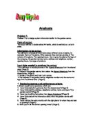
SECTION 3 – Selecting Relevant Information
SECTION 4 - Developing Information
I chose to put a very limited amount of information on my front page because I wanted to attract the reader’s attention simply. I placed Oxfam’s logo on the front page, because I knew that as soon as people saw the logo they would know which charity my leaflet was for. I spread out my chart all over one page because I thought the statistics needed a lot of space to be seen clearly. My text is fairly well spread out. I don’t want to put too much text on one page because I am aiming my leaflet at teenagers and if there is too much text on one page they will lose interest and not bother to read my leaflet. My page orientation was landscape because that is how leaflets are usually set out and I wanted my leaflet to be just like any other leaflet about a charity. My paragraphs are short with a fairly large font because I was afraid that if I put too much text in a small font my target audience would not bother to read it. My centre columns in the middle are 10mm apart. This will allow enough room when I fold my leaflet in half and it will make the text in the leaflet seem more logically spaced out, and not bunched up at the sides. I put in sub heading to make it easier for people to find what they are looking for in my leaflet. I also changed the colour of my subheadings to green so that it stands out from the body text and matches the colour of the Oxfam logo. All of my margins are 20mm. This is a good number because I know that the printer won’t print any of my work if it is in a 15mm margin or less. I chose an image of a short poem about poverty. The late Mother Teresa wrote it and it really made me think about the poor people in the world and what we can do to help them. Hopefully this image will have the same effect on my target audience. I chose an image of smiling children to show people what the poor children could look like with their help. I think that my leaflet will be suitable to my target audience because I have used only a small amount of text, but it gets straight to the point. So even if my target audience does have an incredibly short attention span, they should be able to read my leaflet with ease. The images are bright and eye catching. I was quite pleased with the outcome of my end leaflet but then thought of ways to change to so this is what I did:
Leaflet 2:
I think my second leaflet is better than the first because I broke up the text a bit more to make it look more appealing and to make it easier to read. I also changed the font to a more attractive font. I enlarged the picture because I thought the picture had true meaning to what the charity was all about. I also enlarged the contact numbers and addresses on the back page because it will hopefully entice people to contact the charity and find out any extra information they need to know about donating or any queries they may have. I reduced the size of my statistics chart to make more room to move around my text. The chart is still easy to read. So it still fulfils its purpose in making the audience realise just how many people are living in poverty in our world today. I did not see the need to change the page orientation because my leaflet is supposed to be produced landscape. I didn’t change the size of my centre columns or margins, because I thought that the present ones were suitable. I left my subheadings in the same green colour because I thought it was good idea to make them stand out. I left the image of the smiling children on the back page because I thought it was a pleasant way to end the leaflet.
Leaflet 3:
I decided that I didn’t have enough information on my leaflet so I changed it again. I left my front page and back page because I thought they were suitable for my target audience. I entered another paragraph of derived text from my paper-based resource.
I added more subheadings so that my audience would know what they were reading about and to make the leaflet more consistent. I had to change the font size from 14 to 13 and I changed my text to normal instead of italic. I think this leaflet looks the most appealing and has the most information so I am going to choose it for my final idea. I also decided to change the front page of my leaflet because I thought it looked a little plain and might not entice my audience to pick it up and read it. I added another image to make the front cover look more interesting and to attract my audience’s attention.
Leaflet choice:
I am going to choose leaflet 3 because I think it has the most information and the most relevant size font and graphics. It is the most suited to my target audience and I think it looks the most appealing.
SECTION 5 – Checking Work is Accurate – Proof Reading
I asked my parents to proof read my leaflet and they found a number of mistakes:
-
The word ‘believes’ was spelt incorrectly
- The word ‘communities’ was spelt incorrectly
-
The bright green colour was a little bit difficult to read
-
They couldn’t really read the writing on one of my images
-
The word ‘different’ was spelt incorrectly
- The phrase ‘or basic sanitation’ was put in caps lock
- The word ‘Oxford’ didn’t have a capital ‘O’
- There was an ‘s’ missing off the end of ‘goods’
SECTION 6 – Saving work
I can’t do this section because I had a problem with my computer near the beginning of the project and all of my work was wiped off the system. I had to start again but I couldn’t save all of the different prints of my leaflet. This means I don’t have anything to show how I saved all of my work on Workspace manager.
SECTION 7 – Advantages & Disadvantages of Using ICT
Advantages
- It’s easier to change any mistakes or errors. This will save lots of time and will prevent you having to start again if a major mistake is made.
- You can add accurate images and pictures without sticking them on manually. This will save time and will end up with a more professional looking leaflet.
- Easier to re arrange leaflet on the PageMaker program to design a new leaflet. The PageMaker program allows you to move around the components of the leaflet and see how it looks before you save or print it, so it is much more efficient than redesigning by hand.
- Printing out many copies in one go is much faster than doing many copies by hand.
- You can use the spell checker to check for any spelling or grammatical errors, which is much quicker than manually using a dictionary or thesaurus.
- You can set up back up files as a precaution if the original gets damaged. If a handwritten original gets damaged then you will have to start at the beginning, which is very time consuming.
Disadvantages
- If computer crashes you could lose all of your work. This can be very annoying and depressing.
- You cannot do free hand drawings on the computer.
- Viruses can ruin your work and computer leaving you very stressed that you have lost all of your work and will have to start again.
If I was going to create this leaflet manually I know it would take much longer than by using a computer. I would have to draw out all of the images I wanted to use, and write out all my text by hand. Not only is this tedious but my handwriting is quite messy so the leaflet wouldn’t look very good and it definitely wouldn’t look as professional as if I used a computer. If I made a mistake I would have to start all over again because I wouldn’t be able to erase my mistake. I would have to take my time when colouring in my images so that it didn’t look like a toddler had scribbled over my leaflet. The images wouldn’t have the same desired effect as if I had got them from the Internet, because the fact that I had drawn the images would make them look more like cartoons and that is not the effect I wanted for my leaflet because it wouldn’t seem lifelike and realistic. Poverty does actually exist in the real world and I want my leaflet to help people understand that.
SECTION 8 – Copyright & Confidentiality
It’s against the law to copy information without the permission of whoever owns the information. It is also against the law to write about a particular person’s private life without their permission. The owner of the needed information can give you a licence if you contact them and ask for one. I haven’t written about any particular people in my leaflet so the confidentiality rule doesn’t apply to me. All the information and images in my leaflet was either taken from the Oxfam website or my paper based research which was an official Oxfam leaflet. I derived any text that I used and tried not to use too much of the text straight from the source. I also acknowledged my sources, so I am not trying to pretend that the information I found on the Oxfam website of leaflet is my own. If I were going to print out many copies of my leaflet and give them to people I would need to ask Oxfam for their permission first. I emailed Oxfam to ask if they would mind if I used some of their information and facts in my GCSE project and they said they didn’t mind. This means I have permission from the people who own all the information about Oxfam and I am not going against the law by copyrighting the material.
SECTION 9 – Error Handling and Virus Protection
I used google Internet searches to find all my information about Oxfam. The searches gave me immediate, accurate results. I used the spellchecker to check for any spelling or grammatical errors and asked my parents to proofread my work ad sign it. After my parents had proof read my leaflet I had to make sure that I corrected all of the mistakes. I also had to reformat all the numbers in my leaflet on the page maker; for example, I changed the word ‘three’ to the number 3. Occasionally an error message would pop up saying “This computer has performed and illegal operation and will be shut down”. Whenever this happened I asked my teacher for help to see what I had done wrong, but usually it was the fact that I had too many programs open at once and the system couldn’t cope with the strain. I only had to as the technician for help once and that was because my computer screen kept on freezing. He restarted the computer and told me to use another machine. I understand that computers can be very fragile things so I treat them with care and respect, for example I don’t hit the keys on the keyboard exceptionally hard because I know it will damage it. I don’t interfere with the keys on the front of the monitor because I know I could damage the monitor by doing that. I tried not to crash the computer, as I am well aware that this can seriously damage the monitor, the only time my machine crashed was when the technician restarted it. The name of the anti-virus software on this system is Sophos anti-virus. It is very important to have updated virus protection because new viruses are being designed every day and if the anti-virus software doesn’t recognise a virus it won’t protect the computer against it. To prevent any viruses affecting my computer I made sure I virus checked my floppy disks every time I used them. I went on the internet a few times to retrieve much of the information I put on my leaflet and I am well aware that many viruses can be picked up on the internet. I only went on the google website and Oxfam websites. I believe that these websites should be safe because they are popular, fully established legal websites that have been scanned to prevent any viruses getting through and affecting computer systems. I used a backup system as a precaution against my original copy getting damaged in any way. This ICT project is saved on the school’s system in my ICT folder and my backup folder, it is also saved on a floppy disk which I use to take information to and from school. My backup system is nothing like the schools though. My school uses 8 magnetic tapes every week to make sure that everything on the school system is backed up to prevent loss of important data. It is very important to have a back up strategy because without one, valuable data could be lost or simply mislaid and it could mean a loss of money for some businesses. There are many different types of back up media such as: floppy disks, DVDs and magnetic tapes.
SECTION 10 – Health & Safety
RSI stands for Repetitive Strain Injury. If your workstation is like the diagram above then you are less likely to injure any muscles by repeatedly straining them while making the same movements over and over again. If your workstation is not suitable then you could suffer from:
Repetitive Strain injury
Eye strain
Back problems
Fatigue and stress
Repetitive Strain injury can be cured by purchasing ergonomically designed keyboards with wrist supports, these prevent you having to move your wrists too much and make typing for long periods of time more comfortable.
Diffusing the lights in the room can cure eyestrain or fitting window blinds to prevent any glare falling onto the screen. Adjustable chairs can also be installed so that people can adjust the way they are sitting and they can look at the screen comfortably.
Adjustable screens and chairs can help to prevent any back problems. The chairs and screens can be adjusted so the person can sit comfortably while maintaining good posture.
Sitting at a computer screen for long periods of time can lead to fatigue and high stress levels. Therefore, 10-minute breaks are recommended every 2 hours. During these breaks, the people should try out a number of relaxation techniques to try to de-stress themselves and come back to work renewed, ready to concentrate on the task in hand.
Certain safety procedures need to be followed when using computers:
Make sure everyone in the room is aware of the fire exits and proper procedures in case of fire.
There should be a fire extinguisher in case of a minor fire.
Food and drink should never be brought into an IT room in case of spillage.
Make sure the plugs aren’t overloaded with too many wires, as this can be a risk of electrical fire.
Only trained technicians should touch any wires at the back of the computer because of risk of electric shock.
Only trained technicians should try to remove any paper jammed in a printer or change the ink because of risk of injury or electric shock.
No one should enter an It room unless accompanied by a responsible adult like a teacher.