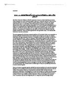
The PFF can easily be applied to this diagram. This is because the curve being shown is a PFF curve, and at point ‘A’ the NHS are using their resources to do more ‘all other’ operations, and a point ‘B’ the NHS are using their resources to do more ‘heart’ operations. If a point was drawn up that was inside the curve, it would mean that resources are being either unemployed, such as inefficient staff, or using resources inefficiently, such as equipment not being fully used to its potential. If a point was drawn up outside the current curve, this would mean that there is an increase in available resources to the NHS or an increase in productivity, maybe due to factors of production increasing in productivity, better trained and qualified staff for example. The diagram can also be applied to the PFF theory because a PFF theory explains how an economy uses its resources to produce a maximum of combinations of services.
Choice can be applied to the diagram also as it is clear to see that choices have to be made by the NHS, in this case on which operations they will do more of; ‘heart’ operations or ‘all other’ operations. You can see from the graph that at point ‘A’, they have decided to do more ‘all other’ operations, and at point B, they have decided to do more ‘heart’ operations. Each decision also has an impact not only on the number operations they have decided to do more of, but also a direct impact to the number of operations they have decided against doing more of, as they will be less. Not only do the NHS have to make choices on what goods or services they will produce, but also businesses, both in the private and public sector of the economy also have to make choices. For example, a typical computer business may have to make a choice on whether to produce more keyboards than monitors because the resources they have only allows them to produce more of one or the other. An example of a choice that the government may have to make could be deciding on whether to build a school or a hospital because their resources; factors of production only allow them to do one or the other (we could use land in this example). Therefore, when we or businesses and governments choose something, most time, we miss out on other things, and this is called opportunity cost.
Opportunity cost can be applied to the diagram; it is very closely linked to choice. We can say that is the consequence of choice, as choosing one thing leads to use missing out on another thing, in most cases anyway. Opportunity cost can simply be applied to the diagram because; if we look at points ‘A’ and ‘B’, we can see that if the NHS was using its resources in its economy to produce its operations at point ‘A’ then opportunity cost is happening as they are missing out on producing more ‘heart’ operations, this can be seen on the graph, where the points are lying on the curve. Again, not only does the NHS suffer from opportunity cost, businesses, governments and consumers all do too. This is closely linked to choice, as choosing one good or service over another leads to opportunity cost. An example of consumers suffering from opportunity cost is if they were to be walk into a shop and only have money for one chocolate bar, they would miss out on buying another chocolate bar as they have no money left. Choice and opportunity cost also leads to something we call the ‘Pareto Efficiency’. This concept was developed by economist , and it means that it is impossible to make something or someone better off without having the opposite effect on something or someone else, causing a negative effect to them. This can be applied to the diagram and both choice and opportunity cost because in this case, if the NHS are working at point ‘A’, performing more ‘all other’ operations than ‘heart’ operations, the ‘heart’ operations will become negatively affected and worse off because there will be less of them. This also works the other way round if the NHS would be working at point ‘B’, performing more ‘heart’ operations.
Finally, scarcity can be applied to the diagram because some of the resources that the NHS are using are definitely scarce, and therefore are in short supply. The NHS can only produce so much and here this can be applied to the diagram as this limits the curve. However, if a alternative was found to a scarce resource, this may lead to a price decrease and therefore the NHS will be able to buy more of that resource and therefore the curve will expand because the NHS’s individual economy will have a higher capacity. The curve will also expand outwards if other factors were to be improves, such as higher quality or quantity of factors of production or reduction in costs.
In conclusion, we can apply the PFF theory, choice, scarcity and opportunity cost to the diagram as they all have an influence on the diagram in one way shape or form. The
PFF theory can be applied as that is what the diagram and curve is showing us, choice can easily be applied because the NHS are having to make choices, like everyone in life, weather it by people, businesses or governments and again that is what the diagram and curve are showing us; the effects of these choices. Related to choice is opportunity cost, which is another concept we can apply to this diagram. A direct consequence of choice and having to make choices, it can be applied as the diagram is showing us the opportunity cost of the NHS making its choices. Finally, scarcity can be applied as the diagram shows us what would be possible if the resources weren’t scarce or an alternative was found, or if an increase in resources or factors of production occurred.