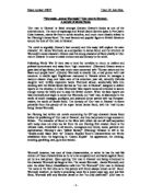
The genre of the film is far more evident in the poster for ‘The World Is Not Enough’. The images used connote an action film that has many different narratives. The poster is lively and eye-catching and is full of bright, vivid images. The poster fits in very well with the title of the film, as it looks like James Bond is going to embark on some international mission, the image of some of the continents in flames shows this. There are also several images circling around the main characters in the film, which look futuristic and scientific and feature explosions and car chases. Comparing the two posters also shows how technology and science has progressed through the decades and this is very apparent in the 1999 film poster, which looks far more advanced, as far as gadgets and weapons go.
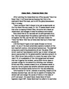
The ‘Dr No’ poster does not specify the genre so well. It could be for several different genres. It indicates that it could possibly be a spy or mystery film, which is partly true of the James Bond movies.
James Bond is shown in the ‘Dr No’ film poster as a silhouette, it suggests that he could be a very elusive character in the film and has a high profile profession, perhaps undercover, or an important position in some kind of leading organisation. There are also different coloured drawings of four women next to him. This connotes to the audience that the film is perhaps very sexual and since the drawings of the women are smaller than the one of Bond, it could also signify male dominance.
In the more recent poster, the audience sees the actual character of James Bond, and it looks less secretive, perhaps this is because the audience already knows who he is and it is no surprise. He is pictured in the middle of the two women; it portrays him as being a ‘ladies man’. He looks very stern and serious and this signifies to the audience that he is a highly intelligent and important character. It is interesting that in each poster, Bond is outnumbered by women. He looks very well educated and respectable from the smart way in which he is dressed, giving the audience more clues about his character, which is by this time, is already well known.
I think both film posters appeal to a different audience altogether. ‘The World Is Not Enough’ appeals to a wider range of people as on the poster it features both men and women, and since the Bond films and its conventions are already broadly recognised by both genders of all ages, it appeals a wider audience.
As ‘Dr No’ was the first ever Bond film, people had no idea what it was about exactly, unless they had read Ian Fleming’s novels. The poster itself appeals more to men, because you cannot actually see James Bond in the poster, you only see the images of the almost unclothed girls, thus making it appeal more to males. I think it would also appeal to older males, as it is obviously not a children’s film.
In the time of ‘The World Is Not Enough’ several important events were going on internationally. This strongly influenced the content of the film. The audience knows straight away that this film is obviously about something ‘international’ from the title of the film and of course the image of the world on the poster. In the 1990’s, there was a lot of research being done into weapons of mass destruction, which is apparent in the film. The poster also has connotations of terrorism and war. Also, the apprehension that media tycoons such as Rupert Murdock have too much authority over what we are thinking, watching and reading.
Around the time of ‘Dr No’ several things were taking place, economically, socially and politically. Male dominance was still very prominent in the society of the 1960’s and this is reflected in the poster, it also proves that a sexual revolution was taking place around this time, and ‘Dr No’ was infact considered to be ‘too sexual’. The film also goes out of its way to be politically incorrect.
The first James Bond film was low budget, but as the films have progressed over the years, they are now high budget films and almost always certain to be box office hits. The producers were also very selective and careful in choosing the suitable actor to play James Bond. This is also a very important factor that contributes to how well the film will do, and who it will appeal to. It is evident that the famous actor that does plat James Bond has to look, speak, act and think in a certain way for the film to be successful.