The last link is a search option where customers and viewers can enter there specific information on they are looking for in the house but on the contrast the site gives you a certain amount of options to choose from as you can see from the screen shot I have created below:
The screen shot below shows the certain amount of information you can enter when searching for a house.
At the bottom of the search option there is a symbol of a tree, this is one of there fancy hyperlinks which has a validation within it:
This screen shot shows when you click on the tree hyperlink and you have not enter the right validation rule you will have a message box come up telling you must enter a certain for example your name etc….
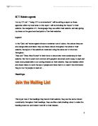
Language:
The site gives you a clear and easy to read information about the company throughout their whole website, they don’t really use any terminology which I think its good for people who are not as well educated and not able to read as well as other people so its more understandable.
The language they use is quite suitable for its purpose because it always relate back to the topic of what they are trying to put across.
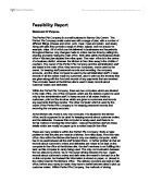
Good and Bad points:
There are a number of good and bad points of there Oak lets estate agents website, one of there bad points I feel is there consistent use of colour, they use a kind of a dull colour for example the use of grey on the original site on their back group which doesn’t look attractive and not very appealing, it makes the site look boring and not worth reading, but on the other hand one of their good points about this website is there information I have they used a lot of information about them.
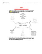
Furthermore another good point about them is they have made another website and which looks better then the original, on this site they have designed pretty well I feel by having the menu put on the side and the main body in the middle with all the information on which is shown below from the screen shot I have taken, within the screen shot I have outline the tree main parts of their new trendy and stylish site:
Diagram 1:
Diagram 2:
As you can see from the two diagrams above the site is arranged very differently by putting the menu bar with the title on top and having the main body on the bottom half, they have improved this having structurally constructing it into three parts as you can see from diagram 1.
Estate agents 2: Acorn
Acorn prides itself on being one of the largest independent estate agents in the South East and Kent areas. With over 20 years' experience in the lettings market, you can rely on us to protect your investment. We have specially tailored packages to ensure peace of mind. Please feel free to browse this website for useful information or to arrange a free valuation
Layout:
The layout of the “acorn” estate agents shows a consistent use of colour, their primary colors for this organization are mainly red and white and blue, and they use these colors throughout their website. On the site I feel that they have a very good layout on the structure, I have outline the tree main bodies of their website they have created showing in the screenshot below:
The acorn organization use the common font “Times New Roman” this is used throughout their whole site, the colour and font and the layout are the three main consistencies they use in their website, they also have a clock on the right hand side on their site. The graphics they use in there are mainly images of houses and they tend to use images relating to the text.
Logo:
They have created a logo to represent their organization they use a acorn image, this relates to their name “Acorn”, they use only two of their primary colours on the logo.
Navigation:
As I have stated above the site is structured well with three main parts to it the “title”, “menu bar” and the “main body”, this allows the viewer to navigate more freely without having to worry how to get back to the home page. The menus and links are mostly in the same place the menu bar as I have stated in the screen shot does not move.
The search options are good on this site it allows you to have a “quick search” if you are in a rush, and then it also gives u longer criteria you can enter etc…..
Language
The language they use is formal and gives you a clear insight on what they are about and what they are trying to put across to people! In comparison to the “oak lets” they tend to use basic language techniques in their site for people who could have learning difficulty with reading so its easier for viewers to understand.
The language they use is suitable for the purpose they are trying to put across because however they explain certain aspects they always relate what they are trying to sell to their audience.
Good and Bad Points:
In the acorn website they have a number of good and bad points. One of their good points I have started before is their layout they have a good structure using the main body that only moves when clicking the hyperlinks. Another good point is the use of pictures for example just about every page you enter on their website they show a picture of a house, they do this to catch the viewers eyes.
One of their bad points is that they don’t really explain their self as clearly as I would have hoped when searching for property. Furthermore they have a lot of information which can be boring to read and might bore the viewers having to read long information about a certain aspects.
Estate agents 3: Robinson Perkins & Jackson
Layout:
The Layout of the this estate agents is very similar to the other two above they use the same structure to construct their website with title and menu bar in the same place and only the main body, which contains the information about aspects move and change, they use the common font “Times New Roman”. The colours they use are mainly the blue and yellow they are consistent in ever page with these colours. There are not very many graphics used in this site just mainly the people of work there and the pictures of houses.
Navigation:
Navigation is quite good in the website you move around the site by clicking on the hyperlink of your choice then move from place to place, usually the menu links stay in the same place and will not move so it’s easier to find the link to the home pace of index page etc….
The search options are set to their criteria for example if you enter a name or a place that is not set for their validation a message box will appear and tell you what you may have to enter.
Language:
The language use used differs from the rest they do not use a complex of terminology due to the fact, people with learning difficulties may find it hard to understand a use of terminology within the site so they made it so it’s easier to read and understand.
Good and Bad Points:
The good points about this site are that it’s easy to read and not complicated by using complex terminology etc….. alternately the layout looks boring and does not look presentable, mostly I feel there’s too much stuff packed together and not look nice to go through, But although the structured it well so when you click hyperlinks etc you can easily find your way back to the home page.
Comparison:
The three estate agents are very similar when constructing their website by separating it into three parts; the three don’t really use vibrant colours to catch the eye of the customers.
The three use the same font “Times New Roman” throughout their site, the graphics used are mainly their logo and pictures or houses the three both usually keep it in the same place which is the top left hand side of the page, they are consistent with it and it doesn’t move when changing the page.
The three uses the same layout when navigating around the site they always keep the links in the same place and does not move so it’s easy for viewers to click back to the home page etc….
All of them have a “quick search” near there home page and then have a longer advanced search on another link further in the site.
Again they do not really use a lot of complex terminology due to people not understanding etc… so they try and keep straight to the point and make it as easy to understand as possibly. As I have stated above they all have a number of bad points aswell as good points but they one I think that would be very successful would the “Acorn” website due to its present ability and the way it is laid out by using different pictures to illustrate their point.