A dependent variable is a variable that dependent on another, the independent variable is said to cause an obvious change in the dependent variable.
So I’ am going to plot the foot breadth (mm) as a dependent against the foot length (mm) as the independent variable. Knowing that (y) is a dependent of (x), as (x) is an independent foot breadth will be on the (y) axis and foot length will be on the (x) axis.
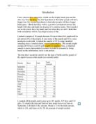
Scatter graph
A scatter it shows a relationship between two variables. On the scatter graph the (y) versus the corresponding values of (x). On the vertical axis which is (y) is usually responding variable and the horizontal axis which is (x) which relate to the response.
A scatter will be drawn to identify any outliers which mean any anomalous result that may look far out from the region. I will able to draw my line of best fit this will be drawn visually and also able to find the correlation coefficient in this case the value of r.
Prediction 2
Looking at the scatter graph I can visually predict that I will get a fairly fat ellipse has the points are quite spread out has. This also shows children with the foot breadth of about 52-55 (mm) are fairly grouped together where has foot breadth of 56 (mm) onwards or less are more spread out.
Diagram 1
After plotting the scatter graph I’m able to have a visual impression of how the points lie, it shows that all the points lie generally on an upward diagonal and also shows that there is an outlier.
Outlier
An outlier can occur due the basic linear relationship between (x) and (y), a single outlier occur in the (x) axis. The outlier may be defined as data point that emanates from a different model than do the rest of the data.
This outlier may be there due to the fact of data input error or may also explain that there is a medical problem with the child’s foot growth. Has it is not possible for a child who is 2 years and 3 months to have a foot length of 154 (mm) and 69 (mm) foot breadth. Has research shows that a normal 2 year old should be a size 7 in socks. In this case length is not an issue for that particular child the investigation is on the breadth, this may say the child’s feet is broader than the other children in the chosen age group.
The outlier will be put in and will be used when calculating the r value which I will then determine which one will be best to indicate the correlation coefficient and the strength in terms of the original situation.
An ellipse
An ellipse is drawn on the scatter graph this is to show how strong or weak the correlation is. In this case it show that I have a ‘fat’ ellipse which mean a weak correlation this show that the second prediction was accurate has toddlers with foot breadth ranged 53-61 (mm) and a foot length ranging from 138-144 (mm) tend to be repeated at this age group. This also give a firm prediction of how
Confident the prediction is in this middle region of determine Small size, Median size, and Large size socks. This can be determining when I have drawn the regression line.
An ellipse with the outlier and an ellipse without the outlier
Looking at the two scatter that contains the ellipse, it show that even if the outlier is on or without a drawn ellipse it cannot be drawn around the outlier, as the value far off as result will give a poor model. So in this case the else is still giving a weak positive correlation.
Showing the other weak and strong ellipse
Prediction 3
From this information above I can predict that ‘r’ value with the outlier will give a fairly weak possible fit to the model. This will mean that if the data are included in the linear regression then the fitted replica will be poor every.
Positive correlation
From this I’m able to say that I have met my first prediction of having a positive correlation has the ellipse is sloping upwards direction. This is saying a weak positive correlation in this case having a characteristic of length (mm) increasing as another; the points are sloping upwards from the bottom left to the top right. In another words the points are arranged in a group structure.
However if I was to have a negative correlation the point will be diagonal slop downwards from the top left to the bottom right. This is indicating there is a lot of error with date input having in mind the age group chosen.
Correlation coefficient
From the scatter graph I will be able to measure the correlation coefficient. A correlation coefficient is seen from a number between -1 and 1 this measures the degree to which two variables are linearly related. In this when talking of have a line of best fit will mean a regression line that will pass through the points in a accurate way. From the scatter graph I’m able to have a visual impression of the line of best fit that will pass through the mean point indicating that point are balance on either side.
If there is a perfect linear relationship with the slop between the two variables, than this is called a correlation coefficient of 1, this can be said when have a positive correlation whenever one variable has a high (low) value, so does the other. If I were to have a perfect negative slop between two of my variables, than this will be a correlation coefficient of -1, this means when one variable has a high (low) value; the other has a low high value. Having no correlation at all will mean the correlation coefficient will be 0, this happens when there is no linear relationship between the variables.
Knowing that this is a Pearson’s product moment correlation coefficient usually denoted by ‘r’ is one example of a correlation coefficient. It is measurement of the linear association between two variables that have been measured on interval, knowing that this is foot length (mm) and breadth (mm). The regression will be mainly for predictions these minuses the vertical distance.
From this information I can make three predictions:
A child having a foot length of 135 (mm) will have a foot breadth of 57 (mm)
A child having a foot length of 140 (mm) will have a foot breadth of 56.2 (mm)
A child having a foot length of 150 (mm) will have a foot breadth of 58 (mm)
Diagram showing correlation
The formula for the correlation is:
Mean point value
In the order for the regression line the mean is needed to found. Having in mind that the line is a linear, A general equation of straight line is y=mx=+c in this case I know I have (x) which is the independent variable and (y) is the dependent variable. From this I can straight away plot theses points onto the scatter graph and draw a line through it.
From this mean point the regression line will pass through it. The mean point should be:
Visual checking
X=139 (mm)
Y=57 (mm)
Checking using the calculation
Calculator checking
Unto the Ti-82 STATS calculator press the STAT button press 4 which is ClrList – 2nd function button 1 comma 2nd function 2- STAT- Edit – place the values of the second, tired and fourth. The entire (x) axis should be placed in the L1 and all the (y) axis should be in L2.
Again press STAT-Calc-2:2- Var Stats press– 2nd function button 1 comma 2nd function – ENTER.
Here the checking of the total number of sample should on the calculator is correct showing that it is 30.
= 139.2
= 57.7666666 This will placed in nearest whole number
= 140
= 58
From this I’m able to draw a line best fit that passes through the mean point and all points are balanced on both sides.
The calculator also can used to find the regression line.
Again press STAT-Calc-4: LinReg (ax+b) press– 2nd function button 1 comma 2nd function – ENTER.
This will appear on the screen
y=ax+b
a= 0.2179960043
b= 27.42162287 this need to be stated in 3 d.p.
This gives me an equation of a straight line, which I can then use to substitute three chosen value from the dependent variable in this case the foot length (mm) which then allow make a firm prediction on the foot breadth(mm). This will be lying on the regression line.
Also here I’m able to use the calculator to find the correlation coefficient value r.
Again press VARS- 5: 5-Statistics- EQ- scroll down to 7: r which is the value- ENTER.
In this case r is:
r=0.530585503
Excel checking
Summary
When using the calculator I’m able to get accurate number when comparing it against the excel checking. When a visual impression and calculation checking, show that close relationship on the (x) and (y) value. In the visual look is at the line of regressing will pass through a child that as a foot length of 139(mm) will have a foot breadth of 57(mm) using the calculator is able to give a more accurate value of the mean point passing through the a child with a foot length 139.2 and foot breadth of 57.7(mm). Excel checking give a rounded up value of the mean point this may be due to the fact that the scale of the axis’s, from this u can have an impression on the where the line passes. This show a accurate number of mean point of foot length being 140 (mm) and foot breadth being 80 (mm).
Comparing the calculator variables against the excel variables is that the calculator gives a whole clear numerical value of what ‘a’ is and ‘b’ where as excel rounded up the value to 3 decimal places.
Bring the calculator value to 3 decimal places will be:
y=ax+b
a= 0.2179960043
b= 27.42162287
Therefore it will be:
a=0.22
b=27
This shows that the values are very close in showing the relationship between the two variables in a linear type.
From this I’m able to confirm my ‘r’ values predictions that I have predicted. This points will show how far or near there regression line.
Here I’ am going to substitute the variables in the linear equation which is y=mx=c.
Here, it shows that there are more points in the middle region of the scatter graph so I able to have a confident value that may lie on the regression line.
y=0.22*135(mm) +27= 56.7(mm)
y=0.22*140(mm) + 27=57.8 (mm)
y=0.22*150(mm) + 27=60 (mm)
These values show predicted value of foot breadth that can be plotted against the other variables in this case the foot length.
This show that these predictions lie very close to the regression and this than confirms my prediction being very accurate and also again I can say that I’m able to make a decision the points where the a child’s foot breadth is small using this prediction points use to conform this. Again I can make say using this points to support the justification of providing a right value for a small size socks, medium size sock and lager size socks.
Checking ‘r values
Looking at the r value that obtain I which is 0.5305 in one d.p. is say I have +0.5 from this I can say I have a weak positive correlation. This then confirms my initial predict which state that I will have a weak value as I have wide ellipse.
Checking that these correct I will need to square root my excel value as a checking.
r=√0.2815= 0.5305657358
This shows that my values are very accurate. So this is saying that I have a weak positive correlation between foot breadths of the children age range of 2-2 ½ years of age. In this case r value is weak meaning that points are not valid.
Discussion
From this regression line I’m able to make a confident prediction in the inner region of the scatter graph has I can say e.g. a child with a foot length of 137 (mm) will have a foot breadth of 56 (mm). Where as away from the regression line from the left hand corner I’m not able to make a clear stable confident prediction on this region as no prediction can be made on the individual’s foot length (mm) and foot breadth (mm) this may mean that the two variables may not have yet producing points. This could be from the region of foot length being ranged at 100-119 (mm) and foot breadth changing from the range of 50-51 (mm). From top right corner of the scatter again I cannot make a clear stable prediction on the effects base on the individual’s foot breath (mm) and also foot length (mm) variable. This may due fact that I only chosen 30 samples, the variable may increase along the way if there were more.
Extension
Here I’ am going to see to best possible fit regression lines that may suit my model.
Table of results from the regression graphs
From this I can say that all of the different types of regression lines I can determine that all of the lines are fairly close to the line; however power indicates that the r value is fairly strong to a positive correlation which mean that in the future I can use this lines to determine how strong my coefficient correlation is. Power as the highest value in r linear meaning if I had the opportunity to use this in the future I can use power to explain the relation between the variables. This is the sense of explaining the breadth lengths of the age range of 2 year olds.
Conclusion
- During this investigation I can say that knowing that the data is a secondary data there was an outlier within this chosen sample of foot length and foot breadth (mm). There are some limitation in checking if there is any errors.
- This was done in the US which is not relevant to those researches that what to produce socks in the U.K.
- The data was produced in the 70’s which mean is the not relevant to those research that want produce socks in this present time 2008.
- I’m able to make confident prediction on where the point seem to be more re-occurrence and where I can have a clear value of what my r is
- During the investigation I’m able to meet all my predictions which mean’s that my r value was showing a strong relationship between the variables.
- If I had the opportunity to this again I will take a large sample of the children within the age group and see if coefficient correlation will be measured greater than what I have this will be a fairly strong positive correlation.
- Together I have weak positive correlation which means that the two variables that increases and make the ellipse broader slop upwards from bottom left to top right.
- As the r value is between +0.5 this is saying that is fairly weak positive as it may move to a strong positive correlation which is 1.
Index
- Content pages
Number of pages
Label all the diagrams:
Tables
- 2 types of checking
Why? You are doing each graph/calculation commented on all work done
Intro
Conclusion
- Summary
- Limitaions
- Further ideas /improvements
Bibliography