Please note: I shall be using the same sample for each hypothesis I and III.
Analysis/Results
Hypothesis I – Firstly I got the 25% sample (see page on “Stratified Sample”) then I put each sample on one sheet on the same spreadsheet. So I had 6 sheets headed: Year 7; Year 8; Year 9; Year 10; L6; and Stratified Sample. I was then able to have my 150 pieces of data on one sheet which made it a lot easier. The data was below each other and because each year had the same amount of columns it was easier when adding columns and equations. I then inserted a column before question 3a to calculate the absolute error for each pupil in question 3a. I used the function “=abs()” I then copied this function down across each year using small square in the bottom right corner of the cell. I deleted all the spaces between each set of data where I had marked the space. And in the printed screen below you can see how I right clicked the square and pressed delete, I did this for the two below as well, and then changed the name for the next table heading from #VALUE to abs error. Also there was an error column I had put this in before the absolute error column because it was just to show the amount the pupil was off and whether he was below or above the correct answer. Then I added a last column next to the “abs error” and “error” columns and this was the percentage of how close they got. This was their “percentage absolute error” column the equation used was “=abs(550-cell)/550”. Then I put all the values in order according to the percentage error, by clicking “data” then under data I clicked “sort” and then chose the order and pressed “ok”. I then put them in groups and worked out the frequency of each group. With this information I was then able to draw a cumulative frequency graph. I then took the mean of the absolute error for each year using the excel function “=average()”, then highlighted the cells I needed the average of. I then sorted the data for each year in order to put them in ascending order from lowest at the top and highest absolute error at the bottom. This was so I was able to find the Lower Quartile (LQ) and the Upper Quartile (UQ) and median in order to draw box plots. I found all the values for the box plots like so:
- Lowest value – the lowest amount of absolute error
-
LQ – (amount of values all together in that year/sample) ÷ 4 = (always round up the final answer)
-
Median – (amount of values) ÷ 2 = (always round up the final answer)
-
UQ – (amount of values) ÷ 4 = (answer) x 3 = (always round up the final answer)
- Highest value – the highest amount of absolute error
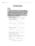
A box plot is then drawn using the lowest and highest values as the scale and then the LQ, median, and UQ are all drawn as lines. The LQ and UQ are connected as a box with the median as a line in the middle and then the final box plot should look like this:
Lowest LQ Median UQ Highest
I drew a box plot and then a cumulative frequency graph in the style of a scatter graph. I did a box plot by hand but the scatter graph I used excel. I wrote in the information in excel and then highlighted it all and clicked the graph wizard button in the toolbar at the top. I followed the simple instructions giving the graphs titles and renaming the key and it gives me this finished result. Also sometimes you may have to input the data range and x-axis range but it very simple you just have to click on the button next to the data range section and highlight all the data you need. This is so you don’t end up having the row numbers plotted in your graph which can mess it all up!I then did all the calculations as you can see below and this gives me the values of each person for each year so I can use these values when doing box plots for the other hypotheses. Each number represents the pupil. So if I had 9th it means the 9th person in that particular year. So all I had to do was find the pupil and then the answer to that question. Here is how I did it and all the calculations:
My Box plots:
Year 7
Lowest – 1st
LQ – 35 ÷ 4 = 8.75 = 9th
Median – 35 ÷ 2 = 17.5 = 18th
UQ – 8.75 x 3 = 26.25 = 27th
Highest – 35th
Year 8
Lowest - 1st
LQ - 33 ÷ 4 = 8.25 = 9th
Median - 33 ÷ 2 = 16.5 = 15th
UQ – 8.25 x 3 = 24.75 = 25th
Highest – 33rd
Year 9
Lowest – 1st
LQ – 29 ÷ 4 = 7.25 = 8th
Median – 29 ÷ 2 = 14.5 = 15th
UQ – 7.25 x 3 = 21.75 = 22nd
Highest – 29th
Year 10
Lowest – 1st
LQ – 26 ÷ 4 = 6.5 = 7th
Median – 26 ÷ 2 = 13th
UQ – 6.5 x 3 = 19.5 = 20th
Highest – 26th
Year 12 / L6
Lowest – 1st
LQ – 27 ÷ 4 = 6.75 = 7th
Median – 27 ÷ 2 = 13.5 = 14th
UQ – 6.75 x 3 = 20.25 = 21st
Highest – 27th
My Cumulative Frequency Graph:
My Box Plots:
Hypothesis II – Firstly I went back to the all the data and separated the table on L6 into two. One of the tables had all the sixth formers studying maths the other had all the sixth formers not studying maths. I then got a stratified sample from each table of 12. Then I copied them into a new sheet called “L6 maths?” I then used the column after the last column in the table being used and named it “if”. I also had to put the letter d in the column after the “if” column because I had to use something for the correct answer when using “if” formulas. I then used the “if” formula and wrote that if their estimate was correct then it would say “correct” and if it was incorrect it would say “wrong”. This is because I couldn’t use the abs error formula when the answers were letters. After sorting them I then counted the amount of right answers and the amount of wrong answers. Then with this information I then calculated the percentage of correct and wrong answers for each table. Then there was nothing else I could physically do with this information because it was either right or wrong there was no absolute error and no answers close to the right answer. It was simply Correct or incorrect. All I could do was to put the percentage results in a table, see below.
Hypothesis III – Firstly I got my stratified sample of 25% using the instructions below on the page headed “how to get a Stratified sample” then I added three columns before question 1a. I then named one of them “error” and the other “abs error” then the third “% abs error”. The error column I used the formula “=27-cell”, the absolute error column I used “=abs(27-cell)”, and the % abs error column I used the formula “=abs(27-cell)/27”. I Used 27 because 27 was the answer to question 1a, I then sorted the data in order of the abs error column. I then found the mean of the years using “=average(cells)”. Once it was all ‘set-up’ I was then able to start getting data from it and drawing graphs. Firstly I wrote down on a piece of paper the absolute error and frequency. Then I drew on a piece of graph paper the axis and plotted the points. I put them all on the same graph so I could see all the differences easier and quicker. Then I drew a box plot and used the information I took earlier to make it quicker. The graphs are below:
My Scatter Graph:
And My Box Plots:
Interpretation and Conclusion
Hypothesis I – Looking at my hypothesis and graphs I can conclude that all the medians are roughly at the same place but then looking at the box plots it shows that the average student doesn’t get better at estimating but it does show us that the box plots are getting narrower and the range is getting thinner. When box plots get narrower this shows us that the students are becoming more consistent towards the right answer. The graphs on the other hand are bit more disappointing. The first graph for year 7 I cannot make sense of, and am really confused about the numerous curves there are. The graph doesn’t go down but still is a bit confusing. Out of all of them I have interpreted that the cumulative frequency graphs get steeper as the pupils get older and so I believe that my hypothesis was correct. Also the mean of the absolute error per year also gets smaller and so that proves that as pupils get older they have more knowledge of distances. Furthermore please note: that the 99th person in year 10 had all his values as N/A so I deleted him and got the next person at the top of the list from the table when in order of random numbers in the beginning stages whilst I had all values for each year, before the stratified sampling. This was a problem that occurred at the beginning and was sorted out easily. Unlike some problems which occur rarely and are hard to sort out.
Hypothesis II – Looking at my second hypothesis there is not much I could say about it. This is because it was a multiple choice question and so the answer was either right or wrong. I did try and use numbers instead of letters A=1, B=2, e.t.c. but that ended up not very helpful and I realised you can’t actually have any absolute error when the answer has to be either correct or incorrect. What I could do is just have a small table showing the amount of right answers and amount of wrong answers and get a percentage, and then Interpret ate it. So what I have concluded is that it shows that pupils studying maths are better at estimating calculations but only just and maybe if we had a bigger stratified sample I think that it could be 50/50. This is only a theory and has not yet been tested it. That is something I would have done if given more time and would have improved my whole coursework grade. So in conclusion with this hypothesis I think that I was correct in saying that pupils studying maths are better at estimating answers to calculations and also the only reason a few of the non studying maths pupils got it right I think is that they guessed. This is only a theory I have thought of and can never be proved. But as far as this coursework goes I believe that my hypothesis was correct.
Hypothesis III – Finally looking at my last hypothesis and box plot. It shows that the median is actually in the same place for each year apart from L6 where the median is 2. The range is quite confusing and in year 9 it shows that the range goes from 0 – 223. The 223 is only an estimate from one pupil and the estimate before that was actually 23 so we could really ignore that. In fact these box plots are very similar and show that most people young or old are good at estimating line lengths. I can conclude that my hypothesis is correct because if you look at the difference between the year 7 box plot and the L6 box plot there is a substantial difference and this just alone proves that my hypothesis was correct and therefore the graph is also similar and shows that year 7 are not as good as L6 at estimating line lengths.
Finally to conclude my whole project I can say I have used a various diversity of graphs and also explained each part. Also I have included the sheet we used to give to the pupils just to show what we did so you have a full understanding of the coursework and the work put into it before hand.
Finally I would just like to mention improvements. If I had more time and more options I would have probably tried to include girls and adults. This would have given me a much better choice of hypothesis and let me do much more with the data. Also I would have tried to include another hypothesis. This would give me more choice of graphs and I could of included a histogram or maybe a couple more scatter graphs.