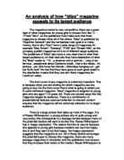
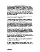
There is a large picture that takes up most of the page. It is of Reese Witherspoon, a young actress who is quite young and very pretty, this corresponds to a teenage female because many of the potential readers will want to be like this. Reese Witherspoon has a happy expression. The reason that she is used is because she appeals to young girls because readers can see how happy she is and they want to be that happy. Her happy expression suggests that the magazine is fun. All of these factors encourage the potential buyer to choose this magazine, there are many teenage magazines in circulation and the publishers must ensure that they increase their share of the market. Reese Witherspoon is also wearing a pink top, which is very bright. The connotations of the colour pink are femininity and romance. The colour also suggests that the girl is innocent. This again attracts people to the magazine.
The girl on the cover is a well-known actress, Reese Witherspoon. She has been in many teen films, such as “Legally Blonde”, “Cruel Intentions” and “Sweet Alabama”, all of these films are mainly aimed at teenagers, but mainly teenage girls, so this will help to sell the magazine because teenage girls will relate to her. Also Reese Witherspoon looks about 16 which will attract 16 year olds to buy this magazine. She is also married to Ryan Phillippe, which is important because she is married to a man who many young girls find attractive so will envy Reese and want to be like her even more.
A variety of fonts have been used in this magazine. Also the editor used a variety of colours and sizes on the front cover to attract a large female audience. The different fonts on the front covet help to break up the text so some will stand out more then others, for example the main stories that are in the magazine. The fact that the different fonts break up the text is attractive to teenager because teenagers do not like to read much and the different font make it appear that there is less to read.
The colour that is used mainly is purple this is a fairly fashionable colour that attracts the teenage girls to buy this magazine rather then others. At the time of the publication purple was very popular colour, it was used in clothes and even furniture and was most popular with teenage girls.
The first letter that is used in the title of the magazine is lowercase not uppercase, “bliss” not “Bliss”. This will draw teenage girls in because it is seen as being informal, non-conforming, rebellious and original.
On the front page of the magazine there are other features that have been used to attract the buyer such as the use of alliteration, “Get Glossy Gorgeous”, which helps the potential buyer to remember it and focus on this magazine.
The language that is used in this magazine is very informal and very chatty, for example, the word “spesh” is used which is slang for special, this helps the potential buyers to relate to this magazine because this is what teenage girls might say instead of special. Also on the front cover there are words like “bonkers” and “Dork” which is colloquial language, which is the way most teenagers talk. This helps the teenage girls to relate to the magazine and go out and buy it.
This magazine cover has a plain white background, which is used to stop you focusing on the background but it is to draw your attention to picture or the text.
This magazines front cover also has the use of mystery, which is very good to use on the front cover. On this cover we read “I’m trapped in time”. This is in the form of direct speech and sounds like someone speaking because it makes the reader want to read the rest of the article and we are encourage to buy the magazine to find out what happens. Beneath this direct speech we read “meet the girl who’ll be 15 forever” which is extremely intriguing so you like to find out the rest of the story.
To conclude I think that the magazine cover is effective at enticing the potential buyer to purchase this magazine and then read it. I think that teenage girls would chose this magazine instead of any others because it uses good presentational devices, a large of a relevant image, and it has good usage of a variety of appealing font types, colours and size. These are used to attract the buyer. The magazine front cover also features very good use of language, informal and very chatty. The front cover also has alliteration, which is good at making the reader remember certain things and the cover also features mystery which is very effective at attracting the potential buyer to buy the magazine and find out what have happened.