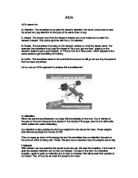
These two people are a young sexy couple that are aspirational and are people that the audience could imagine knowing. They are white, middle class and fairly affluent. They are young and fashionable but also stereotypical of other people. However I feel that the girl should be in the kitchen where she belongs but was plucked on to the sumptuous sofa with the luxurious cushions and box of chocolates which therefore implies that Fujifilm is accessible to all.
The third thing that my eye is drawn to is the visual text. The Fujifilm logo consists of white writing and a green background in a box which is dominant. It is rather retro in a post modern way. It is positioned in a sexually suggested place. However the slogan is in white which doesn’t stand out that much except for the word ‘Pop’ which is bolder than the rest of the words and also implies that the word is literally popping out. Furthermore ‘Pops your shutter’ has undertones of sex and sexiness and the informal language appeals more to younger people. It is bland and innuendo which is almost like a carry-on-film or a dirty joke from the shop on the end of the pier. On the other hand the sexual innuendo is friendly and doesn’t offend as it is relatively subtle. The copy is implying that you can keep staying in ‘rich and tasty’. However ‘rich and tasty’ sounds more like a chocolate advertisement than a camera film advertisement. The font used for the copy is spaced out and snappy as if it were a camera snapping and taking picture after picture.
The fourth thing that my eye is drawn to is the surroundings. The lounge is in pastel colours to show comfort. The sofa is glamorous and sumptuous which implies that the couple have money and take pride in their home. The kitchen looks cheap and industrial due to the stark white colour of the walls and the cabinets which contrast the living room.
In the kitchen the man is holding a kitchen utensil which is silver, round and dull and wiping it with a grey cloth, compared to the girl who is holding a gold, rich and luxurious box of chocolates. Both of these objects contrast the different areas of the flat. Also in the kitchen there is a Sharp microwave, this implies that Fujifilm when put with Sharp is an established company like Sharp in an indirect manner or it could be said that it is an advertisement within an advertisement.
The Picture on the living room wall has a vague affluence as the advertisers didn’t want a distraction so they placed a dull abstract painting using pastel colours as oppose to a herd of wildebeests charging towards the audience.
In this advertisement there are many visual techniques used. The colours in the advertisement are dull and boring in the background however the girl is in eye-catching, vibrant colours which add more attention to her.
The lighting is artificial, however in the kitchen it is more brighter to make it seem natural like a stark sunlight and to add a uncomfortable, working feel to the man, in comparison to the living room which has a dim evening light to add relaxation. The shadow also adds to the relaxing feel of her domain. The use of different light techniques defines the different areas of the living room and the kitchen.
The camera is placed slightly off centre to give it a trendy edge but technically the reason for this is because there is need for a shadow. The camera is also focused on the girl.
Conclusion
The advertisement appears in a young, trendy fashion magazine, Marie Claire which is aimed at around the 21+ age group mostly for readers who follow fashion but also have an interest in current affairs and life stories which they can relate to.
This advertisement has not been aired on television, but the advertisers are obviously keen to get its magazine coverage to a young 20-something market, and therefore believe placing full page adverts in monthly magazines is substantial enough for them to satisfactorily sell their product.
I feel that this advertisement is an absolute cliché due to the role reversals in which you see in sitcoms of the 1970’s or the ubiquitous phrase ‘Who wears the trousers in this house’. In an age where woman have careers, sex lives and are– post Destiny’s child Independent Woman world- they don’t need to have this cliché put upon them – eating chocolates while the husband does the dishes has become tame, un-revolutionary and unnecessary social comment and the humour is lost.
The actual product has no image given due to it is only ineffectively tagged on in a small picture in the bottom right-hand corner, as if they thought of the picture and then the product to go on to it – therefore, the product doesn’t seem to tie in very well with the overall picture. Furthermore, it seems as though the advertisement could have been used for any product, and the decision to use it for Fujifilm could almost be an afterthought.
Overall, the image the advertisement is striving to be associated with is a strong, fun, female market – the exact reputation that the magazine holds. The impression is one of a modern, easy-to-use and spontaneous product that is accessible to younger generations.
I feel that this is a mediocre advertisement, in which the advertisers took the easy, obvious option of the stereotypical prototype that they think young woman want to see, but in reality this advert has little effect on the audience and would be easily passed by skimming through a magazine.
From analysing this advertisement and working on advertising I have learnt that advertisements are much more than just pages to fill up a magazine. I now look at adverts in detail than just skimming through and not paying much attention to it and it teaches me that some adverts have no meaning and others are full of significance. In short, this task has made me do exactly what the advertisers intended – notice their adverts.