ANALYSIS OF THE FRONT COVER OF BEST (FEBUARY ISSUE 2007)
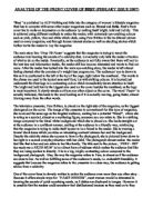
“Best” is published by ACP-NatMag and falls into the category of woman’s lifestyle magazine. Best has to compete with some other major magazines such as Reveal and Bella. Best’s front cover has to make an impression on its audience by making itself bright, bold and bubbly. This is achieved using different methods to entice the reader, with extremely eye-catching colours such as pink, yellow, blue and white which clash, using Fern Britton in the traditional picture used on every magazine, and through human interest stories as well as shocking stories which further invite the reader to buy the magazine
The main story line ‘Drop 7lb Faster’ suggests that the magazine is trying to tempt the audience into learning the secrets of a celebrity diet, but actually only tells the reader a fraction of what to do on the inside. Eventually, as the audience is not fully aware that there will not be the best tips and information inside, the reader still has become interested and wants to find out more. After the reader has looked into the main eye-catching story, the reader is left almost feeling cheated after the promise of a weight loss programme. The audiences’ eye is drawn to this as it is positioned to the left at the top of the page, right below the masthead.. The words in the phrase are used in the typical sans serif font, but with striking colours. It is located just underneath the Best logo in a contrasting colour which immediately draws attention to itself. The bright and bold text is the biggest size used on the cover besides the masthead, as the logo is most important. It clearly stands out from any other object on the cover. The word ‘Faster’ is actually italicised, this leads to the word looking as if it is actually moving, going faster, almost blurring away from the other words.


