The backgrounds for the majority of the scenes are based on animal prints and create a volatile setting for this calm approach. I feel the presence of the tiger and leopard in some of these scenes adds to the drama and stresses the type of attitudes present in this soap opera for a tiger’s is a powerful animal that does not regard any one else but itself, this attitude can be associated with some characters in the soap opera. This technique gives the viewer an insight into the generic conventions of a soap opera and that the powerful backdrop being relevant to personalities in the soap should be made aware of. The backgrounds are also eye-catching and when flicking through the various channels, The efficacious background would be enough for anyone to stop and look at it for a few moments, therefore I think the subtle images depicted in black and white and the vivacious background are an excellent combination which will draw the viewers eye.
The actor or actresses real name is displayed across the width of the scene under the character’s image. I thought it was appropriate to use this method for it seems as the viewer scans across the page the name is also apparent to the eye, therefore this makes the viewer acknowledge the character and familiarise themselves with the name. The soap also features some acclaimed actors and actresses whom are known to the public, therefore I am at a advantage if I can make their names a visual aid for the viewer might have seen a previous show in which the character starred in. The title is constantly apparent to the viewer’s eye, therefore this may seem menacing and make the viewer feel inferior to these strong personalities, which will lead them into storyline without being overwhelmed with shock. The style of the writing follows the features of the contemporary and modern approach, therefore it is not alien to the soaps meaning. The colours of the word interpret the characters intentions on whether to behold many negative personality flaws or to have a more neutral character which does not need conflict. For example if the actor or actresses real life name is highly concentrated with grey, it stresses how this character may have more character downfalls than positive features whereas a actor or actresses name that is concentrated with the colour orange may emphasise that this character has a positive character that is unbiased in many situations. The fact that I have included only the actor/ actress’s real name stresses how this soap deals with real life situations for soaps that include the characters names like Neighbours seem to deal more with escapism rather than realism. The hard-hitting soap operas such as Eastenders do not specialise in light-hearted techniques that contribute towards this simplistic aura, instead they have kept their original opening graphics, which have been present from its beginning and they seem to improve the quality of the storylines that evolve in the soap. Overall I feel the soaps which include the characters names are not taken seriously due to their setting and the idea of escapism which does not occur in everyday life. This technique cannot be explained to any degree, it is simply something I have noticed and I realise that overall quality of the opening titles lead to the stereotype of the soap.
The scenes have to be shown in a certain order and I have realised that the order the scenes are shown in brings purpose to the soaps meaning. For my soap opera, I will show the scenes in an order where the characters are shown first then finally the title ‘High rankings, Low Lives’. I feel this is the correct way to present the scenes for the music that I am planning to present will stop and continue with a faint echo of the last word, while the title scene immediately appears on the screen and then gradually fades away. This technique emphasises the seriousness of the soap and how it will deal with issues related to every day situations. The army influence connotes a harsh reality, which we could not relate to soaps such as Neighbours for war or any reality is not prominent in their environment, however I am trying to feature real life encounters, therefore the reality of war will be taken seriously by the viewer. It also gives the viewer time to reflect on the sequence of the scenes and what they expressed, therefore the viewer can be judgmental and decide whether this type of programme is suited to them.
The scenes that I have not analysed are the title scene and the scene featuring two characters from the soap. I am going to talk about scene that depicts two of the soaps characters. The whole meaning behind this scene is to reveal which characters are going to have prominent in that particular programme, therefore this will change from time to time and to a regular viewer it will show which storyline is going to be continued. This technique is an alternative to showing clips of the storyline from previous times, which I generally associate as a technique that is used in soaps such as Neighbours, therefore I am using my own alternative.
The scene does not show multiple images of the characters face, instead it reveals a body image that is only shown once or twice at the most. This technique makes the character in this scene look superior to the rest of the characters in the other identical, therefore this stresses how the role this particular character is playing for this programme is more emotionally challenging. The character eclipses a majority of the page in this scene therefore to inflict that they are dominating this programme. The person’s real life name is beside the image. The style of the writing is very graphical however at the same time it creates an atmosphere due to the shading, therefore the shading that I have used interprets the character has feelings and possibly a unstable personality. The graphical writing is very angular, therefore the angles emphasise that the soap is hard hitting and deals with reality. The jagged edges of the writing also stress how the particular person at whom the writing is aimed at will not have the easiest of lives and not all the things that they possess will be given to them, therefore the angular writing is demanding the consequences of reality. Overall I am trying to stress the superiority of these characters in this particular programme and by using this scene for that purpose it should engage the regular viewer into watching the programme.
The title scene is overpowered by words echoing everyday situation, which are apparent in our world. The words also depict the scenarios that will take place in the soap opera and therefore give the viewer an insight into the events that will take place in the future. The viewer can also immediately relate scenarios that are listed to events that happen in hard-hitting soaps such as Eastenders. When looking at the title scene, the eye is diverted to the writing, which is in a graffiti style. The words devote themselves to emphasising the emotions and events that will be prominent in many of the characters lives. The style of writing reflects a lack of clarity in presentation and therefore a lack of co-ordination in the characters lives. The writing is contemporary and appeals to an adolescent audience, it also reflects the influence of crime for writing on public objects is illegal and a criminal offence. The title ‘High Rankings, Low Lives’ is enclosed due to the thick lines that cordon it off from the rest of the scene. This technique is used to emphasise the title so the viewer can contemplate its meaning. It also segregates it mentally from any other scenarios or events that could happen so the viewer can divert from one another and not start to relate one to another for the title is quite comical. The style of the title can not be explained or related to any feature that the soap influences. I feel that this is the whole idea for each letter is varied in style and diverse from its neighbouring letter, this style reflects upon the differing personalities in the soap and at how diverse styles of people can live in harmony if it is a necessity. The style of the writing is aimed at a young audience who has lived in an era where the contemporary style is in every culture. In this scene it seems necessary to border different features off from others, therefore the viewer can distinguish words more easily for I feel that due to the large quantity of writing the scene may lose it focus. In the final third of the scene, the names of the director and producer are listed. The names of the director and the producer are shown in the same style of writing. This technique is used to discourage focus on the their names and divert the viewers eye to the remainder of the scene, however the director and producer are important people when a programme is being created and I realised they had to be noticed by the public for their commendable work. The director and producer details are inferior in size compared to other information in the scene. I used this technique to try and minimise the attention towards these details, however I centralised the text so that the director and producer get the recognition for their work. The words Devil and Angel are shown on opposite sides to one another, this technique emphasises the diverse wealth of qualities that they both retain. The two spirits have had an impact on the modern society and for that reason adolescents can relate to their meanings of evil and trust for the people of today have to categorise people in this way frequently. The impact of the devil and angel stereotype has become a fashion scheme and is very popular in the teenage fashion industry due to their obvious different meanings and they allow a person to categorise themselves to match the qualities that a devil has or to try and reflect the attributes of a angelic character. The adolescent audience can identify these two opposite personas quite easily, therefore I tried to include the simple concept in my soap. The two words are repeated three times each to allow the viewer to absorb them and think about their meanings, however when devil is written several times it may seem quite menacing and make the viewer feel dejected, contemplating all the evil qualities that may appear in this soap, however the words devil and angel being apparent are shown to make the viewer aware of the boundaries between evil and good and how they will be reinforced in this soap. The colour of the text remains grey throughout, therefore the scene cannot be deemed as opinionated and condemned for inflicting evil labels upon subjects which can be debated over whether they are good or bad, wrong or right, harsh or lenient and outrageous or boring.
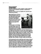
Reviewing the Main Features in the Opening Sequence for
a Soap
I am going to review the title ‘Eastenders’ and the Birdseye view image of London and ask the question to why these techniques are used.
The word Eastenders is presented in a simple yet matter of fact way. The consequences of this presentation are few however the concept of these few consequences are easy to understand. The stark white colour of the Eastenders makes the word stand out and emphasises the need to reflect the events that may occur. The colour white also equates to the meaning of problem resolving and encourages the viewer to think that despite the horrific scenarios that are emotionally challenging for both viewer and actor there is always some kind of positive outcome, which may take a single programme or several programmes to happen. White is not a colour however a majority of us refer to it as a colour, therefore it is not opinionated which is a positive feature in a soap for if they are too biased the outcome will be the opinion of the press. The fact that we immediately see the colour white in the opening sequence stresses to our conscience that despite the events that will happen in this programme, a opinion will not be reinforced and like the News the issue is open to the viewers opinion. The block letters bring an air of reality over the soap and reveal that they will deal with issues that are apparent in our lives. The block letters also equate to negative outcomes and reveal how the issue being acted out will always show the negative possibilities rather than the positive possibilities, however this is what entices the viewer into a programme for some of the consequences to these everyday issues are too surreal to be matched to reality. The white lettering has a black shadowing interpreting the evil that will be revealed in the storylines, therefore the aftermath of these white blocks is never quite what one would have forecast. The title is written as ‘EastEnders’. In the English language it is wrong to present a word, which contains two capital letters, therefore, the ‘Enders’ part of the word has a need to be exaggerated. The word end is associated with the closing of an event or a depressing closure. This meaning is echoed in many of the storylines, however I do realise that the word EastEnders means the people of the East End.
The image of the East of London has the same meaning as the title ‘EastEnders, however it is a visual aid for the viewer. The image is of an area in which a community live and in a soap generic conventions the idea of a community is important therefore we can associate the image as being the communities home.