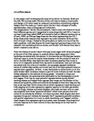
The clothes they are wearing have all been fully customised, the centred artist particularly is showing his own clothing line, before actually hitting the shelves. On the T-shirt it says “50” these digits are the prefix of his name “50 Cent”. Also, this is further advertisement, as the branding of the clothing and its association with the music further entices the consumer to both identify the brand and simultaneously want to buy it. The left artist, Lloyd Banks, has a T-shirt which shows a modified superman logo, with the “G” instead, this is advertising the bands name “G-unit” once again, saying that they are “super” in some sense. The bandanna around 50 Cent’s neck is blue, which is the colour of the large American gang “The Crips”, which was formed in the early 1970’s by Stanley Tookie Williams, who was executed on death row December 2005.
The arrangement of the artists is excellent, 50 Cent the main singer is centred, with the other two slightly at an angle by his side. Also, if you look carefully “Tony Yayo” who was imprisoned during the production of the album, who only appears in two songs, is not forgotten. He is featured on the “wall” on the left hand side of Lloyd Banks. All the artists, have a very stern look on their face, showing that they are not scared and they believe they are the “greatest”. The dark background creates an excellent urban atmosphere, with the “ghetto” behind them, graffiti on the walls as well. On the other hand, they have a light on the right side, this is quite interesting, are they coming across with the idea that there is “Light at the end of the tunnel”?
The tattoo’s which they all have, I believe is showing us that in the urban areas of the world, this is more of a “traditional” thing to have, with the words such as “South Side”. This is showing they were from the “South Side” of America, and their heart is there, and always will be; as it’s tattooed on their bodies. The “G-Unit” lettering is in a posh font, is this telling the customer that they are going to, or already have had good fortune financially. I believe they are, the “Beg for mercy” lettering seems to be in a more objective font, this suits the violent title for the album.
In conclusion, the album cover definitely is aimed at a specific target audience; the genre is clearly rap/hip hop. The representation of all the artists is phenomenal, with sharp and concise imagery supporting this.
By Satpal Johal 10PTM