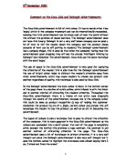
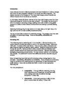
The layout of colours is also a technique that is used to attract the attention of the consumer, this is more apparent in the Coca-Cola advertisement as the colours are condensed into a small corner, the rest of the page is completely white (except the bottle) this provides a huge contrast, the contrast is yet another method of attracting attention to the page. The Coca-Cola advertisement uses a lot of techniques to attract attention, it is a very well thought out piece the Delonghi advertisement is also very well thought out it uses the bottom corner to highlight the microwave oven almost saying ‘here I am, I stand out from the crowd’
The image of the teenagers in the Coca-Cola advertisement is made up of the bubbles of the exploding Coca-Cola bottle, which reminds us of Champaign bottles on special occasions. This links Coca-Cola with merriment and parties, which could maybe suggest that this drink stands for good times, celebration and quality. The fact that the image of the party is made up of the bubbles of the Coca-Cola hints that Coca-Cola IS the party and everyone is having fun because of this drink.
In the Delonghi advertisement the design of the microwave oven is very stylish, with the darkened window and curved corners, this tells the reader that every detail has been catered for. Unlike the Coca-Cola advertisement the Delonghi advertisement is calmer and appeals to the older person who maybe owns his or her own home and would have use for a microwave oven. The Coca-Cola advertisement appeals more to the younger person who would be more interested in trends, fashion and so looking good drinking Coca-Cola.
The Coca-Cola advertisement uses a picture of young people at a party having fun to appeal to the target audience. The people in the picture are all squashed up suggesting that there are more people than we can see. This could be a way of the company saying ‘look at all these young, popular, beautiful people who are having fun drinking Coca-Cola’ and so encourages teenagers to want to be like them. Also, the image of the party is blurred this makes readers look closer and so is another form of attracting attention to the advertisement.
The Delonghi advertisement appeared in a glossy magazine called ‘Ideal home’ this is obviously an intentional move, the magazine was priced at two pounds and twenty pence and so would be purchased by the older person with more money and an interest in improving there home, (the target audience). The Coca-Cola advertisement appeared in a magazine called smash hits, which is aimed at younger people with less money; this is Coca-Cola’s Target audience.
The Coca-Cola company placed the advertisement in Smash hits magazine so that it would reach the target audience easily, without great cost.
The font style on the Coca-Cola bottle is the classic company style writing, this is recognisable from a glance worldwide and has a reputation for being one of the largest, longest formed drink’s firms in the world, this fact that the company has been around so long suggests to us that the Coca-Cola company have had many years to perfect the recipe and so it would be better quality than drinks from other newer companies. The Delonghi fonts are very different, they are written in a bold, modern font which is easy to read, this suggests that Delonghi is a very modern, hi-tech company, this could tell the consumer that the company’s products are hi-tech and good quality.
The pictures of the products in the two advertisements are adjusted to make them look as attractive as possible. For example, in the Coca-Cola advertisement the bottle of Coca0Cola has a bright light behind it, to so make it look as though it is glowing, this makes it look inviting visually and so would make the drink more appealing. Also, around the Coca-Cola bottle there are droplets of melting ice, which is another method of heightening the positive points of the drink.
The Delonghi advertisement uses the same method; the buttons and dials all complement each other. This is the same technique as Coca-Cola used with the ice droplets. This makes the product look more exclusive and upper-class, as though it can only be bought by the rich.
The Delonghi advertisement uses a huge heading ‘At last an oven even men can use’ to draw in the reader and attract them to the page. This technique is used in the Coca-Cola advertisement with the word ‘enjoy’ this is in a bold, plain, modern font and is almost a demand, this makes the reader look closer to the page, once this has happened the company has achieved its objective.
In the Delonghi advertisement the text has a mixture of formal ‘the Infinito is so seriously intelligent that it does the thinking for you’ and informal ‘this leaves loads more time for more important “man things” this could be a way of seeming polite and intelligent but also friendly, approachable and human.
At the bottom of the page there is a special offer ‘if you buy the new Infinito between 1st June and 31st July 2000 we will send you a free Delonghi espresso coffee machine” this is an encouragement to buy the product.
Throughout the Delonghi advertisement the company name and name of the product, this is to familiarize the consumer with the product name so when shopping they will remember the name and this will affect what they buy.
The target audience in this advertisement is women, we can tell this by the language used. The writer is constantly running men down, this is evident from the first line and so all the way through the piece. As well as running mend down, the writer is constantly driving women up, for women to use the microwave oven it is described as creating “their own culinary masterpieces”. Where as if men are to use this microwave oven this is described as “you don’t have to weigh the food or set the cooking time, this leaves loads more time for more important man things”.
Throughout the advertisement the writer constantly complements and praises women even stoops to say “make good use of your IQ and add the Infinito to your labour saving kitchen”, this is ironic, as someone who would spend vast amounts of money on the basis of flattery would be seen to not have a particularly high IQ. The advertisement also uses the rule of three to put across its pint ‘surfing the not, shelf fixing and concentrated sports channel watching.


