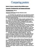
The woman looks like she is tough rather than a weak woman although she does look fearful and nervous. She’s walking towards the key hole with a torch and a pole in her hands which indicate that she is ready for something and knows that something is coming ahead (behind the key hole).
There are no other racial backgrounds shown on the poster other than white.
In ‘Dungeons and Dragons’ poster there is seven main actors. The audience can obviously see the protagonists and antagonists of this film just by looking at the gesture codes of the actors. The 2 main characters are standing in front with one of them holding a sword indicating that he is going to fight and the other standing behind him looking sad – this points out that the man in front is the dominant and the most controlling character out of these 2 characters. There is also a woman in the middle of the poster just behind the 2 main characters who looks like a queen since she is wearing a crown. She is the only character that doesn’t send out a gesture code to let the viewer know whether she’s a protagonist or an antagonist; she looks like she is caught in the middle of good and evil. There are some other actors that include, an educated looking like woman, a smart but evil looking woman and 2 evil men that look as if they are fighting over the control of something and therefore are against each other, although are both oppositional characters.
The clothes that the people are wearing in this poster look like old fashioned, dirty and ripped. The location is shown in the middle section of the poster. It looks like a coast of a city with houses and a bigger building on the side which looks like a castle. The city also looks a bit old and fantasized which represents the genre of this film.
The main colours of this poster are red, orange and yellow. The sky is also orange and yellow which also identifies fantasy. There are some other characters on the sides of this poster that are smaller, with one of them being a little goblin look-alike and a man with a long beard and a bold head holding an axe. There is a border around the main image (people and location) with a red and orange background.
The tagline of this poster is ‘This is more than a game…’ which symbolizes this film very well since the title is also a game that’s called ‘dungeons and dragons’. It also indicates that there is going to be danger and action in this film. The tagline attracts the audience’s attention to think about the object of this adventure.
There is no information about the cast, company, director other than on the credit block on this poster.
The viewer should instantly recognize the genre of this film – fantasy – because of the images and title; dragons, dungeons and other creatures, Adventure – because of the tagline, the images and the title; the tagline suggests that this film is going to be worse than a game because of the dangerous adventure in this film, the 2 main characters also look like they’re on a journey and the title is written in silver lettering like swords. Action – because of the images; characters have weapons indicating that there will be action in this film and there is also a statement written on the poster from the ‘daily star’; “ALL ACTION ENTERTAINMENT!” is what they concluded after reviewing this film. The audience should also identify that this film is generally about the good vs. evil.
One of the main characters look like a tough guy because he has a sword in his hand and looks like he’s there to fight. The woman in the middle looks like a queen that has the control of people but also looks innocent and as if she doesn’t want to be the ruler. The woman on the left looks like she’s smart but a worried and troubled sort of woman and the woman on the right look like an evil woman as well as the 2 men at the top who also look dangerous.
One of the main characters is black and the other is white. The evil looking woman on the right is black. The rest of the characters on this poster are white.
In the ‘Dungeons and Dragons’ poster it is visible for the audience to see where the protagonists and antagonists are and there are examples of both sides on the poster, whereas in ‘The Skeleton Key’ poster, there is only one character that looks like a protagonist by her gestures codes of fear. In the ‘Dungeons and Dragons’ poster there seems to be more confusion with all of the characters, colour and location. The woman in ‘The Skeleton Key’ poster looks scared and anxious while in the ‘Dungeons and Dragons’ poster, all of the gesture codes look very different including thoughtful, tough, evil, angry and many more other expressions.
Both posters show a different time. ‘The Skeleton Key’ poster shows a more modern time while the ‘Dungeons and Dragons’ poster shows an older time because of the old clothes that characters are wearing and also a fantasized place because of the location shown on the poster. ‘The Skeleton Key’ poster is set in a house whereas the ‘Dungeons and Dragons’ poster is set in a fantasized location.
The fact that ‘The Skeleton Key’ poster is black and that the ‘Dungeons and Dragons’ poster is adventurous colours illustrates the genres of both films. The black colour in ‘The Skeleton Key’ poster is a good colour to exemplify the horror, fear and terror of this film as the adventurous colours in the ‘Dungeons and Dragons’ poster which represent action, adventure, exploitation and the journey of this film. The audiences’ attention will be drawn to the fact that some characters have specific objects (mostly weapons) such as the torch and the pole held by the woman in ‘The Skeleton Key’ poster and the sword and axe held by some of the characters in the ‘Dungeons and Dragons’ poster.
Both of the taglines on each poster should make some sort of sense to the viewer. In ‘The Skeleton Key’ poster, the tagline suggests that this film is going to be scary while in the ‘Dungeons and Dragons’ poster the tagline implies the meaning of the danger and adventure in this film. The tagline of ‘The Skeleton Key’ poster attracts the audience by its mysteriousness while the tagline of the ‘Dungeons and Dragons’ poster attracts the audience by its’ excitement.
The written information about the cast, directors and the studio are both very different for these two posters since one of them has the actresses name and information on the writer without a credit block whereas the other poster only has a credit block. This could be because the companies that were producing the posters had two different ideas on the unique selling points. ‘The Skeleton Key’ poster probably has its’ unique selling point focused on the main actress (Kate Hudson) who is an A list celebrity and the writer, who also wrote the successful movie ‘The Ring’ whereas the ‘Dungeons and Dragons’ poster probably has its’ unique selling point focused on the adventure, action, fantasy and excitement (represented by the images) of this film.
From looking at both posters, the viewer should identify the genres straight away. The audience will be fascinated in ‘The Skeleton Key’ poster because of the puzzling and secretive meanings of the images on the poster such as the symbol that implies that it is somehow involved with an actual key. The question that the audience might be asking is – “does the skeleton key open the door and what’s behind it?” The audience will also be engaged by the exciting images of the ‘Dungeons and Dragons’ poster. The exciting images on this poster are mostly exciting because of the fantasized images such as the dragon flying through the poster.
The woman in ‘The Skeleton Key’ is represented as a tough sort of woman in addition to some of the men in the ‘Dungeons and Dragons’ poster. There are much more characters to be analyzed in the ‘Dungeons and Dragons’ than in ‘The Skeleton Key’ poster so there’s many more characters that are presented in a particular way. The ‘Dungeons and Dragons’ poster also has characters who look weak, low, stressed, innocent and some that look evil and scary. This is probably another big reason why ‘The Skeleton Key’ poster looks so shadowy and secretive while the ‘Dungeons and Dragons’ poster looks more revealing although confusing with so many characters and images – the viewer would have to look at the poster for longer to understand it much better.
Racial backgrounds doesn’t seem to matter all that much in ‘The Skeleton Key’ since there’s only one character on this poster whereas on the ‘Dungeons and Dragons’ poster there is 2 different racial backgrounds – black and white although also doesn’t seem to matter all that much. This is probably because of the genres of this film which are horror and fantasy-adventure-action; it is typical for racial backgrounds to be relevant when the movie genre is either a thriller/drama – when it’s a war between 2 races or a gangster type of movie about the racial background importance in certain areas and history (e.g. slavery), – a comedy – not taking racial backgrounds to an extreme level of violence and instead just making the movie hilarious and humorous (e.g. ‘Bringing down the house’), – or a romance – (e.g. a bollywood movie, when a girl falls in love with a different racial background/religion to her…). But ‘The Skeleton Key’ and the ‘Dungeons and Dragons’ posters are not focused on the racial backgrounds and instead focuses on the journeys, fantasies, action and the horrors, fear and terror.
Over all these two posters both convey meaning to the audience by eye-catching images, text, colour, objects and many more media – these attract more audience to watch these films and all of these things also let the viewers know what the genres are. The gesture codes are a huge impact on the way the audience reacts to them – the viewer might have a particular opinion on the genre of a film just by looking at an expressed emotion on the poster. Every media on a poster is automatically absorbed by the audience and analyzed in a matter of time, so the production companies have to think allot about how to produce a poster to make people want to see the movie straight away therefore making the movie successful. People can get interested in the film because the posters have information about the film that may be attracting such as the cast – some people go too watch a movie because of all the good actors that it includes, genre – some people go to watch particular genres, writer or director – some people might like a specific writer or director. All of these features are noticeable to the audience in these 2 posters which means that they would attract the audience who like horrors, the writer or Kate Hudson should get attracted to ‘The Skeleton Key’ and those people that are fans of action, fantasy, adventure, or any of the characters that they can recognize or see in the credit block should be interested in the ‘Dungeons and Dragons’ movie.