Compare and Contrast the presentational, structural and linguistic features of the two texts
Laura Pope 10.2
Compare and Contrast the presentational, structural and linguistic features of the two texts
Throughout the two articles, there are a variety of different ways in which they relate to each other, although they have unique ways of being effective and successful articles by the presentation, structural layout and the linguistic features.
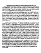
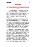
One of the key ways that the Bush article is effective is the way the photograph is placed onto the page. Both, George Bush and Saddam Hussein are facing towards each other giving the impression that they are taunting one another. This is appropriate, as Iraq and the USA have been taunting each other for the past 10 years. The font which is placed either side of the red dividing line which is separating them both is highly successful as well as ironic, because it looks like they are having a conversation, and in real life, they do not talk. In the white racist article, the photograph and sketch that was drawn in court are also effective, because having one facing side wards and the other straight at the camera makes them look like police mug shots. The photograph of George Bush looks as if he is nervous as he is biting his bottom lip whilst seemingly having a conversation with Saddam.


