The stories in which company offer are quite different and they go like this “My boyfriend coned me out of six thousand pounds” and in my opinion I can see the more mature woman reading stories like this instead of Sugars.
The life-style stands out a lot on both the magazines because when you look at sugar and read the title it reminds me of the child hood saying “sugar and spice” and to me again this suggests that the magazine is for the girlie girls where as company suggests quite a sophisticated type of magazine and in my eyes company is the type of magazine what a female banker would buy on their lunch hour but sugar I think girls would probably subscribe to for the free gifts.
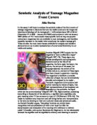
The other striking resemblance about the magazines is that they both use brunettes instead of the normal blond bombshell and it’s a good sign I think because it normally is just blonds on the covers.
The model on sugar is smiling with her teeth and this suggests that she is happy and confident with herself and she does not mind promoting the magazine. She has her body angled to the right and she does not mind being the main picture of the magazine and she is wearing a white top and to me this suggests that the magazine could possibly be a summer issue because the colour is white. Also the model on sugar is wearing a lot of make up including red lipstick and black eye shadow and all though she comes across as being calm and comfortable she may not be.
But the model on company may be brunette she has her body in a total different angle because her image is in the middle and her body is also smaller so you can see legs as well. The model is wearing black which to me this suggests sophistication and style and it could also be a boost to women’s self-esteem as the saying goes if you where black you look thinner. Her make up is also quite natural because she has no eye shadow on and is only wearing clear lip-gloss and to me this suggests that she is naturally pretty but the main concern is that she is pouting and to me this suggests that she is not entirely comfortable in the picture. Her stance also looks fake because she has her hands on her hips and you normally only do that when you are mad.
The models heads covers the slogans “sugar” and “company” and to me this suggests that they are well known in the industry of magazines.
The other big resemblance on the magazines is how they advertise fashion this suggests that one of the reasons why the teens or women buy the magazine is because they have excess amounts of fashion pages which they will probably use as their bible for the months fashion.
On the cover of sugar I think that they mislead the audience because the title, which is, wrote is “be beautiful like Beyonce” and this is misleading because it does not entirely state the facts and is quite misleading on the other hand company states the facts because they say “bad breath, wrinkly skin and a empty purse” this is good because company are telling the target audience the facts about smoking and they then tell the audience how to give up. On the cover of sugar they have a teaser of being Britain’s number one teen magazine and this to me suggests that they have been around for a number of years. Where as company does not make statements but I can tell from the cover that they are a well-known magazine.
From the 2 magazines I can see a number of similarities as well as a number of differences and in my opinion this makes the magazines good and interesting.