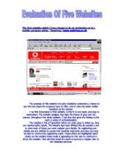
My second evaluation is on the website for the television soap, “Eastenders.” Here is the homepage of the website:
This website is designed to provide viewers of the latest storylines, information on the soaps charters and also there are games for those to have a better understanding on what is going on the weekly soap.
My first impression of this website is quite different to that of the Vodafone website. I feel now after viewing the graphics to this, the Vodafone website is quite plain. I feel that this homepage would be very appealing to people of all ages whom are interested in the daily soap.
There are many different hyperlinks which lead into a series of completely different areas of the website. These different areas include, backstage knowledge, games, latest storylines and competitions. These are quite easy to access and are marked very clearly for anyone who visits the website for the first time.
The colours, which have been used, are very imaginative, and very eye catching. In the background it has a picture of one of the leading ladies who is taking part in this weeks biggest storyline. This makes the user feel interested in what is going to happen in the next episode; therefore they stay to view the link.
Overall I think so far out of the two website I have viewed that this would appeal most to me as a regular user of the Internet and its services.
The third website which I have chosen to evaluate is a well-known music television programme called, cd: UK
It is designed to show viewers what goes on behind the scenes, up and coming venues and dates, information on the weekly stars which appear on the show, and the latest music charts in UK
I found that this website was very eye-catching, with bright colours and imaginative. But the first thing that I noticed was the unnecessary icons in which the web designer has included. Users are able to change the background colour of the website which really in no use or in connection with the website or what it is about.
Also to view the comments, which the readers have written there, is a very awkward scroll that you have to use. I feel that young sers or those with disabilities would not very easily use this, as it is not marked clearly on the page. On the other hand I feel that the graphics are quite good once you find your way around them though it’s hard to find your way around.
I feel that this website could be improved a lot if the scroll bar was presented in a more simplified manner to make it user to access the information. Also if unnecessary things such as colour changes were not on the homepage would make this more appealing to older Internet users.
My fourth evaluation is on a movie website, :
My first impression of this website is that it keeps the theme of ancient drawings and colours throughout the website. Which I feel is quite relevant to the movie.
There is plenty of hyperlinks, which gives many clips form, the actual movie, which for those who haven’t seen it would be encourage doing so. I think that the graphics here are particularly good, again with an ancient feeling.
I found that this was quite simple to use, and I could make my way around the various links very easily. By simply clinking on the enter link, you are able to take a look inside the castle in which the movie is based inside, which has very detailed graphics’ which, I feel are very impressive.
Also again there is a message board for the viewers to post their comments about the website.
Overall I think that this website has had the best graphics so far, and is quite interesting for the viewer to browse through. I don’t think that I could point out any main features that could be improved as, I was very impressed with the whole website.
My fifth and final evaluation is on the website,
This is website is designed to help those who are concerned about there weight, and who would like to learn what foods, contain the possible nutrients which could help your weekly diet become healthy…
My first impression was that it seemed rather for those of a minor age group, although it is made for those of the 18+ age group.
I felt that this website contained a lot of valuable information, but at the same time I felt that this information could have been presented in a more appealing way.
The colours that the website designer have used are quite bold and bright which would not appeal to those of an older age. Also the text font which the have used for the titles and the sub-headings, are quite distracting and again for those with poor eyesight, are hard to make out.
Though I found it quite easy to find my way around the website, I found that most of the text was written in bulk, rather than, ‘easy to understand,’ bullet points. Which it is a major downfall when you are searching for a specific area on the website.
The graphics are quite quirky, but compared to those, which I had already viewed during my five evaluation, they are quite bland and pretty boring.
In conclusion I don’t think this would be very popular with many website users, I think this would mainly be because of the information written in bulk and the presentation of the actual design of the website
I think this website would need a lot of improvement, epically in the areas in which I have just mentioned. For further improvement I think more hyper links should be added, in relation this topic to give the user a more varied option for their dietary requirements.
By Kerrie Mc Aloon