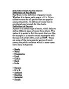
Genre conventions included in a typical punk rock band was instrumentation includes one or two electric guitars, an electric bass, and a drum kit, along with vocals. Vocals sometimes sound nasal and lyrics are often shouted instead of sung in a conventional sense, particularly in hardcore styles. Punk rock lyrics are typically frank and confrontational; compared to the lyrics of other popular music genres, they frequently comment on social and political issues. Trend-setting songs such as The Clash's "Career Opportunities" and Chelsea's "Right to Work" deal with unemployment and the grim realities of urban life. Especially in early British punk, a central goal was to outrage and shock the mainstream.
The conventions of punk pop are similar to those of punk rock as the music has emerged from that genre. The punk bands dress code is very dressed down and more casual wear. Over time, tattoos, piercings, and metal-studded and -spiked accessories became increasingly common elements of punk fashion among both musicians and fans. The typical male punk haircut was originally short and choppy; the Mohawk later emerged as a characteristic style. Baggy jeans, bright t-shirts and cuffs/sweat bands were also part of their rebellious look. Punk bands normally have a lot of tattoos, either sleeves running up their arm or stars on their body. Album covers for Punk bands are usually bright and eye catching, with iconic art work on the front, e.g. Blink 182.
They tend to then have a picture of the band on the back cover to show authenticity, and also get an image across to the audience, a track list is also included and the record label the band is with.
The target audience for my band will be young males ranging from 13-25 years of age, but there would also be a smaller target audience for teenage girls. The target audience would have a rebellious dress sense with piercings and enjoy going to gigs of their favourite bands. They will not be too intelligent as the writing in magazines such as Kerrang is not for heavy reading and includes a lot of slang and abbreviations, and this is the type of magazine my target audience would buy. With the ratio of pictures to text in these magazines and the mode of address it suggests that they do not require a high reading age, if they did they would alienate most readers.
The research I have found out will influence my designs for pre-production and production as I have found out many aspects that are included in magazines and CD covers, some that need to be included such as bar code, record label, band name, album title etc, and others to help sell it like how I will represent the punk culture in my pictures, colours, and writing style I use. There are also many techniques that are used to attract the audience’s attention which will need to be used. The layout of my CD is one that most bands use with a picture on the front along with band name and album title, and then on the back the track list and another picture, of the band. I also placed parental advisory sticker in the bottom corner, this is because it needs to have the label on it to warn people, it is in the corner as it is not the main focus point of the CD, and this was also the case for the album name as the main selling points are the picture and band name.
From looking at my two page spread and existing magazine articles, such as Q, Uncut and Kerrang, I can see the strengths and weaknesses in my work. The visual codes involved in my article include the use of columns as in most magazines, with the format of a big picture of the band at the top to show the reader who is being interviewed, and a large heading to grasp the reader’s attention. There is also an opening paragraph to the article and one to end it, firstly to explain about the band and then to give an over view of the interview. I have also included a little fact file so it’s not all heavy reading, this technique is used in many magazines such as Kerrang. The mode of address is informal and casual using colloquial language,
“They rip up the stage like a tornado.”
I done this because the readers of my magazine won’t be ones of great intelligence; also using more slang flatters the reader and makes them feel better as they know what you’re talking about and people who aren’t in to that music won’t. I have included in the writing a few names of other more famous bands and music names such as kerrang, this is called name dropping, which again flatters the reader as they know who you’re on about while others might not, an example of this would be,
“I'm excited to hang out with Rise Against.”
I also noticed in other magazines they have the name of the photographer below or on top of the pictures so I have used this on my pictures. The background of the pages is a guitar and amp; I used this so the white background wouldn’t be to plain.
The pictures used are one of the band together showing unity, all wearing similar clothing of baggy jeans which has a connotation of being related to skaters and the punk scene, they are all wearing skater shoes which also is related to the punk scene and the hair styles are all messed to perfection to give the rebellious look punk rockers go for. The fact they dress down in the pictures show they care more about the music than their look which many punk bands go for, showing their authenticity. The picture has been edited to give a psychedelic look to the picture as punk bands are also related to the drug scene. The camera angle on both pictures is a low one to show the band’s dominance and status. The other picture I used is one, of the bass player on stage with amps in the background, this picture is in black and white making the main image of the bass player stand out to the dull background. I used this picture as the interview is with the bass player and I have noticed in other magazines that they have a single picture of the person they are interviewing to show their importance.
If I had to re-do this task I would change a number of things, firstly I would like to include more pictures of the band with a more themed approach to it as they do in most music magazines. Another problem I found was the writing lacked interest in the way it was set out in a Q&A style; I would change this so the answers to the questions are worked in to the writing which would give it more of a flow while reading. Also I find my fact file is not as exciting, or looks as good as one in a real magazine. So to improve this I think I would look at more techniques in other magazines to see what else I could place there instead. Another problem I found was it doesn’t look as professional as it should do, the layout of it seems too structured and not like in a magazine for this category and the colours I feel don’t suit the style of the band as I would like them too. It also seems colourless and plain which may put the reader off, but too much colour is also off putting being too “in your face”. I have also realised I would need a spine on my CD cover if I wanted it to be a proper CD cover in a case.


