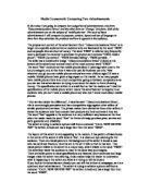
“ Our service makes the difference”, it says beneath ‘Telecommunications Direct’, this is convincingly persuasive and has a competitive edge against other sellers of similar products and services. The phrase makes them distinctive from other sellers; it shows the audience how they endorse their products and how convenient they are.
The word “free” appeals to the audience in a very sufficient way because at the time when the reader reads the word “free” he thinks of cheap purchase price, service and parts guarantee and reliability.
The advert is trying to achieve a phone call from a customer “CALL NOW 020 8760 7687” its written in bold and has a larger font then the word “FREE”.
The layout of this advert is very appealing to the readers. It has pattern of black boxes in the centre of the advert it tells what is ‘free’, it is clear and eye-catching for the audience. There is a visual picture in the background of the advert it shows a man who has achieved freedom, his arms are in the air it tells us that he has won. This visual picture relates to the advert in a unique way, which relates to the word “FREE”.
The advertiser wants the audience to react in the same way and imagine.
There are bullet points to show specifications and features. Short sentences and large images make the advert very alluring, it also makes helps the reader to understand what is happening in the advert and what is it trying to tell the buyers.
If you look at the advertisement closely you can tell that is from a newspaper, as it is a quick and short advertisement. The advert is trying to achieve a phone call from a customer “CALL NOW 020 8760 7687” its written in bold and has a larger font then the word “FREE”.
The advertisement is trying to achieve maximum attraction and to do this the advertiser has mentioned the word “FREE” on every white-colour writing on black-colour boxes, as it is eye-catching to the audience.
The language used in the advertisement from ‘Telecommunications Direct’ is very persuasive. Words used such as “FREE” is very influential to the audience, it gives an enormous impact to the readers feelings.
- 4.5 hours talk time
-
(Under optimum conditions)
- Vibra call alert
- Chat messaging
As shown above, the specifications of the mobile phone (Nokia 3310) are beneath the visual picture of the Nokia 3310. They are written in small and short bullet points because the information is not so much crucial for the writer as the writer knows that the word “FREE” is the most vital word in the advertisement.
“25 HOURS OF FREE CALLS” and “NEVER USE YOUR HOME PHONE AGAIN!” are related together in a factual way. It is true that landline phone calls are charged at a fixed rate, to the same extent mobile phones have some free-of-charge talk time for example in this advertisement ‘Telecommunications Direct’ has gave us a few options such as one package which offers “200 minutes FREE CALLS *peak/off-peak monthly”. I admire this type of language by the advertiser as it appeals to the audience and backs-up the advertisement.
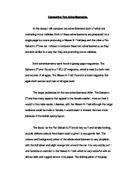
The advert from an ‘Orange Brochure’ has a similar purpose and content to the advertisement from ‘Telecommunications Direct’. As this is a brochure it is more formal, the advertiser is trying to inform us about the specifications of the mobile phone in more detail to the same extent the advertisement from ‘Telecommunications Direct’ is trying to persuade readers to ‘BUY NOW’. Orange is trying to not achieve as much as the advertisement from ‘Telecommunications Direct’, as the readers are already interested about mobile phone.
This advertisement from the ‘Orange’ brochure is targeting a ‘chic’ audience such as people who like new technology and people who would like to upgrade their mobile phones such as changeable phone covers “…including some designed exclusively for Orange”.
The layout of this brochure from ‘Orange’ is structured out like a magazine article. On the bottom right of the brochure it shows a black man laughing and beneath him it is written, “Did you know”, this persuades the audience to read more so they can reveal why the man is laughing. The picture of the laughing man informs to the audience in an bizarre way that they should be well satisfied with Orange’s accessories such as “hands free kit” etc.
The language used in the brochure from ‘Orange’ is very formal to the readers as it has a long description which has a heading “Express Yourself”, which tells you how you can “customise your Nokia 3330e…”
It also shows a man laughing which is very eye-catching to the audience it makes the readers read beneath and reveal why he was laughing.
There are also short bullet points to illustrate the mobile phone’s features
- WAP browser gives access to sport, travel, entertainment and news via Orange WAP services
- 35 ring tones, seven spaces to compose or download your own
- Picture messaging
- Chat menu for text conversations
Short formal tone word “WAP” is used short for ‘Wireless Application Protocol’; they have used the word “WAP” to provoke the audience’s reaction.
“…There is a wide range of press on covers to choose from, including some designed exclusively for Orange” this shows how exclusive Orange is and how highly competitive it is with other companies such as ‘Telecommunications Direct’.
“ Did you know? That some accessories can actually damage your phone? Orange carry out rigorous product testing to ensure that this will not happen.” The advertisers have proved to the readers that their products are safe to use.
Aggressive words like “rigorous” have a very large impact to the readers.
All this use of language finally verifies to the audience that Orange products and services are limited or exclusive.
I concluded that the advertisement from ‘Telecommunications Direct’ use of language was more persuasive than Orange’s brochure as it had such words like “FREE” which caught the audience’s attention.
‘Telecommunications Direct’ gave a feeling to the readers, as it was a very small advertisement and contained less text than visual pictures. Also ‘Telecommunications Direct’ used friendly and informal tone phrases such as “Never use your home phone again!” it backed up the advertisement and helped achieve a maximum attraction.
The layout from Orange’s brochure was well presented like it was from a magazine article. The layout used in ‘Telecommunications Direct’ was very persuasive as it was written all in large bold font, which caught the reader’s eye. This ad looked if it was from the newspaper.
Overall I enjoyed reading the advertisement from ‘Telecommunications Direct’ as it was well presented and the writer used persuasive and ‘catchy’ words.