The masthead is a red block and has magazine title Kerrang! in black capital letters, the motto – Life Is Loud -, the website, the date, the price and the barcode. I think the use of red and black is effective, as they are seen as colours that represent death and rebellion, and these are usually the subject of the songs performed by artists featured in the magazine. The cover models are two members of the band Slipknot. All members of Slipknot wear very eccentric clothing, and they all wear some sort of mask. When the target audience of this magazine sees the two members of Slipknot, without even looking at the feature article headline, they will automatically recognise them. Slipknot are also very popular, so seeing them on the cover will appeal to most of Kerrang’s target audience. The feature article headline is ‘WORLD EXCLUSIVE! SLIPKNOT head up or barnstorming 2003 preview!’. The use of upper case writing here is very effective. The most important words, the words that will grab the most attention are written is capitals. Seeing ‘WORLD EXCLUSIVE! SLIPKNOT’ on the front of a magazine would instantly attract the reader. The worlds ‘WORLD EXCLUSIVE’ show that the magazine Kerrang must have some authority in the music world, and will even appeal to those who don’t yet read Kerrang.
Task Brief
Our task was to explore the magazine industry and try to find a gap in the market. We then had to design a magazine to fill this gap and to appeal to that specific niche market.
I decided to explore the music magazine industry. I have looked through all the different music magazines available, and looked at which genres of music were specifically catered for, and those that were not. There were quite a few genres of music not covered in music magazines, but one that I think has a lot of followers, which wasn’t catered for, was Asian music. I think that there is a lot of demand for a magazine of this genre.
Evaluation
A niche market is a part of the market that needs to be specifically catered for. It is a smaller market taken from a larger, more general market. For example, a football magazine, or a magazine for a specific football team, would be a niche market. The larger market would be sports in general.
My magazine focuses in Asian music and Asian artists in other genres. Currently there are no magazines that specialise in this corner of the music industry.
My target audience is Asian males who are between the ages of 14 and 24. People of this age range will be teenagers, students, and young adults, and will therefore have more time on their hands to be reading magazines, spending their surplus cash on music and listening to music. The reason I chose Asian males, is because my magazine generally focuses on Bhangra, Hindi and Punjabi music. All these types of music are originated from Asia, and will hopefully appeal to my target audience. My magazine costs £2.99 so I think it targets the B, C1 and C2 social classes. As well as focusing on music, it contains news on games, cinema releases, DVD’s and fun stuff on the Internet; I think all these things typically appeal to men and teenage boys.
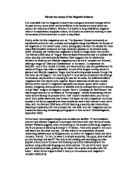
My magazine is called ‘Bhangra Beatz’. It is written in ‘Matura MT Script Capitals’, which after researching Asian films, books and brochures, looks like a font which would be typically associated with the Asian culture. Most of the text on the front cover is written in this font, as I think it would appeal to my target audience. It is not the same font that would be typically used in a normal magazine this may be because it could be hard to read for some people. Also in the masthead is a picture of an attractive Asian girl and the page where you can find more pictures and information on this girl. I think this picture would appeal to my target audience of males because generally men are attracted to attractive women. I have placed the picture on the masthead as this is where people look first when buying a magazine. The feature article picture takes up most of the front page. It is of the band Cornershop; it immediately grabs the readers’ attention, because it has been modified to look more abstract. I chose this picture because I thought it would grab people’s attention and it is clear on its purpose. I think the weakest part of my front cover was the masthead. The text on it doesn’t really stick out, and it seems to be a bit plain.
For the rest of my magazine, titles are written in the ‘Matura MT Script Capitals’ font to keep up the Asian theme, but the main text is written in ‘Comic Sans MS’ font which is easier to read. My editor’s letter is on the contents page. It talks about things that people familiar with the Asian music scene will be interested in. For example, ‘…bad news RBD’s UK tour has been cancelled…’, only people who know who RBD are, will realise the significance of them cancelling their tour. The language is informal, which will appeal to my target audience, who talk to each other and relate more to informal language. Also on my contents page is the contents, with pictures that relate to stories in the magazine. I think this is effective as the pictures I have used are of people my target audience will recognise, and will want to read more about. The background is red, orange and yellow arranged in a circular pattern. I chose this pattern because it is simple, yet effective. It is bright and quite in-your-face, but you can still read the writing clearly.
Also in my magazine is an interview with Cornershop. This band released a single quite some time ago, which was very successful, but have not released anything since. The language used in the interview is very informal, and the interview is set out like a conversation. I think that this format would appeal to my target audience, as I feel they would relate well to this kind of interview. A similar format is used in FHM magazine. I researched interviews and decided this would be the most effective and would appeal to my target audience the most. Throughout the magazine, when I have said the name of the magazine, I have written it in the font that the magazine title on the front cover is in. I found that a lot of magazines and newspapers used this effect, so I decided to use it too, to show the magazines authenticity.
My advert is for HMV. I researched HMV adverts in other magazines, and decided to follow this format; dark blue background, HMV name at the top with motto/catchphrase underneath, products in centre of page, with HMV website and HMV logo/picture at the bottom. The music advertised is music that would appeal to my target audience. Bollywood music is all types of Asian music, maybe taken from Bollywood films. Asian Flava’s is Asian music which has been remixed. This would appeal more to my younger target audience, because it is faster, and bassier.