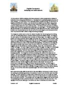
English Coursework
Analysing two media adverts
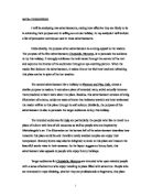
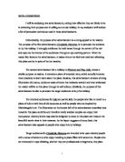
The two adverts I will be analysing have been produced to inform people about holidays in India (text 2) and Disneyland Paris (text 1). The adverts are to persuade people to buy one of these holidays. The India advert is for reasonably affluent people whereas the Paris advert is targeted at families with children. The two adverts are targeted at two different age groups. The advertisement for the India holiday is aimed mainly at couples who want a relaxing or romantic holiday away from there usual busy lives. The Disney advert promotes an existing holiday. Both the adverts could be found advertised in a travel agent. The Paris holiday could also be advertised on the television by showing the main features of the resort. Disney would be able to do this advertisement as they are one of the world largest tourist attractions which mean they would be able to afford a large advertising campaign.
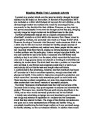
The images are mainly used to show the readers the place that they are going to be visiting. Text one, the Disneyland advert, contains a well structured and placed image. The image is the main castle at the Disneyland resort and also the Disney logo. The image is in a portrait position and takes up almost half the pages this shows that the castle is a main attraction, also there is text overlapping the picture this shows that the image is connected to the text, it also makes the reader think of the image when reading the text. The castle is a detailed building with loads of colours to make it more attractive and appealing. The colours in the image are blue, gold and purple these colours make the advert stand out, exciting and interesting this suggests that the visit will be fun as well as relaxing. Advert two, the India advert, has a number of images. The main image is towards the top of the page, the image is in a landscape position. The picture is a lake with a boat and the image is taken at sunset this makes the holiday look relaxing. There are three more images in the bottom left of the advert. The bottom two images are set in a portrait position with another image above them in a landscape position. The images are of a luxury building with views of the inside and the outside. There are two images showing the inside of the building, the first well detailed and designed the main building is in white and the floor appears to be in a blue colour which suggests that this is a calm and relaxing area. The affect of having images in blue and white against a gold one are it makes them stand out against each other this pulls the reader to look at those images. The second image is in gold and has a lot of architecture and designs in the walls and the roof, this also suggests a calm area but it also shows the luxury of the environment it also gives an image of India as historic but exciting. The final image in landscape has a number of steps leading up to a small building on the top. At the foot of the steps there are two sun chairs with umbrellas, this again shows that the visit will be relaxing and hot, the use of two chairs also emphasises again that this is a holiday intended for couples.