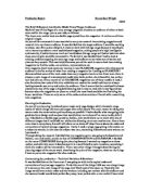
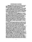
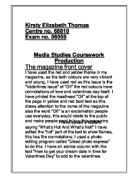
The magazines which I have analysed are:
- Fitness
- Men’s fitness
- UltraFit
I had decided to analyse these three magazines because my magazine is about fitness and a healthy lifestyles. I had decided to analyse these three different magazine covers because I then have a wider range of ideas which I can then combine to create the magazine. The case study I had chosen to provide as my research is from the magazine ‘UltraFit’. This is because unlike the other 2 magazines, this magazine has an image of both genders, male and female. On the ‘Fitness’, magazine, the image given only had a female on the front which indicated that it is mainly aimed for women. A similar issue was with the magazine ‘Men’s Magazine’ which was an issue because it clearly shows that it is aimed for the male audience.
The analysis of the magazine front covers as influenced me to add quite a few aspects. I am influenced as most of the magazines included the same headings such as “Your diet and nutritional values”. This was tempting because it had been a popular topic at the time but I avoided using it as I wanted our magazine to be unique. Another heading I was tempted to include was “How to cope with injuries”. This was because it was an issue brought up in many sports such as football, hockey, etc. I have also chosen this because I have had injuries from sports myself so I could add a personal touch to it.
Preparation and Planning
Our first ideas were producing a magazine about football as stated before. This was because our knowledge of football was much more than any other sport but as we researched over the internet, we learnt that there were already many football magazines to compete with. The next thing we decided to do was a fitness magazine which was our final idea. Also, the colours first were yellow and white as they complimented the topic as they were clear and clean colours. The colours were then changed to a black background with mixtures of colours to make different parts of the magazine to stand out more and seem more appealing.
The genre I have chosen to work on is health and fitness. Our first idea was originally football however we researched football magazines and there were too many which would not give us the factor of having a unique magazine. So we decided to choose something that is not focused on much in the UK; Obesity. We are not actually aiming to produce a full magazine but the main features of it which would be: a front cover, contents page, an article and a back cover.
We decided to make our target audience the general public as this magazine bases itself on a subject that anybody can benefit from. Also, the age group is also any because anybody can benefit from exercise and fitness as it can help with things like diabetes, obesity, etc. on the magazine, there will be an image of different sports equipment showing people can play any sport and be fit.
The technology we will be using to create our front covers are things with ICT such as Corel Draw, Adobe Photoshop and Microsoft Word. These were used to make the magazine to seem more professional and some would believe it is easier to design via ICT. Even the article was produced using Microsoft Word which made it seem a lot more appealing and professionally designed.
Evaluation
My strength of helping design a front cover was that I had a lot of knowledge about design which was a great use in this project. This was a really big help as I could make the cover to the best quality possible using graphics designing software.
An area which I was not very strong in was mostly the research side of the project. I was able to research other magazine covers that were relevant to the genre of magazine that I had based my project on. This was a help as it helped me to decide colours and layout on a real fitness magazine so I made my magazine seem as real as possible. On our magazine, we had used a variety of colours that went together and colours that didn’t so that the cover looked very appealing. This was a good point because it was very eye-catching and although the background colour was black, the other colours went together and the black made them all seems more appealing although they were very different. An example of this would be on the front cover as I have used a lot of different colours like red, blue, yellow, white or purple. These worked well together as the black background was neutral to all other colours.
Another thing I was good at was when I had to choose colours which would compliment each other. This was a major issue at first as colours are usually the main points that attract readers to the magazine. In the end we decided to use the colour yellow as our main colour for our magazine name as it was the known as the colour of good health whereas other colours would have been is outstanding. Another colour we tried to use was purple but this became difficult as it was hard to compliment it and also because it was a colour that defined nobility and spirituality which sort of links into what we are doing.
My weakness in helping to design the contents page was similar to my problems with the front page as I have no internet at home so my research was limited. This was things like how the contents page was set out and how to make it seem clean yet beneficial for the reader in terms of information. As I had problems doing the research part of the contents page, I was lucky to be working with somebody that is very skilled in methods of research and who is also very dedicated to their work so the majority of the research was done by him and the design and appearance of the magazine was mostly done by me although we both put equal amounts of effort into both parts of the project so that one person isn’t doing all the work.
My strengths on the article was that when the person I worked with had typed the article of obesity, we had decided to make it into the shape of an obese person with all the text inside the person as it would be creative and original another good point about the article was that the colours of health had been added so the colours would give the reader the idea that I was trying to promote health as healthy colours were used such as orange, green, etc. One other thing that I found a good idea was to put the slogan for the magazine along the sides of the body for the article as they would motivate the audience to be healthy. This was effectively because the slogan was motivational –”What the mind believes, the body achieves”. This seemed like the perfect slogan as it seems to be motivational and in some way inspiring to young people as it motivates them to become healthy as it suggests that their body can achieve its goal if they as a person would believe that goal themselves mentally.
My strengths on designing were that I had researched some information and I had learnt that the reader’s eye automatically goes to the right of the page when a magazine is first opened. This is why I decided to put the topics and names of the articles on the right side of the contents page so they are clearly visible and not a problem to understand either. I had also used bright colours and large images to dominate the page so that the contents page looked appealing to the audience and still provided sufficient information was is good because it makes the text seem appealing without making the page look too compact. Also, I had used the same colours as the main colours on the front page for the contents page as they are the colours that will be representing the magazine and also because they are bright and eye-catching. Another reason I decided to use these colours was because they are attractive and motivational colours whereas other colours such as purple or blue are too dull or boring. One thing I had added as an extra was a FIFA world rankings table as I have a lot of knowledge about football and I wanted to add a personal touch. This was also beneficial because when the reader opens the magazine and their eye moves to the right of the page, they will see this extra feature and may find it interested to read if they are fans of the sport.


