We also did a questionnaire to gain information from our target audience. Using these two pieces of research we decided what kind of content we should have in our magazine as so to attract our target audience. We decided to have an interview with a hip hop or garage star of black origin, we also included fashion reviews, which are for all ethnic minorities and with a wide range of prices for the class divide. We also included an information page on drugs, as we wanted to promote clean, healthy living. We also have a problem page with teenage related issues, as we wanted to give boys a better representation and show their softer side, as not all boys are athletic and macho. We included interviews and fact files on Jonny Wilkinson and David Beckham, we chose these particular sports personalities because we feel that they are excellent role models for boys and young men, they are also clean living and David is a family man. They also added a sporting element to our magazine as we found this to be popular with teenage boys. We also thought very carefully about the adverts we put in our magazine, the first is an advert for Lucozade, the girl featured in the advert is also represented well as she is not a sexual object and is dressed in sports clothes. Locozade can also be associated with sports. There is also orange in this advert, we looked at many adverts aimed at men and found that orange and red are commonly used because they make men feel powerful. There is also an advert for Subaru Impress’s as a lot of boys are very interested in cars, the car itself is blue which is a typically male color, there is also orange and yellow in the advert (orange again for power). The last advert is for Nike, this advert is not aimed at either gender or any particular race it also has the slogan ‘No prejudice. Just sports’, the main colours in the advert are black and white as we found a lot of these colours in other male magazines and they are neutral again for either males or females.
We have tried not to stereotype age, to do this we have included adult concerns in our problem page for example sex. The front cover also features a healthy good-looking young man, but he is not overly athletic or built. The main colour is blue as is many boys favorite colour, the subheadings are bright and attractive to catch the customers eye.
Production diary
Task 1- Front cover
The first thing I did was draw and colour the model on the front cover, I found this quite challenging because I couldn’t seem to make the colour bright enough so I decided to use a blend of paints, pens and pencils to get the desired effect.
Then I had to use ICT to produce the background, title and subtitles, to do this I first tried using Microsoft Word but I soon found there weren’t enough tools. So I used Publisher instead, this was perfect. I found it hard to place the title correctly. I printed it out to see what it looked like, I also checked to see if the picture would fit, it was fine I’d just trim a centimeter off the bottom. I also noticed that it hadn’t printed to the edge of the paper. So I went back and stretch the borders on the computer. I wanted to subtitles to overlap the picture on the front to give it that professional look but I tested if the computer would print over the background but it wouldn’t so I settled with sticking them on instead.
Task 2 – Double page spread
I had to draw and colour pictures of the artist I wanted and make sure they would fit well on A3. I used the same mix of paint, pencils and pens as I did with the front cover. I wanted to make this interview eye catching so I decided to use a background with some pattern in the correct colours. Next I had to create the interview, to do this I studied other interviews and took ideas from them, I again had to stretch the borders to try and print on as much of the page as possible. I had to print several copies slightly moving round the text each time so I could fit the pictures in.
Task 3 – Advert
I knew I had to have an advert to do with cars but I didn’t know what to do. So I asked some of my male friends and they suggested I so a Subaru Impreza as it’s a well liked car. So I found a picture copied it, painted, coloured and outlined it then I cut it out and stuck it on blue paper then used orange in the title to add power and put the website on the bottom so people would know where to gain information from.
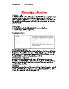
Evaluation
I think our magazine has turned out very well, much better than I expected. I think the magazine looks quite professional, and is eye catching and attractive.
To find out if it had achieved its purpose we took it back to the same 20 people we questioned about the magazine before we made it. The feedback we got was very positive and shows that most of our target market would buy it. We also found out that a large majority of our target audience would like the magazine a lot more if it came with free samples, especially miniature aftershave bottles.
I think the continuality is very good as it runs throughout the magazine, most of the text is in comic sans, the same colour scheme runs throughout as do the page numbers.
When we put our magazine together it looked really good but to make it look more professional we decided to print all the pages on photographic paper to give it a glossy look about it.
I expected working in a group would be quite difficult, but I was pleasantly surprised to find that it worked out quite well, as three heads are better than one and we could combine all our ideas to make the magazine better. At first it was quite easy to get distracted but once we got started we worked really well together.