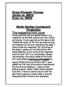
The main photograph on the front cover is of Jennifer Aniston looking upset, almost longing, this photograph works with the main heading “Broody Jen’s Breakdown.” This picture has been chosen to gain sympathy from the reader. This picture takes up a large proportion of the front cover and even partly covers the title of the magazine. The photographs and titles on the front cover work very well together to attract readers. For example, next to the title “The REAL reason Sharon hates Rebecca,” there is a picture of Sharon shouting angrily and Rebecca looking conceited. I think that the pictures have the most impact on the reader because they have been very well chosen to make you feel sorry for a certain person, such as Jennifer Aniston, or make you dislike someone, such as Rebecca Loos.
Target Audience
This magazine was clearly written for women because of the use of the colour pink and the content of the articles, for example, it is unlikely that many men would be interested in Sezer saying he is going to marry Imogen or Posh saying why men never fancy her. The magazine is clearly a showbiz type of magazine because the titles of articles displayed on the front cover are mainly about celebrities, the only other title is for one true life story. I think that the main readers of New! Magazine are between 18-28 years old. The magazine has a wide range of readers because it only really deals with celebrity affairs and people of any age can be interested in celebrities, although the magazine does have some adult content. Such as “My 28st lover is double the fun.”
I think that the front cover of the magazine appeals to its target audience because the stories it contains, the celebrities shown on the front cover are very significant at the moment. Right now people are particularly interested the main headline “Broody Jen’s Breakdown” and would buy the magazine if they thought it contained “New!” information on the subject. The article “Chubby Chaser True Life”, although one of the smaller articles in the magazine, could also encourage the reader to buy the magazine by being a topic that most people are morbidly fascinated by. For example, when I took the magazine into school to write this assignment, most people expressed there disgust at the article, then opened it up to read it anyway. It has a way of drawing in readers by being a subject that a lot of people find repulsive.
The magazine is quite different from other magazines aimed at the same age group as most magazines have a more varied front cover rather than nearly all celebrity affairs. Normally this type of magazine has articles that attempt to focus on people’s insecurities and offer solutions, using titles such as “The Bikini diet that actually WORKS, lose a stone in a month,” or “Find out if he REALLY Loves You…Take our quiz.” Magazines like New! also normally have other encouragement to buy them, such as free gifts or competitions. The fact that New! Magazine has none of these means it must be a very effective front cover to stay in market with magazines that do have those things.
Money And Cost
New! Magazine only costs 60p…and it wants you to know it! The price of the magazine is the biggest font on the page, and is surrounded by a bright blue star underneath the words “Fantastic Value.” It’s not very subtle but it lets you know that it is quite inexpensive. The price of the magazine is situated in the top left-hand side of the magazine, this is because research has been done into the first thing a reader looks at when he or she looks at a magazine and it was found to be the top left-hand corner, and the first thing that New! Magazine wants you to look at is the price because, compared to other magazines of the same target audience, it is very cheap.
Use of Language
The front cover of New! Magazine uses several language devices to catch the attention of the reader for example, in the title “Chubby Chaser True Life” alliteration is used to add humour to the subject in a way that won’t offend anyone. Alliteration is used again in the title “Broody Jen’s Breakdown” to make the title sound memorable. The way that New! magazine calls Jennifer Anniston “Jen” seems to be so that they sound as though they are good friends, by calling the celebrities by their nicknames (like Posh or Ange) makes the magazine seem more casual and the celebrities themselves seem more down to earth.
Where the price of the magazine is there is a slogan saying “60 things for 60p” this is repetition of the number 60 and is a likeable saying that sounds as though each story only costs 1p which seems like very good value for money. The magazine also has a catchphrase near to the name of the magazine “If It’s Hot, It’s Here” this saying is short, snappy, easy to remember, and says that the magazine has anything that is desirable or “hot.”
Contents
The titles on the front cover are very cleverly written to only give you a small part of the story that makes you want to read more. For example “The REAL reason Sharon hates Rebecca” makes you want to know why they hate each other and “Why men never fancy me” makes you want to know why men never fancy someone who is considered very pretty by women. I think that the images and the photographs work together to try and sell the magazine, the photographs by themselves wouldn’t mean very much but when next to the titles they can be manipulated to make Jennifer Anniston look upset or broody and Rebecca Loos look arrogant, even though the photographs could have been taken a long time ago when the events hadn’t even happened.
Overall Effectiveness
After spending so much time analysing a front cover I began to appreciate just how much work had gone into piecing it together. Thinking up interesting titles, finding the right photographs, considering what the audience wants and applying that to the cover or finding the right colours and fonts and arranging them on the page so that it doesn’t look too cluttered. I had never before realised just how much work is put into persuading people to buy things.
I think that the front cover I have been studying is very effective in general because of its bright colours, eye-catching fonts, memorable slogans and juicy gossip…what more could you want?