Tesco Website
Tesco has expanded rapidly in the past ten years and has become the largest supermarket in the country. The growth has been based on a sound strategy of customer focus, expansion of services and goods, and domestic and international expansion.
The purpose of the website is to create value for customers and to earn their lifetime loyalty. Tesco's success depends on the people who shop with them and also the people who work for them. If the customers like the website and find it easy to use they are more likely to come back and shop again.
The Tesco website offers so much that it's a bit overwhelming the first time you visit it. Aside from the online supermarket, there's a music download shop, a Holiday & Flights section, and phone and broadband internet services.
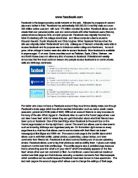
The Tesco's homepage is pretty good but it does contain quite a few graphics, so it wouldn't be suitable for 56k user's to go on there site due to the amount of time they would have to wait for the whole page to load. A bad thing that Tesco's have not added to their site is a version without any graphics so that 56k user's wouldn't have a problem browsing the site. Due to this fact Tesco's might lose a few customers but now that broadband is becoming more of a standard connection, this is Tesco's target audience. Here is a screen print of the homepage so you can see how bad it might be for 56k user's.
Tesco has expanded rapidly in the past ten years and has become the largest supermarket in the country. The growth has been based on a sound strategy of customer focus, expansion of services and goods, and domestic and international expansion.
The purpose of the website is to create value for customers and to earn their lifetime loyalty. Tesco's success depends on the people who shop with them and also the people who work for them. If the customers like the website and find it easy to use they are more likely to come back and shop again.
The Tesco website offers so much that it's a bit overwhelming the first time you visit it. Aside from the online supermarket, there's a music download shop, a Holiday & Flights section, and phone and broadband internet services.
The Tesco's homepage is pretty good but it does contain quite a few graphics, so it wouldn't be suitable for 56k user's to go on there site due to the amount of time they would have to wait for the whole page to load. A bad thing that Tesco's have not added to their site is a version without any graphics so that 56k user's wouldn't have a problem browsing the site. Due to this fact Tesco's might lose a few customers but now that broadband is becoming more of a standard connection, this is Tesco's target audience. Here is a screen print of the homepage so you can see how bad it might be for 56k user's.