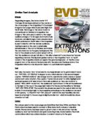
There is a close up black and white photograph of Tony Blair on the front who is the hot topic of the moment and symbolises war and politics. As part of the sequencing of items in the composition, his face is positioned to the right of the captions and is approximately in the upper two thirds of the page. The use of black and white makes the image very dramatic and has immediate impact. He has a serious, concerned and almost challenged expression on his face. The lighting that they have used and the closeness of the shot makes Blair look old, drained and worn-out. As a prime minister he looks weak. This interpretation most likely conforms to traditional view points and values present in contemporary society
The captions positioned on the left of the page are bold in a san-serif typeface, the text is split up by the colour yellow so that the reader is more likely to read it, it is easier on the eyes and more and more inviting to read than if the text was all white. Symbolic codes have been used in the captions text; these are a system of signs which have a strong associative and connotative meaning connected to them. For example “battered” implies that Blair is beaten, defeated and worn out and has probably seen better days. The caption is in serious language and suggests briefly that Blair’s future is looking grey and his time as prime minister is maybe coming to an end (twilight implies the end of the day). This may have been another reason for using black and white for the photograph of Blair! The caption indicates the content of the story and anchors the signs and gestures with in the photograph so that a specific understanding and meaning is suggested, any other topics take up a small amount of space making Blair the main feature. The less important items are pushed to the top and bottom of the page away from the main feature. E.g. Barcode, Date, Pricelist. The editor has also tried to create a preferred reading by using a conventional “Newsweek” composition and lay out. He has used a red border around the main story and image. The captions are positioned down the left side of the cover. The black, white and red has been broken up by yellow so that the whole composition is more inviting to look at.
The Title “Newsweek” is in serif text; white on a background of red. It is bold and easy to read. It is a conventional Title used every week for Newsweek magazine so that the reader can recognise it easily. It is a serious looking title to attract its usually target audience. It is also conventional of the magazine to use red, white, yellow and black on the front cover. This is also to be recognisable to the target audience.
Newsweek’s target audience are an intelligent, affluent, elite and high calibre audience, they are individuals who are interested in current affairs and the media and what is going on in the world around them. The content of this magazine is in serious language and uses more challenging grammar and a broader choice of wording than for example the “Sun” newspaper. I think that this magazine also attracts students interested in the media.