Results for ENGLAND and SOUTH AFRICA for Hypothesis Point 1
Travel Type
Travel Type relates back to the first point I made in my hypothesis which was
” 1. More people in South Africa walk to school than in England.”
In order to support this hypothesis I need to look at different methods of travel used by both English and South African school children.
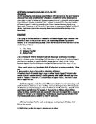
Above, are two pie charts which can be used to compare the proportion of pupils using each different method of travel in England and South Africa. From the pie chart for England I can tell that the majority of pupils (49%) walk to school. This shows that walking is the modal value among English school-children travelling to school. The average amount of people using each method of travel is 8.5. For the South African pie chart it can be seen that a much larger proportion of pupils walk to school. A total of 70% of South African children walk to school compared to 49% of English school children. That is a difference of 21%. So although walking is the modal value for both England and South Africa, the total percentage of children walking in South Africa exceeds that of in England. My hypothesis, in which I stated that more children in South Africa walk to school, has evidence that suggests it to be true, although the results were not drastically different in proportion to each other. Ultimately, more children in England use different methods of travel such as bus or car or even the train or bike. I think the results provide a larger range in England because more methods of transport are readily available due to the country being more developed financially and the need for transport increasing as more people have to travel further distances to attend school or work.
From these results, it is established that the most popular method of travel among English school-children is walking, although a sufficient amount of the children do take the bus or car to school. “A sufficient amount” is approximately half the number of children who use the modal (or most common) way of travelling. For example, 12 children take the bus which is roughly half the amount of people who walk. 9 children travel by car, which although is less than the second most common method of travelling, does still account for approximately 18% of the school-children. The pie chart creates a good picture of the proportion of children using each different method. In South Africa, it can be established that walking accounts for over three quarters of travelling among school children. This is also the modal method of transport. The second most common method of transport is car, however this only accounts for 20% of travelling methods, compared to 87% that use walking. The first point in my hypothesis has evidence that supports the fact that it is true because a greater proportion of South African school children walk than that of school children in England. From the South African results alone, it is established that the most popular method of travel among South-African school-children is walking. Although this display of results complies with my hypothesis, it could be said that it doesn’t go to the extent of supporting it because it was discovered that school-children in both England and South-Africa use walking as the preferred method of travel. However, because a greater number of children in South Africa use walking, this evidence supports my hypothesis.
Travel Distance (in KM)
Travel distance relates back to Point 2 in my hypothesis:
“2. People in South Africa take longer to get to school than in England”
Distance travelled is often related to time because obviously, the further you live from a certain destination; the further it takes to get to that destination and in the majority of cases, the time increases as travel distance gets further. This is not always the case however, and it is therefore important for me to consider speed as another factor in the investigation. I will see from my results whether English or South African children have to travel a further distance and this will aid me in comparing time taken. After I have used data of travel distance, I will then investigate time taken to see if distance and time relate to each other. I can work out speed after this, using a formula speed=distance/time
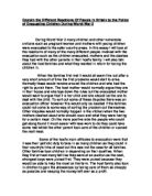
From these results, it is established that the modal distance to travel among English school-children is less than 1km. This analysis of results proves my hypothesis to a certain degree because it shows that the majority of English school-children travel less than 1km to get to school, thus taking less time. The pie charts create a good picture of the proportion of pupils who have to travel less than 1km in both England and South Africa and it is evident that the proportion of children who have to travel less 1km or less is equal in both countries. In England it appears to be just under half of all pupils, the actual figure is 43%, the exact same figure as for South Africa. I originally stated that children in England take less time to get to school because they have to cover a shorter distance. However, the above results support the theory that it is in fact children in England who have a greater distance to cover in their journey to school. My reason for this was that there was a wider selection of available schools in England and children were able to choose the one closest to them to attend. In South Africa, it was thought that schools would be fewer and more spread out. However, this appears to not be the case because the range of distances travelled, certainly the greater distances are of a higher proportion in England. To further this investigation (because it does not prove my hypothesis) I will investigate time taken to get to school. It is possible that because England is more advanced in terms of transport, then schools are still more easily accessible than those in South Africa. In this case, further work is needed to prove my hypothesis point 2.
Range of Distances Travelled in England= 30km
South Africa = 5km
This shows that children in South Africa should live nearer their schools, thus taking less time to get there which is my next point.
Modal distance travelled in England= Less than 1km
South Africa= Less than 1km
This shows that in both countries, schools are easily accessible for the majority of pupils. This does not prove my hypothesis because I stated that South African schools would have lower accessibility rates, due to their being few of them. My hypothesis is not proved because a) the range of distances travelled in SA is less than England and b) in both countries, the same percentage of pupils travel the minimum distance in order to get to school.
Travel Time
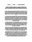
The above pie charts clearly represent that the majority of both English school-children and South African children take 5-10 mins to get to school. I sub-categorised the times taken because there were a large range of times which would not have all been relevant (for example 17 minutes, or 23 minutes) and by categorising them into smaller sections which are more flexible, it is easier to see the modal times, etc… Although the modal time is 5-10 mins, the pie chart demonstrates the spread out range of the times taken. For the England pie chart a lot of the segments appear to be roughly equal and in quite close proportion to each other which shows that pupils take a varied amount of times to get to school whereas the South African pie chart shows approximately half of children taking 5-10mins to get to school. The rest of the segments are in a small proportion to each other compared to the England pie chart. I have drawn a stem and leaf table for the English and South African pie chart to set out the results in a clearer way. This is because for the English pie chart, the results are more varied and need to be examined in a more accurate way in comparison to the South African results.
The stem and leaf table does not group the different times into categories but uses the precise and raw data which should provide a more accurate vision of the results.
Stem and Leaf Table to Display Results of Different Times Taken to Travel to School by
English School-children
Stem and Leaf Table to Display Results of Different Times Taken to Travel to School by
South African School-children
From the above stem-and leaf diagram of England I can see that the Longest Time Taken= 45 minutes. The Shortest Time Taken= 1 minute. By adding up all the results and dividing them by 30 I calculated that the mean Travel Time Taken among English School-children to get to school= 14.5 minutes, compared to 18 minutes for children in South Africa. These averages show that children in South Africa have to travel further to get to school on the whole which proves Point 2 in my hypothesis. The median for England is 12 minutes. The stem and leaf graph shows the results to a more accurate degree because I used the raw data instead of grouping it into separate time categories. It also helps support my hypothesis because it shows that a high majority of children travel the shortest distance to school. When comparing this data to the data of that of South Africa, this analysis will prove vital in order to find out which group of children travel the shorter distance. I think the stem and leaf table will help contrast both sets of data to a higher degree than a pie chart can.
Another function of the stem and leaf graph is to give a picture of the pattern of the data, for example the biggest groups and how the spread of results appears. In England, it is apparent that the shortest times to travel are the most popular. The results tend to stagger in a stepped appearance as the time taken increases which means that the bulk of pupils travel to school in a relatively short time.
In Africa, the case is similar but the staggered effect is not as visible. The longest line of the stem and leaf table is the 0 row but the results also spread themselves out over the 3,4,5 and even the 6 rows. The results are more coherent in England whereas in Africa, the pattern seems to be less developed numerically. This could be because the range of times taken is greater in South Africa and the therefore, the results have further to spread themselves over. It is evident from the shape of the England stem and leaf table that the numbers of pupils travelling for a longer time suffers a lapse whereas from the stem and leaf table of Africa, the lapse is less signisficant.
Longest Time Taken in England=45 minutes
South Africa= 60 minutes
Shortest Time Taken in England= 1 minutes
South Africa= 5 minutes
This shows that the range of times is greater in South Africa which could support my hypothesis because the highest time is 15 minutes higher than the highest time in England. However, just because Africa has a higher range doesn’t always mean the average is higher although in this case it is by 3.5 minutes.
Average Time Taken in England= 14.5 minutes
South Africa= 18 minutes
This supports my hypothesis because it means that people in South Africa take longer to travel to school than people in England.
umulative frequency
Cumulative frequency is used to determine the number of observations that lie above or below a particular value.
The cumulative frequency is found from a stem and leaf table or a frequency distribution table by adding each frequency to the sum of its predecessor.
The last value will always equal the total for all observations, as all frequencies will have been added.
For continuous or discrete variables:
- Cumulative frequency is calculated from a frequency distribution table. A stem and leaf plot can be used to construct a frequency distribution table.*
*definition of cumulative frequency taken from
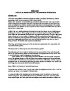
I will now use the information from my stem and leaf table and transfer it to a frequency distribution table. This progress of how I display my results will eventually lead to the cumulative frequency being calculated which I can then use to draw a cumulative frequency curve. This will help me in supporting my hypothesis because a cumulative frequency curve can be used to determine the numbers of data above or below a certain value. I can use this cumulative frequency curve to make solid statements about my data and use them to support my hypothesis.
Frequency Distribution Diagram for England
Frequency Distribution Diagram for South Africa
Summary of Results
The two points in my hypothesis were:
1. More people in South Africa walk to school than in England.
2. People in South Africa take longer to get to school than in England
My first point has been proved because the results were as follows:
Number of people who walk to school in England- 49%
Number of people who walk to school in South Africa- 87%
From my results, you can see that more people walk to school in South Africa than in England. The percentages were not very close, but I feel that if the range of people had been higher than the gap would be lessened. I think the reason why more people walk in SA is because transport like buses and cars are not as advanced as in England and may be harder to access.
I have explored time taken to get to school in South Africa and England and by comparing the results I have the following:
ENGLAND
Longest Time Taken= 45 minutes
Shortest Time Taken= 1 minute
Mean Time Taken- 14.5 minutes
SOUTH AFRICA
Longest Time Taken= 60 minutes
Shortest Time Taken= 5 minutes
Mean Time Taken- 17.5 minutes
From comparing these two tables, it is quite evident that it takes a longer time to get to school in South Africa than in England. The longest time taken in South Africa is 60 minutes, whereas in England it is just 45 minutes. The shortest time in England is 1 minute compared to the slightly longer 5 minutes in South Africa. The average time taken to get to school in England is 14.5 minutes, whereas in South Africa it is 17.5 minutes. These results prove my hypothesis because I stated that children in South Africa take a longer time to get to school than children in England. I am pleased with these results and how I have displayed them because they are easy to read and support my hypothesis well.
Is my hypothesis true?
From collecting my data, I can see that although some parts of my hypothesis have been clearly proved, others are less clear. The first point I made (1. More people in South Africa walk to school than in England) has sufficient evidence to back it up but in order to prove my hypothesis, I think more investigation is needed. When I am working with my sample of 100, I think it will be a lot clearer to which extent my hypothesis has been proven. So far it has only been proved that the majority of children in South Africa walk to school. However, when compared to England, the evidence is weaker than I would have expected. Using 100 people will certainly provide a greater range of evidence.
My second point (People in South Africa take longer to get to school than in England) has been proved with sufficient evidence and results. This complies with my hypothesis and suggests that it is true because the average time taken in South Africa is higher than that of England. There is also a greater range of times taken in SA which suggests that more people travel to school from further destinations.
However, I cannot conclude that my hypothesis is true, based only upon this evidence. If I had more time, I would use a third point to help me explore whether children in England have better and easier access to their schools. However, for the time being I can only investigate the two factors which I have worked with above.
Overall, I am pleased with the way I have handled the data to make the results work in order to prove my hypothesis. Although I haven’t been entirely successful all the time, I am confident that with more time and data, I can prove my hypothesis to a greater and more accurate extent