URBAN ANGLES
Having done predominantly nature based projects for my AS Level, I decided to focus on taking images of cities and people. I started this unit with a brainstorm to help my research:
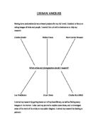
Charles Sheeler Walker Evans Henri Cartier Bressant
Which artists and photographers should I research?
Lee Friedlander Stuart Davis Charles Burchfield
I started my research by getting books out of my local library, as well as finding many images on the internet. I also used my journal to explore some ideas, and to investigate some of the work of the artists on my spider diagram. I started my research by looking at painters:
This first painting is by Edward Hopper, titles Manhattan Bridge Loop, painted in 1928:
'Manhattan Bridge Loop' is a very horizontal painting. This is mainly due to the painting being horizontally divided into four sections. The first section is the sky, the second section is the buildings, the third section is a wall and the final, a path a couple of metres below the rest, along which a small man dressed in green, is walking. The man is the only form of life visible in the painting. He brings an element of movement to an otherwise static scene. His movement, and it is clear that he is moving due to his back leg being slightly lifted as though he were about to take a step, is in fact about to take him out of the painting for he is at the far left of it and is walking in that direction. This could signify that there is little hope left of life. If this seemingly unimportant man were to leave the painting, it would become entirely static, in the same way that life would. The man, due to his position in the painting, is blind to what the viewer can see. There is also a parallel between the man and the lamppost on the opposite side of the painting, as they are almost equidistant from the two edges of the painting. They are amongst the few vertical aspects of the painting.
The bright sky occupies a fairly large portion of the canvas and contrasts with the other duller colours of the painting. The sky is a beautiful azure and is cloudless other than two thin slices of cloud to the right of the frame and a longer strip of cloud directly above the buildings. These clouds add to the horizontal feel of the painting.
Some buildings are clearly detailed, both in colour and form, in contrast with those in the far background which are silhouettes with a strong outline, putting the buildings in front of them into relief. All the buildings other than two have similar sombre colours: dull browns, beiges and greys, similar to the colours of the wall in front of them. The other two buildings, one of which appears to be a ruin due to the jagged quality of its walls, are the same, strong shade of red. Not a red that makes the buildings look out of place, but a colour that stands out from the others and adds a new element to the painting. The tallest building is mirrored in shape and size and is parallel to a large metallic structure connected to the wall, which one would assume to be a bridge loop. This plays a big part in making the painting a balanced composition.
This next image is also by Hopper, titled "Approaching a City", painted in 1946:
Judging by its title and perspective, this painting could be seen through the eyes of somebody approaching the city by train. In the way that 'Manhattan Bridge Loop' is divided in four sections, 'Approaching a City' is divided in three: the buildings at the top of the composition, the wall and the tracks. There is only a little bit of sky in the composition, where one of the buildings is shorter, leaving a gap where the sky can be seen.
'Approaching a City' is made up almost entirely of straight lines, the only clear exception being the curved arch of the bridge. Unlike 'Manhattan Bridge Loop' there is no life or bright colour to make the painting less static and as a result it is a little monotonous. The only aspect of movement and life is hidden to the viewer of the painting and to the train passengers by the dirty white wall. Behind it there is probably a street with cars and bicycles and people, but that is hidden. The tunnel forms a black shadow in which ...
This is a preview of the whole essay
'Approaching a City' is made up almost entirely of straight lines, the only clear exception being the curved arch of the bridge. Unlike 'Manhattan Bridge Loop' there is no life or bright colour to make the painting less static and as a result it is a little monotonous. The only aspect of movement and life is hidden to the viewer of the painting and to the train passengers by the dirty white wall. Behind it there is probably a street with cars and bicycles and people, but that is hidden. The tunnel forms a black shadow in which trains enter upon arriving at the city, symbolising its darkness. In this shadow all the tracks converge and disappear.
A motif recalling the train tracks is visible on the roof of the shorter building, where the tracks are mirrored by two black chimneys. The chimneys are vertical lines as opposed to the horizontal lines of the tracks.
The buildings, as well as the wall, are clearly dirty. These buildings, upon entering the city, would clearly not make one feel joyful. Each window in the large beige buildings on the left of the canvas is identical and is equidistant from one another. There is much dullness and lack of detail and distinctiveness in the buildings. This could be a reference to the monotonous and alienating life of the city's inhabitants.
Next I looked at some work by Georgia O'Keeffe, starting with a painting called "New York Night":
'New York Night' is a very dark painting. So much so that the things in it can only be made out upon inspecting the painting in detail and only then by the lights in the windows of the buildings or by the building being a darker shade than what is behind it. No detail can be made out. It is as if everything in the picture were silhouetted, some things more than others. However, the atmosphere of the painting is not as one would assume by the painting's colour, or lack of it. It is certainly a less gloomy painting than 'East River From the 30th Floor of the Shelton Hotel'. It is not a happy composition, but it is a more animated portrayal of a city than the first O'Keeffe painting. There is no life in either painting, but this one is rendered far less static by the long road, visible due to its many lights, and by the two red buildings facing one another with a road going through them on the bottom-left corner of the frame. There being a road in itself makes it less static, for roads are what people use for moving. Together with the yellow roof on top of the main tower, the two red buildings are the only buildings with colour in the whole painting. It is a close up of a typical scene of a city: a little road with shop signs and lights. Both a close up and the view of a street are missing in 'East River from the 30th Floor of the Shelton Hotel'. The road animates the photograph for similar reasons: that a road is something used often by life and is often full of movement. This road also takes the painting from the foreground to the distant background. Where the road stops, of course is still the background, but it stops only because it is covered by the buildings in the foreground and one can imagine the path it would take, joining up with the road in the foreground on the bottom-left of the painting.
The small rose at the centre of the main tower stands out. It stands out in its brightness and in its shape. Just about everything in this composition, which is a very thought-out and symmetrical one, is made up of straight lines and this small, but very bright, round rose stands out and gives the painting a new characteristic.
I then moved on to investigate the works of some photographers, starting with Paul Strand and "Wall Street":
'Wall Street' is divided in two. There is the wall, rendered yet heavier and darker by the large rectangular black shapes which fit evenly and symmetrically in it. These black rectangles dominate the photograph not only in the fact that they cover much of the photograph's surface, but also in their heaviness. This contrasts the considerably lighter-coloured road, maquillé with black humanesque shapes which are all walking in the same direction. These shapes are dominated and dwarfed by the edifices for they are far larger and bolder than themselves. As we know from the title that the photo was taken in Wall Street, U.S.A. and also the world's centre of economy, one can assume that the buildings are stock exchange markets or banks and can thus assume that the way the silhouetted humans are towered by the buildings of economy in such an extreme way that it represents how Americans are controlled by America's economy. Or to make a more general statement, that Americans are controlled by bureaucracy. The fact that they are all walking in the same direction puts this in evidence as they seem to have little control over their lives. Every morning save weekends and holidays these people can be found on the same road to the same offices and again coming home in the evening.
Another statement one could make, also taking into account the way the humans are merely black shapes, is one similar to a statement one can make about the above Hopper painting: 'The City'. Each one of these black shapes' emotions is entirely irrelevant to the functioning of life and to all other people. In this case their task is to work in these buildings and that is what they will do, their feelings are of no relevance.
The people are followed by their shadows - forming near perfect right angles - which are very long; yet longer than the people, indicating that (as one would imagine from people going to or leaving work) it is either morning or evening. One gets the impression that it is morning from the amount of contrast between the road and the shadows and from the sombre mood the workers appear to be in. Although the people are clearly walking to the left, the shadows are such that one gets the impression that the feel of the photograph is very much in the opposite direction. This would suggest that although the people are under the illusion that they are moving forward, they are being held back by something, in this case their shadows.
Something interesting about 'Wall Street' is how almost all the lines or shapes are either perpendicular or parallel to one another: there are only two directions in which the lines go. Neither direction is perfectly horizontal or vertical. One direction is that of the shadows, the ledge, and the two lines just before the wall of the building and the lines of the cement separating the bricks on the wall of the building. The other direction is that of the people, the black rectangles and the columns separating them on the building and the lines of the cement separating the bricks on the ledge and those on the building of the wall (the bricks are piled on one another both vertically and horizontally). This was because the camera, when taking the photo, was tilted slightly at an angle. This causes the road to appear uphill, when in truth it is flat. As a result the people appear to be struggling to walk up it. This could be a representation of how the people are facing an uphill struggle. Strand must have been a psychic, for a mere fourteen years later these people's uphill struggle would become more relevant than ever.
This next photograph is also by Paul Strand, titled "Fifth Avenue New York":
In 'Fifth Avenue' the emphasis is placed on the avenue as opposed to the buildings of the avenue. It cannot be seen because of the people in the foreground but it is clear that the avenue is the centre of the photograph, for the title suggests this and the composition is made in such a way that the buildings remain to the side leaving a space that is ample evidence of an avenue passing through it at the very centre of the photograph. The buildings are there in order for there to be a space in between them; so that we can imagine the path the avenue takes. In this way very little goes on in the centre of the photograph; the people walking on the avenue are at the bottom of the composition and the buildings are on the two sides. There are a few things in the centre of the photo. St. Patrick's church (light in colour and texture to the point of looking like smoke) is one of them, and it makes it clear that there the avenue turns slightly, and another is the flag.
The flag looks rather like the rolled up sail of a boat. It is all rolled up save a small strip of it. From the small amount of lines on that alone (taking account that it was taken in the U.S.A) it is clear that the flag is the 'Stars and Stripes'. The flag, even if it does not stretch to the whole width of the photograph, links the two sides of the avenue and photograph.
In the foreground of the photo there are two things: the dark people and the equally silhouetted hanging lamp on the far right. The glass lampshade at the bottom of the lamp is similar to, though slightly larger than, the windows of the building behind it. These windows are very clear and stark and they are one of the few things in the photograph that seem solid and that prevent the photograph from floating away.
Next is another photograph, this time by Lee Friedlander titled "revolving doors". Although the previous images were useful in giving me an overview on my project of "Urban Angles", the next image is very similar to one of my images:
This image relies on an abstract composition, using interesting highlighted shapes
This active image effectively captures the views attention by interesting reflections and the prominent bar down the centre that splits up the page. The urban scene is effective as it is using strong composition and ????? and relating it to everyday urban scene's, making you look twice.
My Photographs
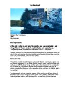
I started my project whilst on holiday in Singapore, which is where these first three pictures were taken:
I feel that the success of this image lies in its deception and intriguing perspective. The solarization adds atmosphere and gives the image a surreal feel. Due to the man being positioned in the golden mean and the pathway sweeping diagonally across the image, the viewer is drawn in by the appealing composition. One can then notice the peculiarities and interest of the image, for example the man appearing twice and the strange slanting of the way as well as the unnatural light seeping in the past the pillars. Due the darkness in the bottom third of the photograph, a lot is left to the viewers imagination. This also attracts the focus to the subject of the image, and does not distract the viewer with cluttering. One of my favourite aspects of this picture is the interesting distinction and sharp edges between the light and dark areas. With the unexpected inverted tones adding to the *strangeness*.
This next image also relies on reflections, breaking up the page by the strong diagonal:
The lettering at the bottom helps to connect with the subtle letters that lie in the street scene. The stillness of the glass and sign contrast with movement of the people in the foreground and background, and the curved design on the pavement compliments the prominent diagonal and the ordered lettering. The busy composition sends the viewer all over the page, with the movement of the people animating the street scene. The white sign effectively breaks up the page, send the viewer diagonally across the page. The picture does not reflect the busyness of a bustling city, illustrating the benefits of having smaller populations. In my opinion the main reason this image is effective is because of the interesting affects of the reflection, as well as the movement and patterns of the street scene. The significance of the lettering 'payment voucher' ties in with the location of the image, illustrating the mentality of the Singaporean government, with the results also shown- a very clean and orderly city.
While researching some of the photographers I noticed some similarities to that of my work, for example the use of reflections:
The image above by Walker Evans has the very appropriate title "city lunch counter". It
Evaluation
I have found this project extremely beneficial as it has complimented my previous focus on nature related topics. I have enjoyed the more spontaneous and intuitive approach required of a photographer in a vibrant city, and was extremely fortunate to be able to take images in Singapore as well as London. Both have provided me with different but lively environments to take pictures, especially Singapore which had beautiful strong lighting and interesting reflections off some of the newly constructed buildings. In my opinion these were my most effective images, as I really liked experimenting with the distortion of reflections.
Looking back at the project I would have liked to have taken pictures in different conditions, and possibly taken more images related to street photography as I really enjoyed that aspect of the project. However, overall I am very pleased with this project, and think that some of the solarisations were extremely successful. Researching artists and photographers has given me a lot of respect and appreciation for their work, as well as providing inspiration for my own images. In particular there are many links between some of my photographs and the reflections of Walker Evans (which I have previously discussed).