Unit 1: Tools and Applications | Description and Evaluation of Documents Document 1: Report Evaluating
Letterhead
Introduction
In the following report I will be evaluating my Edge End High School letterhead. I produced my letterhead using the software application Serif Page Plus 8.0. I produced my letterhead A4 size, as this was the typical letterhead size. Along with my final letterhead, I shall also be evaluating 3 drafts which I produced and edited before I got my final letterhead.
Content- Refer to Production of Documents| Appendices | Document 1: Letterhead: Pages 1-5
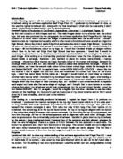
My first draft consists of both images and text. The main images drawn to my attention are: the school logo, this was also produced by me using again the software application Serif Page Plus 8.0. My logo consists of a circle, which contains an image of balance scales, and the letters EEHS. I chose a balance scale as it represented equality which is what every school should have as well as Edge End High School. Above the circle it reads Edge End and below the circle it reads High School. I found that the name of the school is a vital feature of a school logo, so I also decided that I should include it in my logo. I did not include any colour to my logo, as I found that it looked simple yet elegant without colour. Due to the fact that Edge End High School has four sponsors, I found that it would be necessary to place them on my letterhead, as it showed professionalism and would give the school a good image. After looking at a commercially produced document I saw that the company name was placed inside a rectangle, therefore I also decided to place the school name inside a maroon rectangle. I chose the colour maroon as it was the main colour of the current school logo. Beneath the rectangle there was a line, so I also decided to place a yellow line beneath the rectangle. I chose the colour yellow, as it was the second main colour of the current school logo. Inside the rectangle in the font Bodoni BdCn BT, size 24, in capital letters I wrote EDGE END HIGH SCHOOL. I chose this font and size as it was a legible font and size, and also resembled the current font used for the school logo. I used the colour black for the name as I thought it would stand out most clear on maroon. Another main feature which I included in my letterhead was the contact details. Again, after looking at a commercially produced document I found that each aspect of the contact details was separated by a triangle which was the shape of their company logo, so I decided to use a maroon circle to separate each aspect as it was also the same shape of my logo, and I thought that to use maroon as a colour scheme throughout my letterhead would look professional. For the actual contact details I used the font Bodoni BdCn BT, size 14, as again I found this a legible font and size. I decided to use the colour maroon for the headings Tel, Fax, and E-mail as it was part of my colour scheme and so that it would show that it was a heading, and not part of the address.


