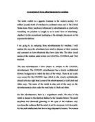
On this advertisement, there is a magnificent watch. The face of the watch is shaped in the identical fashion to the Camelia flower. The small sapphires and diamonds gleaming in the eyes of the audience only convinces the audience that the watch is not for everyone; but it is mostly for the posh intellectuals that have a large disposable income. The reason for this is that people with low incomes will look at the watch and admire it as much as the can; however, when it comes to the day of purchasing the watch, the price will put them off. On the other hand; people with large disposable incomes will not care how much the price of the watch is and will purchase it if they admire it; no matter what the cost is.
The way the CHANEL advertisement is proposed; is a very innocent, luxurious and romantic approach. The advertised have used their techniques to catch the eyes of the audience, and then they have left the watch to do the rest of the talking. This advertisement make the people with low incomes get rather jealous; it makes them feel as if the watch is only inches from their reach but they are not allowed to touch it.
This advertisement appeared in The Times newspaper. The Times is a national newspaper, published daily in the United Kingdom since 1788. it has played and influential role in politics and shaping public opinion about foreign events. The newspaper was printed in broadsheet format for 200 years, but switched to compact size in 2004; in an attempt to appeal to a younger audience.
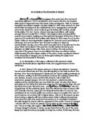
The second advertisement I will be analysing is for the PANERIA watch. This advertisement has a quiet crowded background; with three uniformed men in the engine room of a ship. There is not much colour used as most of the advertisement is in black and white. Also; there is hardly any copy, with the exception of the details of where to purchase the product from; which is in small sophisticated writing, the name of the watch and a subtitle at the top.
The watch has an outstandingly pure looking brown strap with the carefully done white stitching around it that bursts right into the eyes of the audience the moment they look at the advertisement. The PENARIA advertisement is targeted at audience that have a large disposable income as the watch is fairly expensive.
The PENARIA watch has a busy and sophisticated approach on the audience. The advertisers have made it so the audience know straight away just by looking at the advertisement, that this is not a watch to be worn at any old time and at jobs like: building sites, garages, factories and other places alike. The advertisers have made it very clear that this is a watch for special occasions and very clean work places.
The PANERAI watch appeared in the Sunday Telegraph. The Sunday Telegraph was founded in 1961; in November 2006, the Telegraph was the highest selling British broadsheet.