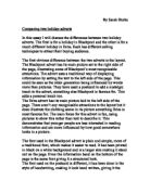
The font used in the Blackpool advert is plain and simple, more of a traditional font, which makes it easier to read. It has been printed in black on a white background and is a larger size making it stand out on the page. Even the information band on the bottom of the page is the same font giving it a structured look.
The font used on the postcard is different, it has been done in the style of handwriting, making it look hand written, giving it the personal touch as well. This could have been done this way because the older generation live their lives very routinely.
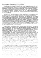
Whereas the Ibiza advert is all different fonts. The main one that stands out on the page is the page heading. This has been written in a 3D effect, it looks like a neon club sign. The text on the page is in white small font on a black background, it doesn’t clearly jump out of the page. Each paragraph is headed in a different colour and font. The fonts that stand out the most on the page are the ones that look like neon sign or information bar lettering, maybe this has been used to also illustrate the clubbing scene. Everything used on this advert is to reflect the clubbing scene.
The language used in the Blackpool is simple and easy to understand. They have used interesting descriptions of the attractions in Blackpool, such as “Aquatic marvels at the sea life centre to the Victorian grandeur of the world famous Blackpool tower…” They have used a chronological layout to the language, setting the day’s iternary while simple giving details of the attraction available at Blackpool.
The Ibiza advert is also simple and easy language to understand but is more modern almost slogan for example “… the rep will be able to sort you out with a range of discounted tickets”. If a similar sentence was used in the Blackpool advert it would be worded differently.
The main picture on the Blackpool advert is of two famous attractions, the first is The Blackpool Tower and the other is the Big wheel on the pier at Blackpool. Most people at sometime in their lives have been to Blackpool, and when seeing these attractions it would bring back nostalgic memories. They have used a soft focus on this picture making it look dreamy. The smaller picture are set across the middle of the page, again these are set out in a day’s iternary with a morning’s walk on the beach, afternoon in the Winter Gardens and an evening dancing at the Tower Ballroom.
There are a lot more pictures used on the Ibiza advert. All seem to have a different theme, to aim at different groups of young people. One is of a younger group of girls having fun while another is of an older group of women too having fun. Because the Ibiza advert is for a Club 18-30 holiday it is showing all ages can have fun on this holiday, but its not just different age groups which are shown, there is picture of a man that could be described as gay and a young man that could be described as a geek. They have also used two pictures “how much?” and “how hot”. The first displays how much alcohol costs something most young people are interested in when going away and the second how warm it is in summer months. Both of these are extremely important to young people when booking a holiday.
The primary aim for the Blackpool advert is for the over 50’s. This is evident by the information in the text. “Take high tea and a spin in the amazing Tower ballroom” this is not something a person booking a Club 18-30 holiday would be interested in. There is a secondary aim in this advert for younger children, maybe the grandchildren. “Ranging from adrenaline pumping rides on the pleasure beach” this defiantly is not aimed at the over 50’s.
The primary aim for the Ibiza advert is young people, this can be seen by the pictures used in the advert. But its not just young people that the advert is aimed at it is also aimed at the older age range of the holiday. It is also aimed at the gay community which could be represented by one of the pictures used in the advert.
The one I feel is more interesting is the Ibiza advert. It has more happening on the page with the different pictures and fonts and colours. It maybe that I find this one more interesting because I’m younger and Blackpool isn’t somewhere I’d go for a holiday just yet. To me Blackpool is a place you go for a day out.