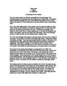
The woman in the advert looks similar to a housemaid in the 1950. The stereotype of a housemaid in the 1950’s was that they were meant to clean and provide the best food to their family. This shows to the viewers that this is a simple and good cereal for the family to eat. The last feature of this advert is the name Kellogg’s. This is well known in the United Kingdom as it is the monopoly in the cereal industry. This will make the customers believe that this has to be a delicious cereal as it has the Kellogg’s logo on it. This will help to vast majority of Britain as many of the public who eat cereals normally buy a Kellogg’s cereal brand.
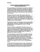
The Cadbury advert is trying to sale non healthy food. One of the ways they do this by the colour scheme. In this advert the colour scheme is dark colours. This shows to the audience that this is pleasing you temptations. The main product that stands out in the Cadbury flake as this is bright colours. This makes the viewers think that this is a rare treat that you should keep to your self as it is emphasized in the slogan ‘ just me, Cadbury and a spoon’. This helps sell their product as it shows it will satisfy their craving for a tasty snack.
Another main aspect is the person on the advert. The only part of her that you can see is her face. This is by the reflection from the spoon. They did this deliberately to show to the audience that there is no one else in this particular room were she will satisfy her self by eating this delicious yoghurt. Furthermore her expression on her face gives an indication of what she is planning to do. She is starring at this Cadbury flake as well as smiling. This shows her desires coming out of her. This tells the viewers this is how you’ll react if you were in the same position.
Lastly the repetition of the word spoon shows the significance that this is a devilish treat. In this advert alone the spoon is mentioned four times. This is at the top right hand corner were the Cadbury logo is; underneath it is the slogan ‘for spoons’ on the actual product it shows the yoghurt being picked up by a spoon. The spoons were the reflection of the person is on. Lastly the slogan at the bottom ‘just me, Cadbury and a spoon’, this has helped put emphasis on how this product should be eaten. This tells the audience instead of eating a cereal with what people normally eat with a spoon, buy this yoghurt and eat it with a spoon.
These two adverts are very similar despite they are advertising different products. The Kellogg’s is advertising a healthy product when the Cadbury is advertising a sweet unhealthy product. They both use the same scenario; both of them have one character which is a female, they both have a table were the product is.
The difference between these two adverts is the colour scheme. As for the healthy one they used light colours, but for the unhealthy product they used dark colours. This has helped to set the setting for both of these products to show what type of product they are trying to promote. This will help persuade their target markets as they are using this colour scheme.
The simplicity of both of the adverts dramatically improves their product. The simplicity in the Kellogg’s advert helps to show to the viewers that this is a simple and healthy cereal. On the other hand the simplicity of the advert made by Cadbury shows that it is your own desire that you are pleasing. This helps to sell their product by showing to the customers this is only for you to enjoy and all you need is a spoon.
Lastly the words that are on the advert help to sell their product. As the Kellogg’s product is a new product they had to describe what it is underneath. This helps to give a brief summary to the customers to tell them what this product is about. The Cadbury yoghurt is well known this why they had to use a few words. These few words have a major impact though. As the slogan ‘Just me, Cadbury and a spoon’ stands out because of the colour that it is in clashes with the colour them of the advert. This will be the main selling point for this product as this will be the main part of the advert that the viewers will remember.
These two products have produced an outstanding advert to sell their product. Even thought that they are selling two totally different products they are using the same principles. The colour scheme of the advert and the simplicity helps to sell their product. This is why these two products are doing so well on the market.