Comparison to Monsters Inc And Classic Monsters.
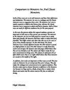
Both of these texts are to do with monsters and have their differences and similarities. The monsters Inc text is a webpage and the Classic Monsters text is a magazine front cover. The monsters Inc’s text is mainly targeted at children and Disney fans, whereas the Classic Monsters text is targeted at adults and horror fanatics. Both of these texts are made for different audiences but for the same purpose.
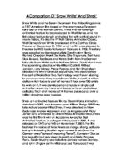
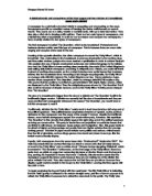
In the texts the pictures define the targeted audience, pictures are important in both texts as they attract you attention. The monsters in the Monsters Inc text are both posed in a casual way to make them look friendly; the monsters both have smiles to make them look friendlier. The bright colours also show that this text is not scary at all as it has friendly monsters. On the other hand, the Classic Monsters text is totally different because the other monster is posed on a high position on top of the other monster to make them look scarier and stronger; the monsters also look angry which shows that they are not friendly at all. The colours also help to make the text more concentrated on being scary. The colours are dark and a bit of light which states that it’s at night which shows that these monsters are outside in the middle of the night.


