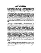
The rich red lustrous texture behind the slogan is surely used to put forward the proposal that the cake is only for the rich who can afford to spend money on luxurious gifts for the purpose of pleasing their partners. In the slogan the use of the word ‘Angel’, which is a representation of good and purity, is used to explain the actual antonym of the word. Instead of saying ‘It’s an evil cake’ the phrase is altered to ‘Its no Angel cake’. This is a very clever use of wording to achieve the same result but in a more devious way. The trident shaped fork on the forefront of the image and the application of the word ‘Angel’ in the slogan draw an immediate link of good and evil to the consumer. This is one of the many contrasts used in the advert between good and evil.
The copy of the advertisement mainly concentrates at persuading the consumer to buy the cake. It uses many long and short sentences to give it a varied pace and make it an enjoyable and user friendly read. The copy directly addresses the reader: ‘You won’t see Death by Chocolate…’ this adds to the striking and somewhat comforting affect of the text to the reader.
The beginning of the copy starts of commenting on the cake not being found in any vicar’s house with the exception of those that have appeared on the News of the World. This is the depiction that only the sinful and corrupt vicar’s who have affairs and misuse their authority appear on the News of the World and so since this cake is so tempting and lustful only those who have the will to submit to these sins will consume this cake. This cake is everything but innocent and the text implies that it is ‘harmful’ but to such an extent that the consumer will not be able to resist the temptation.
The use of rather babyish language such as ‘fwuffy wuffy…’ is used to mock the consumer almost daring them to indulge themselves with the cake. It is influencing the consumer to challenge their temptation to cheat on themselves with the cake like they would cheat on their partners with an accomplice.
The advertisement uses many contrasting words in the copy which creates an affect of mystification to the meaning of the cake. ‘Dark’ and ‘bitter’ is applied to associate with the bitter love affairs and to bring out the dark side of love. On the other hand, ‘light’ together with ‘mousse’ and ‘moist’ suggests that the cake is good and healthy. The copy focuses deeply on the self-indulgent experience of the cake and uses alliteration to put forward the idea. ‘Lascivious layers’ and ‘flavoured fudge’ all bring forward the proposal that this is the ultimate indulgence and increases the temptation to the reader to cheat on themselves with a bite.
The use of words such as ‘melange’ and ‘mousse’, being part of the French vocabulary, add to the sensuous style of the copy. The long vowel sound creates both an exotic and erotic affect on the reader. These are the references to sex in the advertisement. ‘Sponge’ and ‘moist’ generate the feeling of wetness along with freedom and the phrase, ‘fresh chocolate cream’ adds to this mouth-watering effect.
‘…small but perfectly formed…’ was a phrase used in the magazine ‘Private Eye’ to describe the male genitalia. By using this phrase in this advert it is almost referring the cake to be as sexy and erotic as the male genitalia. Also for those who are able to understand the humour within the use of this phrase, the advert is drawing their attention with this joke. The reference to sex is continued here.
The small expression used to illustrate the wholesome of the product; ‘…two to a box…’ refers to couples and the fact that a phrase in this sense would be used to describe their intimacy. It also explains that the product is not for self-seeking individuals but duo’s who enjoy each others company and are willing to share it equally.
Furthermore, the reference to Lolita, the temptress in a Russian novel, who indeed looked ‘sweet’ but was destructive due to her ability to seduce powerful men with her charms, implies that this cake is vicious like Lolita though it may look sweet and innocent. It is astonishing that the writer entails that the cake may kill its consumer. This is the conception of excess and definitive indulgence in the advertisement that tempts the reader into buying the product.
I think that the target audience for this advertisement are the middle aged businesspeople who devote their lives to work and forget the pleasures of life and the humour of sex. The use of excessive sexual imagery and the great emphasis on the immense indulgence that the cake portrays to the reader shows that the target of the advert is really for those who are unable to experience such delight. Also, the ostentatious use of phrases and the application of expressions referring to the sexual characteristics of one makes this advert rather more pointed towards the cheating sinful section of society than the faithful segment. The overwhelming importance given to the simple sexual enjoyment of this alluring product certainly expels young children off the list.
I think that the advert is effective because it uses a lot of humour to interest the reader and references to the sexual nature of the cake to lure the more mature audience towards the tempting cake. It persuades the consumer by stating that to eat this cake would be the ultimate indulgence and comically implying that one would die from the experience. The underlying message of this advert is that this cake is by far the most exotic and tempting creation of its kind and that this product will appeal to all the ‘sensual’ needs of its purchaser.