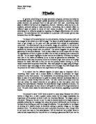
The size of the image is medium but is still more eye catching than the paragraph of text below; it is what the 20’s housewife would have seen first when looking at the advert. As there is a large amount of text to be read it is important to have an eye catching image to grab the readers initial attention.
The layout of the main paragraph of text is in columns, which are there to order the text and make it more presentable. In this case, as there is a lot of text to read, presentation of text is key, because the advertisers want to keep the attention of the reader for as long as possible. The font for the text, ‘Your Boy’s Ambition’, is relatively large compared to the main informative below, this is to catch the reader’s eye and lead them to read on. This is an effective font as it is bold yet clear and easy on the eye. However, when regarded the amount of text used, I would say it is too much. This is because, an advert should aim to carry its point across to the reader as quickly as possible and this advert does not do this, thus the impact is minimal. However, it could be possible that the 1920’s woman may have had a greater attention span.
The phrase ‘Your Boy’ is repeated in this advert, the use of a possessive pronoun is to make it sound much more personal to the reader. The advert tries to convey the idea that if the reader wants what is best for their child then buying Gibbs Dentifrice is the answer. Other example of repetition is the repetitive use of the brand name, Gibbs Dentifrice; this is repeated for the effect of emphasis. “Your boy”, and “His career”, can be deemed sexist language and this would not be surprising considering the advert was published at a time when, even though it was the beginning of female emancipation in terms of women being allowed to work outside of the home, men were still considered to be the bread winner of the family home. The adjective used in this advert also point towards it being highly sexist and focused on male needs, “...he will have to be strong and healthy....”, “strong... manly”. This is a form of personification as there is not such thing as ‘manly’ teeth but to 1920’s woman this would sound extremely positive as she would want the best for her son. Also, a boy who grows up to be the ‘manly’ type successful adult is an idealistic wish for a mother of that time.
The advert itself is very direct in the way it approaches the advice it gives to the reader. The first word of the main paragraph is the imperative, “explain”, and other examples include, “teach”, and “Let”, these are very forceful, the use of imperatives in this advert creates a sense of knowing coming from the writer. As if the writer knows what’s the truth, and what they are saying is an absolute fact which must be followed in order to achieve happiness and success.
The advertisers will assume most women will not know the technical terms used to describe the health of teeth, so use these phrases in the science will impress women into buying the product. “...the enamel which protects the teeth is formed into millions of miniature waves and facets...”. However, because of the fact many people will trust an advert which sounds like it knows about the relevant facts; I think the use of technical jargon is effective in this case as a 1920’s woman would probably know no better.
The advert uses cohesive contrasting to compare teeth to diamonds, “...as does a diamond”, this is, at first a very positive comparison. However, it later goes on to suggest that Gibbs Dentifrice will make teeth gleam but without it, they will be dirty, “....a diamond covered with mud.” Comparing teeth to diamonds is a very effective way of relating to the female audience as diamond are seen a precious luxury every typical woman wants and should cherish. The idea is that if ones teeth are diamonds, they should take care of them as they would do as they had actual diamonds in their possession.
There are a range of different sentence structures throughout the advert. For example, paragraph two in one long, complex sentence and this is to make the text seem scientifically impressive, and also to add a sense of fluidity to the sentence which accompanies the positive words in the paragraph, such as “bright”, “glisten” and “light”, nicely. Paragraph four begins with a long sentence which sums up the message of the advert; that message is that Gibbs Dentifrice exists to give “your boy”, the best start in life. Ending with an influencing and positive imperative is effective as it is the last sentence, which needs to be impactful.
The advert nowadays would not be as effective as it might have been in the 1920’s. One of the reasons is because a primary objective for a modern advertiser is to convey their message across to the customer as quickly as possible; in the case of the Gibbs Dentifrice advert there would be far too much text for a modern day customer to read. However, the fact that the advert has a lot of text is effective when being read by the 1920’s woman as at a time where there were not televisions, as she would probably have enough time to read it whilst being provided with some type of entertainment.