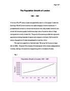
By the middle of the century, the prosperity of inner London led to a rapid increase in land prices. Many people started to move out into the suburbs. At the same time, the suburbs regrouped along existing class structures, unlike in London where the homes of the wealthy coexisted along the homes of the very poor. The Upper and Middle classes moved to fashionable areas such as the West End of London, while the less well off classes congregated in the East End, where some parts were of incredible poverty and filth. The growth and the movement of the population can be seen in fig. 2. The data in the graph was derived from the census which took place every ten years in the 19th century. Note that the curve of the London City and the Strand (census registration districts) starts to slope downwards after the 1840s-50s point. These curves are similar for most inner city districts.
Fig. 2
The sharp dip in the London City curve just after the 1941 point marks the period of cholera outbreaks. There were several cholera outbreaks in this period, amongst which the most serious were in 1833, where 10 000 people died, and in 1849 where 14 000 died. Cholera was contracted from drinking contaminated water and until the second of half of the century, London residents were drinking water from the same parts of the Thames that open sewers were discharging into. Dr. John Snow first realised the link between sewage, water, and disease when he proved all the victims of cholera in a Soho area drew water from the same pump. This, along with the Great Stink of 1858, finally brought about a cry for action. Plans were drawn up to provided adequate sewers (eventually completed in 1875), and laws were put in effect to stop water companies from supplying drinking water from drawing water from the heavily polluted parts of the Thames and required them to provide some sort of filtration.
In the same graph, we can see that around the same period, the Lambeth (north-west London) and Kensington (south London) districts experienced a rapid increase in population. This is mainly due to the improved transport links and the growth of the Middle class in the areas, which in turn, leads to increased employment opportunities in the service and domestic areas. Again, these curves are similar for the districts that are similar in structure and location of Lambeth and Kensington (see appendix 2).
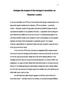
Fig. 3 shows some of the districts within the area between inner London and the suburbs. The graph clearly shows the steady rise in population in the districts up until the 1861 point where the slope begins the level out. This is because it has reached saturation point which can be explained by the lack of space more additional housing and possibly crowding of the area.
Fig. 3
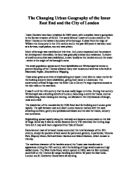
The graph in fig. 4 shows the districts in areas that are further out than that of the areas shown in fig. 3. We see that the population in these areas has quadrupled by the end of the century. If we compare the graphs is fig. 3 and fig. 4 we can see that where the slopes in fig. 3 start to level out, the gradient of the slopes in fig. 4 become much steeper. This tells us that there is a high possibility that the population from the areas shown in fig. 3 may have to move to areas such as those shown in fig.4.
There is an anomaly in the slope in fig. 5 which shows the population growth of Islington. The graph shows a sharp dip in population in 1881. I have not yet found the reason for this anomaly or it may be a mistake in the statistical data.
Fig. 5
AppendicesAcknowledgements
- Power point presentations by Anthony Gorst
- http://www.fidnet.com/~dap1955/dickens/dickens_london.html
- UCLA Dept of Epidemiology website at http://www.ph.ucla.edu/epi/snow.html
Appendix 1 contains the raw statistical data.
Source: On thee Mode of Communication of Cholera John Snow, M. D. London: John Churchill New Burlington Street, England, 1855.