Analysis and Conclusion
Analysis of Data
Oxygen Levels
The oxygen concentration and saturation are both at their highest at the first site, before the sewage outfall. At site two, after the sewage outfall, the oxygen concentration falls from 10.8 mg/l to 8.17 mg/l. Similarly, the oxygen saturation falls from 96.2% at site one to 80.7% at site two. This reduction in dissolved oxygen can be attributed to the process of eutrophication, as stated in my hypothesis.
In my hypothesis, I predicted that the oxygen levels of the ecosystem would fall after the sewage outfall due to a larger amount of micro-organisms in the ecosystem and nitrification. The micro-organisms will feed off the effluent from the outfall and break it down, consuming oxygen as they respire.
However, the oxygen levels continued to fall from site 2 to site 3, which I had not predicted. This could be because the majority of the effluent has been washed downstream so it has not yet fully affected the ecosystem at site two.
At site three, however, the oxygen levels had risen. The oxygen concentration had risen from 6.07 mg/l at site 3 to 9.47 mg/l at site 4. Similarly, the oxygen saturation had risen from 59.7% at site 3 to 86.4% at site 4. This rise can be explained by the distance (of nearly four kilometres) between the two sites. This distance may have enabled the ecosystem to recover from the sewage outfall, particularly as most of the effluent is unlikely to have been washed this far downstream. The distance offers an explanation for the ecosystem’s recovery and indicates that freshwater ecosystems can recover from pollution.
Temperature
My second histogram shows how the temperature of the water rose from the first site to the second (by 4.7ºC). This increase proves that my second prediction in my hypothesis was correct. My hypothesis predicted that temperature would increase, due to the sewage outfall (as sewage works processes heat the effluent).
The temperature is highest at site 2 and falls slightly at site 3. This is to be expected as the effluent would have cooled as it travelled downstream to the third site. This explanation is also relevant for the fall in temperature from the third site to the fourth site.
The change in temperature between the four sites may help to explain the change in oxygen levels, as the warmer the water the more oxygen it can hold. This may therefore affect both oxygen concentration and oxygen saturation.
Turbidity, Conductivity and Nitrates
The turbidity, conductivity and concentration of nitrates were all at their lowest at the first site. This indicates that the first site, before the sewage outfall, had the lowest level of pollution. The concentration of both suspended and dissolved solids (turbidity and conductivity) are good indicators of the level of pollution at each site, by helping to identify the presence of pollutants (such as phosphates) in the water. The turbidity rose from 5 mg/l to 43 mg/l between the first and second site, before rising again at the third site to 60 mg/l. The turbidity fell, however, between the penultimate and the fourth site to 6 mg/l. These results are another indication of the ecosystem’s recovery, a considerable distance from the outfall.
The conductivity results also indicate the same conclusion. The conductivity was at its lowest at the first site (467 ʯS) before rising at the second site (1302 ʯS). However, once again, the highest result was recorded at the third site (1355 ʯS) before the conductivity fell at the fourth site to 1042 ʯS. This follows the same pattern of all the results so far, with the first result representing the lowest level of pollution and the second result representing a huge increase in the level of pollution with the third results having the greatest amount of pollution. The fourth result continues to represent the ecosystem’s recovery.
The concentration of nitrates at each site is another important indication of the level of pollution at that site. In my hypothesis, I predicted that nitrogen levels would increase after the sewage outfall, due to nitrification. My results prove this prediction. The first site had the lowest concentration of nitrates (48 mg/l) and the results at the second site showed a huge increase from this amount to 107 mg/l. The amount of nitrogen in the ecosystem had more than doubled. In a variation of the pattern established above, the third site did not have the greatest amount of nitrogen (96 mg/l). However, the fourth result did not vary from the pattern, as the nitrogen levels fell to 49 mg/l.
The pie chart shows that the second site had the greatest percentage of nitrates, followed by the third site. The fourth site had a similar percentage to the first, representing its recovery from site two and three’s pollution once again. Both velocity and pH had little variation throughout the investigation. This confirms that these variables were kept constant; this adds reliability to my results.
Biotic data
In my hypothesis, I predicted that the species richness would decrease after the sewage outfall. My results both confirmed and contradicted this prediction. As I predicted, the first site (before the sewage outfall) had the greatest total number of species (23) which decreased at site 2 (after the sewage outfall) to just fourteen. This figure continued to fall to a total of ten species at site 3. However, the figure rose to nineteen species at the final site. Although these results are slightly contradictory of my original prediction, they follow the established pattern demonstrated in the abiotic data and indicate the ecosystem’s recovery by the fourth site.
The BMWP scores for each site also follow this pattern, with the first site holding the highest score of 123 and a mean score of 5.3. These scores demonstrate that the water at this site is clean, according to the BMWP scoring system. The third site had the lowest score of 32 and a mean score of 3.2, meaning this site was polluted. The second site had a similarly low score of 46, also meaning this site was polluted. The fourth site, however, received a higher score of 94 and a mean score of 4.9. This represented a significant recovery as this site was no longer classified as polluted. The total abundance of each site also reflected this pattern, as Figure 2 shows.
At all the sites, the dominant species was the freshwater shrimp. This does not provide us with useful information about the change in the level of pollution at each site as the dominant species did not change. This is not a surprising result, however, as freshwater shrimps have a high tolerance for polluted conditions (particularly low oxygen levels due to their haemoglobin adaptation) so can remain prevalent in polluted conditions.
Conclusion
In conclusion, the predictions in my hypothesis were correct. However, my results indicate an interesting pattern, with the first result representing the lowest level of pollution and the second result representing a huge increase in the level of pollution with the third results having the greatest amount of pollution. The fourth result continues to represent the ecosystem’s recovery.
This pattern can be explained using geographical theory. The first results consistently represented the lowest level of pollution (with the highest BMWP score of 123 and the highest oxygen concentration of 10.8 mg/l) because it did not contain sewage effluent. Without the sewage effluent, this site does not suffer dramatically from de-oxygenation or nitrification.
The second results consistently represented the second highest level of pollution (with a nitrate concentration of 48 mg/l and a BMWP score of 46) as although it contained the sewage effluent, the effects of this effluent had not yet begun to fully pollute the ecosystem as they may have been washed downstream. This explains why the third site consistently represented the highest level of pollution (with a BMWP score of 32). Finally, the fourth site represented the second lowest amount of pollution, with factors returning to a similar level as recorded at the first site (for example the fourth site had a BMWP score of 94). This recovery can be attributed to the distance (of nearly four kilometres) between the two sites. This distance may have enabled the ecosystem to recover from the sewage outfall, particularly as most of the effluent is unlikely to have been washed this far downstream. The distance offers an explanation for the ecosystem’s recovery and indicates that freshwater ecosystems can recover from pollution.
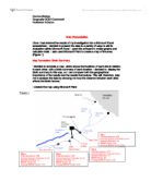
There is evidence to support this conclusion. My initial research shows that the impact of organic waste on a freshwater ecosystem leads to a reduction in oxygen levels (shown in Figure 3). My research also states that a ‘gradual elimination’ of pollutants can take place downstream from the outfall as ‘natural purification’ of the water takes place, known as ‘natural repair’.
This process is shown in Figure 3 from my research. This research supports my conclusion that the ecosystem had recovered from the sewage outfall by the fourth site, after the initial pollution of the ecosystem.
Additionally, my research into public attitudes towards freshwater pollution indicates that ‘water pollution continues to be a public concern’. This research has lead me to the conclusion, therefore, that the local residents in Pocklington would be concerned about the level of pollution in Pocklington Beck. My research indicated that freshwater pollution often is an important concern for farmers, who may need to monitor their use of pesticides.
Possible Improvements of the Study
I could have improved my study by taking more measurements and repeating my readings. This would have made the final results more reliable. Investigating more sites at Pocklington Beck would also have achieved this aim. However, it may have been difficult to do this as it may have disrupted local residents or agricultural activities.
I could also have investigated more freshwater ecosystems around the country to confirm the pattern I established during this investigation. This would have made any conclusions more reliable and added credibility to my research. It may also have made my results more accurate. However, I did not have enough time to carry out these improvements. Due to these time restraints, my explanation and conclusions may be incomplete as I have only investigated one freshwater ecosystem and this may not be a large enough sample size.


