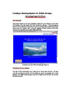
Homepage (Visual Basic)
A screen dump of the Macro for the Homepage (Fig 3.2)
Members /Non Members
This page needs to have an influential, contemporary, persuasive look, as potential members will still at this time, be deciding whether to register their details of not.
A screen dump of the Member/Non Member page (Fig 3.3)
Problems Encountered
When importing the logo, the size was difficult to set.
Members (Visual Basic)
A screen dump of the macro for the “Members” button (Fig 3.4)
Log In
This page just informs the member that they are about to be prompted for their username and password.
A screen dump of the Log In page (Fig 3.5)
Problems Encountered
When the horizontal and vertical value bars are taken away, the buttons and logos were out of position so these need to be adjusted.
Log In (Visual Basic)
A screen dump of the macro for the “Members” button (Fig 3.6)
Log In Form
This is where the details of all customers are kept.
A screen dump of the Log In form (fig 3.7)
Problems Encountered
Unless one of the two headings is highlighted, the form will not find any data to use.
Log In (Visual Basic)
A screen dump of the macro for the Log In Form (Fig 3.8)
Registration
This page notifies the customer that he/she is about sign on as a new member and asks for confirmation by clicking the “Register” button.
A screen dump of the registration sheet (Fig 3.9)
Problems Encountered
When the horizontal and vertical value bars are taken away, the buttons and logos were out of position so these need to be adjusted.
Registration (Visual Basic)
A screen dump of the macro for the “Registration” button (Fig 3.10)
Registration Form
This is where the details of all customers are kept.
A screen dump of the registration form (fig 3.11)
Problems Encountered
Unless one of the two headings is highlighted, the form will not find any data to use.
Registration Form (Visual Basic)
A screen dump of the macro for the Registration Form (Fig 3.12)
Seating Plan
This is the seating plan of the plane. It gives the customers the opportunity to see and choose where they would like to sit on the journey.
Seating Plan (Fig 3.13)
Problems Encountered
It was difficult to repeatedly gain the same box size in the diagram, which caused a lot of time to be wasted. To avoid, copy and paste boxes.
Seating Plan Visual Basic)
A screen dump of the macro for the “Members” button (Fig 3.14)
Accounts Sheet
This sheet works out how much money has been made per day and can work out the maximum possible income.
A screen shot of the formulae on the accounts Sheet (Fig 3.15)
Problems Encountered
When asked for formulae to be shown, the format of the sheet changes completely. Adjustments have to be made.
Ticket
This page shows the format of the final ticket that will be printed showing the flight number, destination, Flight date, Airport, Price, Rate and Type.
A screen shot of the ticket that will be printed. (Fig 3.16)
Problems Encountered
Is difficult to design with out the use of gridlines, use gridlines to design then take gridlines off.
Ticket (Visual Basic)
A screen dump of the macro for the “Print” button (Fig 3.17)