1.4 Outcome of Research
Therefore the outcome of my research was to reduce time spent on admin and making sure the customers receive their tickets on time. This would be effective as currently First Travel spends thirty five minutes on each sale, with the computerised system they could reduce this time and therefore more sales could be made within the working day. One of his customers in the questionnaire mentioned that overnight, Mr Jones should leave a voicemail service for any customers that were booking after the closing time. I decided to design a logo for First Travel as this helps their customers to immediately identify with the company. Also to improve the following processes:
- To store customer details
- To automatically creating an invoice
- To create an e-ticket which would e-mailed to the customer directly once the total amount is paid.
1.41 Storing Customer Details
1.42 Creating an Invoice
1.43 Creating an e-ticket
There are a number of ways to create e-tickets: I can store the information to be used for the e-tickets separately I can use a database such as Microsoft Access or the data editor in Microsoft Word. I have decided to use to use the mail merge facilities on Microsoft Word that will help Mr Jones to create a standard e-ticket with the relevant information for each customer, as I feel most comfortable with this and I have used it before.
The data that would be stored are:
- The Customer Details
- The Holiday Information
- Number of People Travelling
- Payment Information
Report 1: Logos
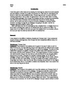
Analysis of Travel Logos 2.1
This logo is attractive as it advertises its name in its logo and so it is a useful selling point, this is unlike other logos such as the Apple logo where there is no text. Secondly logo uses two colours and therefore it looks clean and professional and unlike other logos such as the old Fanta logo (which is cluttered and un colour coordinated). Thirdly this logo is a definite improvement for previous BA logos, such as the one released on the Queen’s Birthday in 1991. However the logo hasn’t been updated for just over fifteen years, certainly there have been modifications and improvements, and however BA hasn’t changed it completely. A report done by The Economist shows this could be why BA’s sales have been dropping gradually over the past decade.
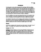
This logo represents the British based airline; Monarch. This logo uses two complementary colours, which are purple and yellow. The crown image is very clever because it matches the name of airline. The colours are used to great effect on the crown, the middle part of the crown is filled in with a golden yellow, and the two sides match the purple font. The crown is in a bold shape of an “M” so that people will notice that it belongs to Monarch Airways. It is extremely simple but also very clever and unique
Ryan Air is an Irish Airline company who specialise in cheap flights. This logo is simple and quite plain and dull. The writing is big and bold so that people can read it from a long distance and so that it stands out and it has a short slogan underneath persuading potential customers to fly with them. It also has a small image of a golden harp but it’s not on the subject of flying, planes, or holidays. The Ryan Air logo is far too plain and doesn’t use the beautiful two colours to effect.
2.2 My Logos
2.3 My Final Logo
I have chosen this logo, because I believe this logo represents the ethos and nature of the company. This is one of the only logos to have the slogan of the company underneath. I believe that this is an essential marketing point, which reflects the company. After research of existing logos (both travel and non-travel) and their colour scheme, I chose brow, yellow, and black. I chose the computer designed logos because they look more professional and pleasing to the eye. Another factor that was imperative to my chosen design is the survey I carried out (see Appendix C for completed survey).
2.4 Evaluation
How did you choose what features to include in your logo?
I looked at three different logos and evaluated the good and the bad things about each logo, and then created each of my own logos and trying to include all of the good features that I had spotted, to make it as effective as possible. I also created a survey on what customers wanted to see in a logo which has given me more of an insight into customer’s needs.
What hardware and software did you use?
To create these particular logos I used:
Hardware
Dell Dimension DM 051
Software
Microsoft Publisher 2007
Microsoft Word 2007
Corel Graphics Designer
Internet Explorer 7 ()
Suggest an alternative way for completing the task and what other hardware or software could you have used?
For this task I could have used different programs or I could have edited my drawn designs on the computer
Software
Microsoft PowerPoint 2003/7
Adobe Photoshop CS2
Hardware
Apple Mac
How well did this task work?
Overall I think I did quite well on this task, as I managed to use different programs and explore the different features of them, also I looked at the differences in the features between Microsoft Word 2003 and Microsoft 2007, I feel this has benefited me greatly. My logos look professional and smart, and I am pleased and the end result, however I feel I could’ve put a slogan on all of the logos, not just one.
Data Capture Forms
3.1 Data Capture Form for E-Ticket
3.2 Data Capture for Invoice
How did you gather the data?
When Mr Jones employed me he gave me a handwritten list of his current customers; I computerised this list in Microsoft Excel and imported it to Microsoft Access. To gather the data for my invoice I referred by back to the Excel version of ‘Customer Details’, linking relevant cells to the invoice. Here is a step by step guide:
What hardware and software did you use?
To create this particular invoice I used:
Hardware
Dell Dimension DM 051
Software
Microsoft Excel 2007
Microsoft Access 2007