Appearance:
The appearance of the payslip is good although not all the writing can be read on the payslip. The size of the font used is too small and will not be able to be read by all employees. It could be improved by adding the name of the company to make it look more professional
Response to User Comments
Layout:
I will expand the field size of both the name of the field and the entry box to ensure that there is enough room for all text to be added. I will sort the information into chronological order and spread the information out slightly so it is easier to read.
Information:
I will add “Forename” to the payslip and ensure that it is in the appropriate place on the payslip. I will ensure that all the information on the payslip is in the correct place.
Appearance:
I will change the font size to something larger so all employees can read it. I will expand the field size so that all the field name text can be read such as “Standard Hours pay” which at the moment can only half be read. I will also add the name of the company at the top of the payslip “DVDs-2-Go”
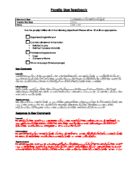
Has the payslip fulfilled all of the following objectives? Please either ☑ or • as appropriate.
Organised/Logical layout
Contains all relevant information
- Related to pay
- Related to personal details
Professional appearance
Fits on one page (three per page)
User Comments
Layout:
The layout of the payslip is better and the fields are of an appropriate size. As the information on the payslip is vertical at the moment, three payslips will not be able to fit on one A4 piece of paper. I think that the payslip needs to be more spread out horizontally rather than vertically. The font size is good, however I think that a more professional looking font should be used as the one at present is a little too comical looking and has too much weight
Information:
The payslip contains all the relevant information needed and is now sorted into chronological order. In order for the payslip is better, I think that “Week beginning” should added at the top of the payslip to keep track of what week the payslip is for. The “Net Pay” needs to be made bigger and stand out more and be a little separate from the rest of the information on the payslip.
Appearance:
The payslip does not have a professional appearance and does not have a logical layout. There is no clear organization. A company name needs to be added to make it look more professional. The “Week beginning” should be at the top of the page.
Response to User Comments
Layout:
I will make sure the information of the payslip is more spread out horizontally l so that three payslips are able to fit on one page so paper is not unnecessarily wasted. I will change the font style to “Century Gothic” as this is a more professional looking font.
Information:
I will add, “Week beginning” to the payslip and ensure that it is in the appropriate place on the payslip. I have sorted the information on the payslip into chronological order. I will make the “Net Pay” bigger. I will merge four cells to ensure that this is more defined that the rest of the information on the payslip.
Appearance:
I will add a company name to the payslip – “DVDs-2-Go” to make it more looks more professional. I will ensure that the information on the payslip is in an organized, logical layout. To ensure that this happens, I will separate the information into sections, for example: “Personal Details”, “Rates and Hours Worked” and “Pay and Deductions”.