For the second picture which Rachel wanted me to at least have, I have decided to put in the picture named “Turtle”. I inserted it in as before, to show all the people that will go on to the web site that there are a wide range of animals that Rachel can treat at the surgery and not just cats and dogs. This also meets the needs of the user, as before, it shows another type of animal from the wide variety of animals that Rachel treats and the picture helps the viewers tell if they can come to the surgery with their animal.
For the following links to other pages which Rachel wanted, these are as follows:
- The “Animal Of The Month” Page
- The “Dog Training Costs” Page
- The “Treatment Costs” Page
For the first of three links to different web pages that I will design, I have chosen to put the “Animal Of The Month” first as it would come first in alphabetical order. For the font I have chosen the size to be font size 28 as I think that it is an adequate size so people will be able to recognize it quickly. Also I have hyperlinked this word to the animal of the month page as that is required from Rachel. I have done this also for the next two links in order which are “Dog training Courses” and “Treatment Costs” as I think it will look good if they will all match. For the words dog training courses I have hyperlinked it to be able to go to the dog training course page as that is what Rachel wanted me to make the web site to do, and for the treatment costs words I have also hyperlinked to the treatment costs page as that is also what Rachel wanted me to do to the website. This meets the needs of the users, as by clicking on the hyperlink it will send them to the page that they wanted to go to.
For all three of the links I have decided to put them in the centre of the page and underlined as they will be evenly spread out in the centre so it will take more space so it looks like less space will be wasted, so that they can be read easily and underlined so that it looks more important so that people will be likely to click on it more. This meets the needs of the user as it can link the words to the appropriate page, which they want to read up on any other information, which they require or want to know.
For the link labelled “Animal Of The Month” I have also decided to use a clip art picture named “Clip Art 2” that Rachel gave to me on disk, as the clip art 2 image is a picture of a cat and the animal of the month is a cat. I have chosen to put this on the next line below the animal of the month link and I have chosen to also make it a hyperlink, as that is what Rachel wanted it to be and do.
I have also designed this for the other two hyperlinks. For the next hyperlink which is the “Dog Training Courses, I have chosen to use the image “Clip Art 1” which Rachel gave to me on disk which is a picture of a dog as it is related to dogs. I have also created a hyperlink on this clip art as it is what Rachel wanted me to do. For this I have also decided to centre it one line below the title of the page as it shows the viewer a bit more about the page.
Finally the other one I have chosen to put a clip art on the hyperlink is the page labelled “Treatment Costs”. For this I have decided to use the clip art image named “Clip Art 3” which Rachel gave to me on disk. I have chosen to use this clip art as clip art 3 is a picture of a syringe and that is related to the treatment costs page. Again for this I have also decided to put it in the centre of the page and one line below the title of the page as it also gives more information to the viewer about the page, which they may look at. All of these clip art hyperlinks meets the needs of the users as they show more information about the respective pages and they can also send viewers to the pages that they want so it will make it easier to send the viewers to the pages that they wanted.
For the font of the home page I have decided to put the whole page in the standard Times New Roman font, as it will be easy to read. This meets the needs of the user as it will be able to be read clearly so that none of the information will mistakably be read wrong.
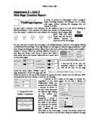
Animal Of The Month Page
For the title of the animal of the month page which is “Animal Of The Month” I have decided to centre it so it can be seen and read more clearly, underline it so it stands out more, and put it in italics so it also stands out. For the size of the font I have decided to put it in font size 36, as it will be able to stand out so that it can clearly state the title and the contents of the page. This meets the needs of the user as it will show the title to be bold so it can be clearly read and the title being underlined, in italics and centred to make it stand out more.
For the colour of the title I have decided to put it in red as the hyperlinks on the homepage are also in red so it matches with the titles of the separate pages, and I think that it will stand out so it catches other peoples eyes. This meets the needs of the users as it can catch people’s eyes so they can clearly see the title as it is in a bright, bold colour.
Also I have chosen to put the first letter of each word of the title in capital letters so that it will be more prominent. This meets the needs of the user, as it will look more professional so that viewers will be more interested about the look and the contents of the page.
For the picture on the web page I have decided to put in the picture called “Cat 2” which Rachel gave to me on disk as I think that it is the best picture as all of the other pictures are not as attractive as the cat 2 picture. Also for the position of the picture I have decided to put it on the left of the page a few lines below the title so that I can position the cat information on the left and below the picture. This meets the needs of the user as it shows a picture of a cat, which is needed by Rachel and also it verifies that a cat is another of the wide range of animals that Rachel treats at the veterinary surgery.
For the cat information I have decided to put it in the colour black, as it will be the easiest to read and because it doesn’t need to be fancy in any way. Also for the font size I have decided to put it in font size 12 as it is not too big so it doesn’t take up too much space, but not too small so it can’t be clearly and easily read.
Also for the actual cat information I have got it from Rachel that she gave to me on disk, that information will be the text that will be on the web page as Rachel wanted it to. This meets the needs of the user, as it will be able to be read easily so viewers of the web page can gain an insight on cats either because they have one or they just want to read up on it.
For the link back to home page I have decided to hyperlink the word “HOME”. I have put it in capital letters, as it will clearly stand out the word so they are aware that it will hyperlink back to the homepage. For the font size of the hyperlink back to homepage I have decided to have the hyperlink in font size 24 as I think that it is a good size as it is big so it can be seen clearly, not too small so it cant be seen but not too big so that it takes up too much space. For the clip art picture that Rachel also wanted me to use I have decided to use the clip labelled “Clip Art 4” as the picture fro this specific clip art is a picture of a home so It will go well with the home word hyperlink. This meets the needs of the user as it shows the viewer the link back to the homepage clearly so that the viewer doesn’t have any troubles reading it. For the font colour I have decided to put the home hyperlink in the colour red, as it will match with the homepage hyperlinks and the animal of the month title. This meets the needs of the user is it will show up bold making it even easier for the viewers to read.
For the font of the animal of the month page I have decided to put the whole page in he standard font, which is Times New Roman like in the home page, because, it will be easy to read. This meets the needs of the user as it will also be able to be read clearly like the home page as none of the information will mistakably be read wrong.
Dog Training Courses Page
For the title of the dog training course page I have decided to put the title the same as the animal of the month page. I have decided to put the title in the centre of the page. I have decided to underline it, put it in italics, put the first letter of each word in capitals, make the font colour red and make the size of the title font size 36. I have decided to put the title in the centre of the page so that it will stand out more than if it was aligned left, the reason I put it in italics as that it adds to the way that it will stand out when viewers are looking at the page. I have chosen to put the first letter of each word of the title in capital letters so that it will look more professional. I have also chosen to make the font colour red so that it will stand out more and I have also chosen to put he font size as font size 36 so it will make the title stand out more so that the viewers are more aware of the page. I have chosen these settings of the title as they are the same configurations as the title for the animal of the month page and I am copying the settings as I think it will look better if all of the titles for all of the different pages will look the same. This meets the needs of the users as it will stand out for the viewers to see and it will make them be aware of what page they are on. And so they know what the page is all about.
For the picture of a dog that was required from Rachel, I have decided to use the picture labelled “Dog 1” that Rachel gave to me on disk as I think that it gives the best impression of a dog from the selection that Rachel gave to me. This meets the needs of the user as it shows the viewer the animal that the page is about in case they didn’t read the title or if they just wanted to look at the picture without reading about it.
For the dog training course information I have chosen to use the font size as the standard size which is font size 12 so that it is clearly readable for the viewer of the web page and also for the font I have decided to use the standard front which is Times New Roman as it will make the reading easier for the viewer as he or she won’t have to try and make out what it says.
For the colour of the text I have decided to put the colour of the text in black as it will be easier for the viewer to read.
Also for the text on the dog training courses I have got the information from Rachel that she gave to me on disk. This I will use for the web page as Rachel wanted me to do. This all meets the needs of the users as it will show the information which they are wanting to know about clearly so that any vital points which they may need will not be hard to read.
For the link back to the home page I have decided to hyperlink the word “HOME”. I have put it in capital letters, as the word will clearly stand out so they are aware that it will hyperlink back to the homepage. For the font size of the hyperlink back to homepage I have decided to have the hyperlink in font size 24 as I think that it is a good size as it is big so it can be seen clearly, not too small so it cant be seen but not too big so that it takes up too much space. For the clip art picture that Rachel also wanted me to use I have decided to use the clip labelled “Clip Art 4” as the picture for this specific clip art is a picture of a home so it will go well with the home word hyperlink. This meets the needs of the user as it shows the viewer the link back to the homepage clearly so that the viewer doesn’t have any trouble reading it.
For the font colour I have decided to put the home hyperlink in the colour red, as it will match with the homepage hyperlinks and the animal of the month title. This meets the needs of the user is it will show up bold making it even easier for the viewers to read.
Treatment Costs Page
For the title of the dog treatment costs page I have decided to put the title the same as the animal of the month and dog training courses pages. I have chosen to put the title in the centre of the page, and I have also decided to underline it, put it in italics, put the first letter of each word in capitals, make the font colour red and make the size of the title font size 36. I have decided to put the title in the centre of the page so that it will stand out more than if it was aligned left, the reason I put it in italics is that it adds to the way that it will stand out when viewers are looking at the page. I have chosen to put the first letter of each word of the title in capital letters so that it will look more professional. I have also chosen to make the font colour red so that it will stand out more and I have also chosen to put the font size as font size 36 so it will make the title stand out more so that the viewers are more aware of the page. I have chosen these settings of the title as they are the same configurations as the title for the animal of the month page and I am copying the settings as I think it will look better if all of the titles for all of the different pages will look the same. This meets the needs of the users as it will stand out for the viewers to see and it will make them be aware of what page they are on. And so they know what the page is all about.
For one of the four pictures that Rachel wants in the treatment costs page I have chosen to put a cat picture labelled “Cat 3” that Rachel gave to me on disk as I think that it portrays a cat in the best possible way as I think that picture looks good and also as I want to show different pictures of cats as on the animal of the month page there is a picture labelled “Cat 2”. For the picture I have decided to put it in the top left of the page just below the heading as it will look good with the other positions of the other pictures as they are all positioned in a squared way and the information will go in the middle.
For the second picture of four that Rachel wanted me to use I have chosen to use a picture of a dog labelled “Dog 2” which Rachel gave to me on disk. I have chosen to use this as it shows another type of dog that the dog training course page doesn’t and also to show more varieties of breeds of animals which Rachel can treat. For the position of this picture I have decided to put it in the top right hand side of the page underneath the heading as I stated before as I am putting the pictures in a position so that the pictures will be in a square and the information will be in the middle.
For the third picture I have decided to put in a picture of a horse labelled “Horse 1” which Rachel gave to me on disk as this shows yet another type of animal that Rachel can treat at the surgery so the picture shows that horses can be treated at Rachel’s surgery. I have chosen to put this on the right side of the web page about 15 lines beneath the cat picture so that the information has space to fit in on the lines in between the cat and the horse pictures.
Finally for the fourth picture that Rachel wanted me to use I have chosen to use a picture of cows named “Cows” which Rachel also gave to me on disk. I have chosen to use this one, as before in the other pictures, it shows another type of animal to the viewers of the web page that Rachel can treat. For the position of the picture I have decided to put it on the right side of the web page about 15 lines beneath the dog picture to form a square so that the information can fit inside of the square. This meets the needs of the users as it shows a clear picture of some of the animals that Rachel treats and the picture verifies that, as it is on the web page of the surgery site.
For the information of the treatment costs page I have decided to put the text in the colour black as it will be easy to read. I have also put the size of the font in font size 12 as it is the standard font and it is just right and for the font itself I have decided to put it in Times New Roman as it would be easy to read and it is one of the clearest fonts there are. All of these settings I have just mentioned, I have put them as they are on the other pages so it will look better as everything will look similar.
For the link back to home page I have decided to hyperlink the word “HOME” as before with the other pages. I have put it in capital letters, as it will clearly stand out the word so they are aware that it will hyperlink back to the homepage like before and for the font size of the hyperlink back to homepage I have decided to have the hyperlink in font size 24 as I think that it is a good size as it is big so it can be seen clearly, not too small so it can’t be seen but not too big so that it takes up too much space. For the clip art picture that Rachel also wanted me to use I have decided to use the clip labelled “Clip Art 4” as the picture for this specific clip art is a picture of a home so it will go well with the home word hyperlink. This meets the needs of the user as it shows the viewer the link back to the homepage clearly so that the viewer doesn’t have any troubles reading it. For the font colour I have decided to put the home hyperlink in the colour red, as it will match with the homepage hyperlinks and the animal of the month title. This meets the needs of the user is it will show up bold making it even easier for the viewers to read.
Testing Plan
On the website that I am making for Rachel’s surgery I need to let viewers go to different pages on the site via hyperlinks. For my testing plan I need to make sure that all of the hyperlinks to everything including the animal of the month, dog training courses and treatment costs pages, as well as the hyperlinks back to the homepage from all of the above pages work on my website. If they all succeed in taking the viewers to the desired web pages of their choice, then I will know that my web site hyperlinks will work.
Software To Be Used
For my software to be used in order to make my web site for Rachel I have decided to use Microsoft Publisher. I will be using Microsoft Publisher as my chosen software as it meets all of my needs and requirements for me to be able to produce my web site.
In order to make my web site I need to be able to use WordArt. Microsoft Publisher has a wide variety of WordArt’s including the ones that I need to use to be able to make my web site.
Also to make my web site I need to be able to change the look of the WordArt. With Microsoft Publisher I can change the WordArt into any kind of shape using Microsoft’s WordArt shape tool to change the shape of the WordArt to the one I need.
For several hyperlinks I need to include words as well as pictures. With Microsoft Publisher you can make anything you want or need into a hyperlink.
For my titles of the extra web pages that Rachel wanted I need to make a bold, big title. With Microsoft Publisher I can make that title as Microsoft Publisher includes the Bold, Italics and Underlined options.
For all of my web pages I must be able to put in pictures and clip art images onto the pages. With Microsoft Publisher you can easily insert any type of picture file onto the pages easily just by clicking onto its specifically functioned insert tool.
For all of my pictures on all of the pages I need to wrap text around pictures so that all of these can be seen and not with the relative information over it. With Microsoft Publisher you can wrap text around any type of picture with any other type of text wrapping setting.
In order to make my web pages with information on them I need to be able to make text boxes so I can put words inside them. With Microsoft Publisher you can put text boxes in any size and put any text sizes in the boxes.
-------------------------------------------------------------------------------------------------------
For my web page I am not going to use the Microsoft Publisher wizard as I would prefer starting from scratch. Even though once the wizard has set up you can delete items that the wizard has automatically put in, I prefer putting in only things that I need as it saves time, and overall I don’t like the wizard and I would prefer making the whole site on my own without the aid of a wizard.