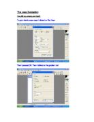
- Macromedia Fireworks: This is my personal favourite software because of the simplicity of it and the wide variety of normal and wierd tools which you can use to create an effective logo. You can also use loads of shapes to create a foundation for your logo.
- Logo Design Studio: this software is specifically for creating logos and it is a very advanced piece of technology. This is the most professional software and many companies already use it, but the software also costs a considerable amount. There are many pre-made templates there for you to alter slightly or for you to add a few of your own ideas.
I have chosen to use Macromedia Fireworks to create my logo, mostly because it is the easiest software to use and still make professional looking logos. It also has many unique features e.g. the magic wand and exciting paintbrush options like; fluid splatter, confetti etc. I will make 3 logos using this software and then I will choose which one is the most effective, compact, bold and attractive logo but I will also need to remember whilst creating my logo that it must not be too big and take up a lot of room or be too small so that it can barley be seen.
Logo Research:
Before I start to create my logo, I must research other travel agents and see what their logos are like. I will choose three other logos then analyze and evaluate them to see which one is the best. When I come to a conclusion I will then know what sort of a logo is needed to represent Type A Flight in the best way possible.
The three logos, which I have found from other travel agents, are listed below:
This logo represents the British based airline; Monarch. This logo uses two complementary colours, which are purple and yellow. The crown image is very clever because it matches the name of airline. The colours are used to great effect on the crown, the middle part of the crown is filled in with a golden yellow and the two sides match the purple font. The crown is in a bold shape of an “M” so that people will notice that it belongs to Monarch Airways. It is extremely simple but also very clever and unique
Airline Empires use modern colours and a 3D clip art image in their logo. The plane image stands out because the wings extend out of the silver circle. The “A” is very bold because of it’s large size and it has a beautiful shape. This logo is very compact and attractive.
Ryan Air is an Irish Airline company who specialise in cheap flights. This logo is simple and quite plain and dull. The writing is big and bold so that people can read it from a long distance and so that it stands out and it has a short slogan underneath persuading potential customers to fly with them. It also has a small image of a golden harp but it’s not on the subject of flying, planes or holidays. The Ryan Air logo is far too plain and doesn’t use the beautiful two colours to effect.
My Logos:
I have made 3 logo designs using Macromedia Fireworks, which is a very simple software to use, and it is also capable of creating fantastic designs.
The logos, which I have created by using the Fireworks Software, are listed
below:
I like this logo because it is simple, bold and looks good in black and white as well as colour. I added a circle bordering the logo to make it look sharper. I could have added the idea of computers to it because Type a Flight is a company who wish to use twenty-first century technology in most of their work. It could have been improved by having the “TAF” in 3D matching the plane image. I would give it 8/10.
This logo is closely linked to the name of the company. The man in the image is “typing” on his keyboard and booking his holiday as a “virtual” plane is zooming out from his monitor. This logo is very simple and quite effective. I could have made it more interesting by adding a border or some colour. I like the way the company name fits in on the monitor. I would give it 7/10.
This logo is very colourful and is pleasing to the eye. The “@” links in perfectly with computers and the 3 different colours also represent something
else. The blue T is the sky, the turquoise @ is the sea and the yellow F is the sand. These colours create a perfect holiday scene. I could have possibly added an image but I do not think it needs any more items added to it. I would give it a 9/10. This is my logo, which will be displayed in the company documentation.