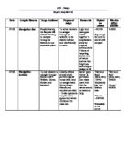
Neg: Interrupts the site’s navigation bar options, i.e. a user may click ‘money’ and choose an option from there but accidently clicks on the advert.
Size: Good – only takes up a small proportion of the homepage.
Source: Date: 12th Sep. 08
Purpose: To advertise BT and computer products on TSR.
Suitability: Suitable as TSR is the home for students, mainly University, who are very likely to buy products like these.
Impact: For unregistered users, both adverts are displayed simultaneously on the homepage; the top banner automatically catches the viewer’s attention, whilst the other banner catches their attention as they scroll down.
Pos: Easily noticed.
Neg: The way that they are repetitious and the same banner is displayed on every part of the site can be putting-off for most users.
Size: Compact – snugs in well with the website as a whole. Top banner is displayed on every page and does not disturb the user’s activities.
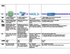
1)
2)
Source: Date: 11th Sep 2008.
Purpose: To advertise for sky motoring
Suitability: Suitable as the advice is being advertised on the service provider itself.
Impact: Gives the advice endorser’s name – in this case RAC (a big name in terms of car tips, insurance, etc...), increasing the probability of a person clicking. The isolated region makes the viewer question themselves if they were in such a situation.
Size: Small – does not restrain bandwidth.
Pos.: Noticeable, yet not annoying to users as it is small and located at the top; it does not interrupt the user.
Neg.: Isolated from the rest of the website; takes up too much space: less turgid impact.
Source: Date: 12th Sep 08