Year 7
Scatter Graphs
I’m drawing scatter graphs to find out the average weight for a given height so I can find out whether at 1.50 meters tall the males or females are heavier for example.
What we can tell from these graphs?
We can tell from the graph that the girls have a better correlation and there is a smaller gap between the tallest and smallest, which points to the girls all being more similar where as the boys are more varied. In both graphs most of people are in the 1.4m to 1.6m range with most of the girls clustered nearer the 1.6m line and the boys more spread out, this could mean that on average girls are taller but since there are more boys that are taller this may not be so and these taller boys will bring the total boy mean height up. For weight nearly all the girls are in the 40kg to 60kg range and in general closer to the 40kg line. But the boys are a lot more spread out and are both above and below the 60kg mark line
What we can tell from the cumulative frequency graphs?(on next the next pages)
For the Year 7 Cumulative Frequency graph for weight you can tell that the girls have a more tightly packed range of weight and that nearly all of the girls are in the middle half of the table. There is more variation either side for the males, meaning that in the girls the interquartile range is smaller.
For the Year 7 Cumulative Frequency graph for height, the graphs are very similar; the only main difference is that the girls’ graphical result doesn’t flow as well and some of the points don’t fit the line properly. This either means that the girls’ height varies a lot or my sample that I have is not a true sample of the year 7 girls’ height.
Standard Change
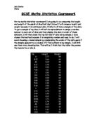
By using the excel formula ‘=STCHA(D2:D41)’ which I looked up, I was able to calculate the standard change of my tables and my selected data,
For year 7 Boys height the standard change is 0.099m to 3 d.p
For year 7 Girls height the standard change is 0.120m to 3 d.p.
The girls S.C. was greater then the boys which means that the boys data was closer together and more better data, I expected since when I was drawing the cumulative frequency graph I found the girls data was not following a proper curve where as the boys fitted in a lot more nicely
For year 7 Boys weight the standard change is 10.3kg to 3 s.f.
For year 7 Girls weight the standard change is 11.9kg to 3 s.f.
Since the boys S.C. was again lower then the females it is fair in saying that my random sample of boys was a better pick then my random sample of female. I could improve this by re-doing my tests or adding more people to my sample.
Year 11
Scatter Graph Males and Females
I’m now going to draw some scatter graphs for the year 11 groups and find the line of best fit an from and other data.
What Can We Tell From The Scatter Graphs?
We can tell from these scatter graphs first of all that the girls have a poorer correlation than the boys, but are in a much closer height bracket whereas the boys have a bigger height bracket and a better correlation. In both of the graphs the majority of people are in the 1.6m to 1.8m range the boys’ height however continues after 1.8m unlike the girls and one person reaching 2.06m in height.
Similar to year 7 the girls weight is not spread out and the majority are still compacted into the 40kg to 60 kg weight range, although it is now more spread out because before it was all nearly on the 40kg line whereas now it is more spread out but still very compact. The boys weight is spread out mainly in the 40kg to 80kg range. This shows us that while the girls are fairly uniform in weight the boys are a lot more varied. Like my first prediction the boys are heavier then the girls by year 11.
What we can tell from the cumulative frequency graphs?
We can tell from the year 11 cumulative frequency graph for weight that the boys are heavier because the graph ends later for boys then the girls. Also the boys have a greater interquartile range. I can tell this because of the shape of the curves. The girls have a tight distribution.
I can tell from the year 11 cumulative frequency graph for height that boys are taller since because many more boys still or the graph even after the tallest girl has been counted for. The girls once again have a tighter distribution of height then the boys do.
Standard Change
Once again I used the excel formula ‘=STCHA(D2:D41)’ to find the standard change of my data.
For year 11 Boys height the standard deviation is 0.134m to 3 d.p
For year 11 Girls height the standard deviation is 0.081m to 3 d.p.
This time it was the boys that strayed more from the mean since the standard change was greater in the boys. I could improve the standard change by making it lower by having more people in my sample and this should bring the standard change down since there is a more accurate mean for one reason and also because there would be more samples which should in theory follow the mean.
For year 11 Boys weight the standard change is 12.0kg to 3 s.f.
For year 11 Girls weight the standard change is 6.72kg to 3 s.f.
In this one the standard change of the females was nearly half that of the boys showing that the boys often strayed from the mean a lot. I could tell this because if you look at the cumulative frequency graph for male and female weight year 11 that the data distribution is very tight.
Main Conclusion
My prediction In the beginning was that in year 7 boys were shorter and weighed more and girls were taller but weighed less, I thought this was so due to real life and just looking around, with the data I have been given I see that this is not so. Boys in year 7 are taller then girls in Mayfield High School and also weigh more then girls, this may just be the random sample I had or more likely year’s height ranges from school to school. My prediction was that year 11 boys were both heavier and taller then year 11 girls, I thought this because in general girls grow quicker but stop growing earlier. I would say that prediction was correct that year 11 boys are taller then year 11 girls, because in my graph there was quite a difference between the boys and girls. I have found that there is some correlation between year, height and weight, as people get older they grow. This is not surprising but I thought I should point out how the year 11 boys were a lot taller and heavier then year 7 boys and the same for year 11 girls and year 7 girls.
Other Conclusions
Something I noticed in my graphs was the variation in the data, on nearly all of the graphs the girls had the closer data, and boys were more even. This means that while most of the girls will be on the same level the boys will vary a lot in height and weigh, no matter which year they are in this seems to be true. That would be why when I found the standard change of the data the females S.C. was a lot lower.
Limitations
There were some limitations of my scatter graphs for example, they are not very clear and the points are too big for my likening, you cannot get a true idea of what the graph is showing because it is too small. Another limitation is doing some work by hand but others by computer, I had to this due to the fact I did not know how to draw more complex graphs on the computer, if a computer had done it, the graph would be more accurate and therefore so would the data.
yhannka February 20, 2003 This essay downloaded from coursework.info http://www.coursework.info/