I chose hypothesis 1.
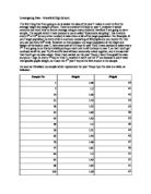
I will be using a sample of 30 pupils as this is a fairly large sample, the bigger the sample then the more accurate my results will be and the more accurate my graphs be and will look simpler as there is a large sample so it will be clearer then having a small sample. I have come across lots of different ways of designing experiments so I was used to setting this investigation as it is similar to a science coursework as it also includes:
- Planning
- Method
- Analysis
- Findings
- Conclusion
- Explanation
I think that my hypothesis can result in some problems for example there could be an odd result or something wrong with the pupils heights, but I am still confident that my hypothesis is factual and accurate.
Hypothesis 1
My table
After I have obtained my data, I put this in a simple chart displaying year group, gender and height. This will not show much but will make it easier for me to refer to the data rather than having to keep checking my spreadsheet. It will also show the data in a manageable way.
Mean & median
Males: mean: 1.67733333
Median: 1.7
Females: mean: 1.622666667
Median: 1.065
As you can see from the line graph below, the boys are slightly taller than the girls.
Line graph:
Bar chart.
Scatter diagrams
Diagram A. Diagram B.
I have made two different sorts of scatter diagrams with the same data. Diagram A is not in ascending order whereas diagram B is in ascending order with the lowest heights to the highest. On diagram B, there is no need for me to place a line of best fit as it is already in order and shows a strong and positive correlation whereas surprisingly diagram A, which is the same data shows a weak negative correlation.
Y = mx + c
Y = mx+ c is the general equation for a straight line graph.
“M” is equal to the gradient of the graph “C” is the value where it crosses the y-axis and is called the intercept.
These are cumulative frequency tables which I have produced using the frequency of the males and females heights and for the cumulative frequency I just added the frequency’s as I went along, so each entry in the table for cumulative frequency just “the total so far”.
Cumulative frequency
Males and females
Heights
Female male
Lower quartile, median and upper quartile:
Females:
Lower: 7.25
Median: 14.5
Upper: 21.75
Males:
Lower: 7.5
Median: 15
Upper: 22.5
By drawing horizontal lines to represent 1/4 of the total frequency, 1/2 of the total frequency and 3/4 of the total frequency, we can read estimates of the lower quartile, median and upper quartile from the horizontal axis.
I have drawn on the lower, median and upper quartile.
The shape of the cumulative frequency curve tells us how spreads out the data values are.
I have made two other cumulative frequency graphs with the same female data. i wanted to see if the data’s conclusions could be seen in a different and possibly clearer way. I think that the 3D graph is a clear visual of the data presented.
By drawing horizontal lines to represent 1/4 of the total frequency, 1/2 of the total frequency and 3/4 of the total frequency, we can read estimates of the lower quartile, median and upper quartile from the horizontal axis.
I have drawn on the lower median and upper quartile.
The shape of the cumulative frequency curve tells us how spreads out the data values are.
I have made two other cumulative frequency graphs with the same male data. I wanted to see if the data’s conclusions could be seen in a different and possibly clearer way. I think that the 3D graph is a clear visual of the data presented.
I used Microsoft office excel to make all these assorted graphs and charts. These help me and others to understand the data easier and for those who are weak at maths, it will be clear to them when the data is presented on a simple graph.
Interpreting and discussing results
I set out to find out if…
“Males are taller then females in year 10.” I found out that my original hypothesis was indeed correct. I used a various number of collected graphs and charts, in which these helped me in finding out if my assumptions were accurate and correct.
I found this out by collecting the data that I needed