‘I predict that the older the car, and the higher the mileage of the car, the lower the used price will be.’
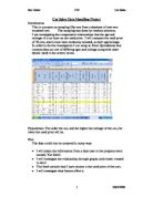
I am going to collect the require information and make some graphs by using the used car database provided; I will then take a random sample from this. I will then subtract the necessary information from the database and put then into charts to help show my results.
Once I took my random sample of all brands I removed some of the outliers as they would throw the results. I did this by checking that there weren’t any ‘silly’ results e.g. a car that is 1million years old.
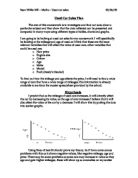
I used scatter graphs because you can easily subtract information from it and its quick and easy to use. On the graph I entered a trend line to show whether there is a positive or negative correlation.
Prediction: I predict that there will be an obvious negative correlation in both of the graphs.
Do a sample of the type of graph you will use and explain it
1.Say what is on graph
This is a sample of a scatter graph. This is exactly what my graphs will look like but with different results. I chose this graph because the data can be easily analysed and interpreted. And once a line of best fit is added, you can estimate results that aren’t actually on the graph.
Explain line of best fit = you can use the line of best fit to estimate one measurement, given another. The more closely the points are clustered around the line of best fit, the better the estimate
Pie charts
I have made pie charts for both age and make.
Age
This shows that most cars are in the range of 5-9 years old.
Make
This shows that most people drive fords.
Scatter Graphs
In the first graph comparing the used price and the age of the car you can see that there is a clear negative correlation, as predicted.
These are the results of my second graph:
As you can see there is no obvious correlation between the used price and mileage. (This doesn’t go with the prediction.) I think to resolve this problem I should re-do this graph using the mileage and the percentage change in price. I did this and the results are shown below:
Anomalies-
As you can see this now gives a positive correlation, this still is not how I predicted the outcome but at least it shows a better result than the previous graph. But as you can see, some cars actually increased in price this gives a large anomaly. This anomaly could be caused by a car that instead of depreciating in value actually increases. When I went to remove this anomie I noticed that it was a classic/vintage car.
.
Below is the same graph without this anomaly. I did this buy removing the outliers which were indicating an increase in price.
Means & medians
The mean of a list of data, is then all the data is added up and divided by however many individual pieces of data there are.
The median of a list of data is when the data is put in ascending or descending order, and the median is the middle number. The reason I only have 49 rather than 50 in my sample, Is because when I had an anomaly in my results I totally removed it.
The mean age of a car is: 374 ÷ 49 = 7.6326530612244897959183673469388
The median age of a car is: 7
For the age of the car the mean and median are quite close.
When you have a long list of numbers where most of them are different, you start creating ranges. E.g. for used price you would create ranges such as £0 - £5000.
The easiest was to collect this data would be in a table:
The mean for used car price is: 337455 ÷ 49 = £6886.836734693877551020408163265
The median for used car price is: £ 4,280
Unlike age, the mean and median for used car price is very different.
Upper and lower quartiles
Once you have figured out the median, you can then start figuring out the upper and lower quartile. The 12.25th (rounded down to 12th) number in my sample was the lower quartile. This was £1330 for used car price and 5 years for age. The 36.75th (rounded up to 37th) number in my sample was the upper quartile. This was £9040 for used car price and 11 for age.
I then showed the upper and lower quartile for used car price and the inter quartile range on the graph. I also did exactly the same for used car price and mileage.
Although I had collected accurate a sufficient results for comparing just age and mileage I then tried To improve my project results by comparing the effect that the age of Mercedes and has on its used price.
This graph shows that there is a strong negative correlation between the used price of Mercedes and the age, I know this because the R2 amount is equal to just below 0.5, and this means that it is strong correlation.
The gradient from the graph equals:
Y= -2047.9x + 28767
This means that, based on my data, I have found out that for every year older the car becomes, the price will decrease by an average of £2048.
This shows that there is a strong negative correlation between the used price of the Fords, and their age of them. This means that, as the car gets older, the car deprecates in value. Fords depreciate in value slower than Mercedes.
Unlike the Mercedes data the correlation here is strong as the R2 amount is above 0.5, which means it is a strong correlation.
Conclusion
My results show that as cars get older, they deprecate in value. Although there are a few anomalies, such as vintage cars that increase in value. The rule generally applies to all car makes and models.
The R2 amount for the Ford data is higher than the amount for Mercedes; this means that Ford has the strongest correlation between the two.
Overall my prediction was correct, as I predicted ‘I predict that the older the car, and the higher the mileage of the car, the lower the used price will be.’
,my scatter graphs show this.
Evaluation:
If I was to redo my investigation I would have changed a few things, firstly I would have used a much larger database of information, this is because, although I collected some results that were acceptable, my results would be much more reliable if I had a larger amount of information to work with. And then my results might show stronger trends and correlations.
Also I would probably select different variables to instigate, I would try and choose variables that would show different correlations so that I could make better comparisons.