Boys Frequency Chart
Girls Frequency Chart
The Graph is shown on the next page.
The results were as expected. The boy’s median height (1.66m) was higher than the girl’s (1.62m). The boy’s top height was 1.90m; the girl’s top height was 1.85m. The boys lowest height was 1.55, the girls was 1.45m.
- Next I will be using a scatter graph to see if there is any connection between the boys and girls IQ, and the average number of hours of TV watched per week. To produce a scatter graph, I must have two sets of grouped numerical data. I hope to find that the higher the persons IQ, the less amount of TV watched per week. In order to produce a scatter graph, I must create a simple chart.
Boys Scatter Chart
Girls Scatter Chart
The scatter graph is on the following page.
Having completed the scatter graph, I found there is a small relationship between the boys IQ & the number of hours TV watched per week. The girl’s data did not really show a relationship. The boy’s data shows a weak negative correlation explaining that the less TV watched the higher the persons IQ. I predicted this would happen to both sets of gender, but the girl’s data didn’t show a correlation.
The most TV watched by a girl per week was 70 hours; the most by a boy was 48. The highest IQ achieved by a girl was 120; the highest from a boy was 130. Ironically the highest scores (120 &130) showed they watched very little television.
3. Next I will be analysing the Boys & Girls means of transport to school. To do this I will input the data into a pie chart. The data field I will be using is the “Means to travel to school” field. I would hope that the majority of Boys & Girls travel to school by car or they walk. In order to produce a pie chart I must complete a table showing the different means of travel and how many people use them.
Boys Travel chart
Girls Travel Chart
The pie chart is shown on the next page.
Having completed my pie chart I analysed the results. I found that the majority of boys got to school by bus (43%). The majority of girls got to school by either car (27%) or walking (27%). My results were not as predicted with the boys, but reasonably close with the girls. Both the boys and girls walking percentage (27%) were the same, apart from that – the results differed quite a lot.
- Next I will be comparing the boys and girls favourite sport. I feel the best way to compare these two is to create a histogram. Before I can do that, I must create a frequency chart. I would expect that the boys favourite sport was Football and the girl probably Netball.
Boys favourite sport
Girls favourite sport
The histogram is shown on the next page.
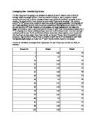
- For my final piece, I will calculate the mean, median and mode weight for the both the boys and girls and the boys and girls combined. I find the best way to do this is to put the boys and girls weights into a stem and leaf table. I predict that the boy’s average weight will be higher than the girls will, as with the median.
Boy’s stem and leaf table
Weight (kg) Boys actual weight
4 0,5,7,9
5 0,0,0,0,0,2,4,4,5,5,6,7
6 0,0,0,2,3,6,6,8
7 2,2,6,8
8 0,0,
Girls stem and leaf table
Weight (kg) Girls actual weight
3 5,6,6
4 2,5,5,5,5,8,8,8
5 0,0,0,1,2,4,4,4,5,5,5,6,6,8,8,
6 0,0,5,6
Having looked at the data I can calculate that the:
Boys Mean weight = 59.2 kg
Boys Median weight = 56 kg
Boys Mode weight = 50 kg
Girls Mean weight = 51 kg
Girls Median weight = 52 kg
Girls Mode weight = 45 kg
Conclusion
Overall, I think my hypotheses throughout the coursework have been proven correct minor a few results. I rightly predicted that the boys would be taller than the girls, that the main means of transport for girls would be by car, that the boy’s favourite sport would be football and the girls Netball. A few anomalous results meant some predictions were slightly off, but overall I feel it has been a good investigating.
Sean Melody