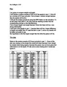
The first thing that I am going to do with the data is put it in tally charts. This will show me where the majority height and weight lies, which will allow me to draw bar charts afterwards. I will do this twice once for height and once for weight.
As you can see below I have grouped the data into class intervals. I have chosen a class interval of 10 so that I have a sufficient number of intervals.
This tally chart shows the heights of a mixture of 85 boys and girls from year 11
Now I am going to do a tally chart for the weight of a mixture 85 of boys and girls in year 11.
This table does not add up to 85 because I had to ignore one of the pieces of data because it was incorrect and did not make sense.
Bar Charts
I am now going to draw bar charts using the data from my tally charts, this is a common way to represent data as they are easy to read. I will do two bar charts the first to show the height and the second to show the weight.
This bar chart and tally chart show that the majority of pupils in year 11 are in the range of 1.60m and 1.70m. It also shows that the skewness is quite symmetric, this means that there are as many people tall as there are people small.
This bar chart and tally chart shows that the majority of pupils in year weigh between 60 and 70 kg. It also shows that the skewness is positive which means that there are more people lighter and less people heavier.
Scatter Diagrams
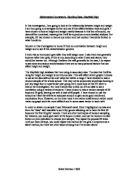
I am going to use a scatter diagram next as they are used to show the relationship between two variables. For this diagram I can compare the sets of data, height and weight, this will make it easier to show the relationship between the height and weight of a mixture of 85 boys and girls in year 11. I can also insert a line of best fit this will make it easier to say whether the graph has positive correlation.
This graph has positive correlation. This shows that the taller the person is generally the heavier they are. There is however some points which are wrong because one of the points says that the person is 1.69m tall but only weighs 5kg and another says that a person weighs 55kg but is only 1.33m tall. I think that these points are wrong because the typist typed them wrong.
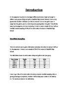
Cumulative Frequency
Cumulative frequency tells you how often a particular result was obtained. Below are the cumulative frequency tables for height and weight of a mixture of 85 boys and girls in year 11.
This table does not add up to 85 because I had to ignore one of the pieces of data because it was incorrect and did not make sense.
I can now draw cumulative frequency graphs
Below is the cumulative frequency graph for the weight of pupils in year 11.
Below is the cumulative frequency graph for the height of pupils in year 11.
Conclusion
I have come to the conclusion that the taller the person the heavier they are. This is shown because the correlation of the scatter graph which has both height and weight on it is positive this means that as height increases so does weight. For example one of the pupils was 1.52 meters tall and he weighed 45 kg and a pupil who was 1.7 meters weighed 56 kg.